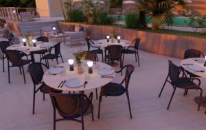
Fermob are firm believers in the power of colour to beautify your establishment and to create an atmosphere that reflects your personality, attract attention and ensure a warm welcome for your customers.
 Photography courtesy of Louise CARRASCO
There is nothing quite like remarkable colours to stand out from the crowd. Both bright and inviting, they not only look good, but make people want to come in and settle down. To give you the dash of colour that makes the difference, Fermob’s range has been extended with three new exclusive colours.
Gingerbread is associated with a classic pastry, a reference to taste, smell, colour and emotion. Gingerbread is both appetising and warm, drawing a sense of reassurance from its timeless appeal. At the crossroads between tradition and modernity, Gingerbread is as much a reference to the collective subconscious as it is to precious memories that are unique. It beautifully complements both Fermob’s mineral tones as well as warmer colours such as Black Cherry and Red Ochre. Classified as a brown, it is reminiscent of natural leather, earth, rock or desert sand. It therefore helps soften an environment thanks to its golden and sweet tones – ideal for both indoor and outdoor spaces.
 Photography courtesy of Louise CARRASCO
Explore the wonders of Pesto, bursting with Art de Vivre. Enjoy Italy, a sunny destination, as Fermob explore the traditional Pesto recipe: a mix of green with a hint of yellow. A mouth-watering tone that transports you into a world of flavours, where all ingredients are taken directly from nature. In a place where meals are served on a welcoming table, Pesto helps recreate this sense, promoting a friendly and social outdoor setting. Effortlessly used both indoors and outdoors, this unique plant-based tone gives off a relaxing vibe and offers a perfect balance combined with other greens, as a subtle touch, or can be used in contrast for depth and style. Bellissima!
 Photography courtesy of Louise CARRASCO
Although marshmallow is a confectionery colour, and by extension has that sweet, sugary connotation of childhood, as a tone it creates a lovely symphony that echoes the fresh, tangy pastels already included in the range: Frosted Lemon, Ice Mint or Clay Grey. In the Fermob colour chart, it makes its appearance in the delicate shade of mauve, ideal for creating spaces brimming with positivity, generosity and creativity. When used in contrast, it brightens blues and greens, bringing subtle combinations to life. With a fully assumed 100% retro touch, Marshmallow has it all: it is reassuring with a touch of modern brightness, ideally suited to help boost both subtle and strong colours.
Find out more at fermob-contract.com


