

words Kieran Long
The Camden Arts Centre’s north London home has always been characterful but problematic.
It is situated on the busy corner of Finchley Road and Arkwright Road, which rises steeply up the hill towards Hampstead. The original building was built by Arnold Taylor in 1897 as Hampstead Central Library and over the next hundred years gradually extended, with basements carved out and new additions made. The building was reopened as the Hampstead Arts Centre in 1965, intended to provide local people with a place to take lessons in painting, drawing, printing, pottery and design. It changed its name to Camden Arts Centre in 1967.
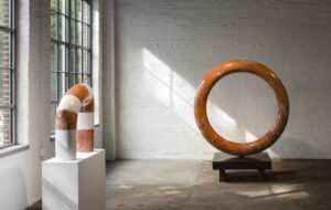
The high and well-lit spaces of the building found a loyal local audience, and also became popular with local artists as a venue to show their work. The centre has since hosted exhibitions by Martin Creed, Sophie Calle, Barnett Newman, Dan Graham, Bernd & Hilla Becher and Atelier van Lieshout, among others.
An Arts Council grant of nearly £3 million was awarded to refurbish the centre and to improve accessibility while ensuring Camden could continue to attract exhibitions by world-class artists. The rest of the £4m budget was provided by private donors and through Camden council, and Tony Fretton was appointed to oversee the refurbishment of this well-used and fondly regarded building.
Fretton says: “In the beginning, Camden did a lot of investigation into how people thought about the place. There were lots of different groups of people, all of whom value the place, and the project doesn’t prioritise between them.
“I am interested in how art exists across a range of levels, and how activities can be in tension with one another. The process of design is a speculative investigation into the social life of the building.”
One of the key requirements was to resolve access to the building, which was previously through the grand portico in the front facade, up from a stone stairway leading from ground level to first floor. As well as causing problems for disabled visitors to the centre, the entrance meant that the basement was a neglected resource, with a series of offices and studios of variable quality.
Fretton’s original plan had been to remove the staircase altogether, and to make the basement into the main access. Heritage objections put paid to that idea, but the idea of making access through the basement is retained. A lot of excavation was carried out to make the basement floor all one level, and underpinning was needed in some parts of the building. Fretton created a new glazed front entrance at basement level which leads through to the new and generous reception and bookshop area, and the visitor also passes by a new pottery studio, which, through a series of glazed openings can now be seen from the street.
The treatment of the interior is highly contingent and defined to a great extent by the technical requirements of improving the galleries and the lack of budget. Walls are painted white and rooms are cleaned up.
Two of the galleries are radically reworked. Gallery one, the largest space, is given an irregular matrix of rooflights in the ceiling, which can be opened or closed to natural light. Galleries one and two are air-conditioned and can now accept a much wider range of artworks. The more intriguing spaces are the less conventional ones, which sit behind the front facade of the building in their original proportions. The one new space is a small installation gallery which occupies the small area that was once the entrance hall.
The most beautiful of these original rooms is the westernmost gallery, which occupies the corner of the building. Fretton’s touch here is merely a few adjustments, raising the trusses slightly to allow a better view of the extent of the high walls of the gallery. The room has tremendous power, particularly with the chandelier installation by Cerith Wyn Evans that occupied it for its opening.
New interventions in Camden Arts Centre are subtle, but on closer inspection reveal themselves as charming, if slightly eccentric in places. The project does not attempt to dramatise the difference between the new and old building fabric, but makes moments of ambiguity, such as the red terrazzo floors in the new reception area and a staircase that could be mistaken for an original finish. The ironmongery also has this strange ambiguity, with customised Bauhaus door handles in gold finishes creating a slightly disorienting sense of history – they are not quite contemporary, nor are they naturally part of this 19th-century building.
The architectural expression in the existing fabric comes less from the treatment of the building, which is left to be almost as it was before, but from the fittings and furniture designed and chosen by the architect. In the reception area there will eventually be a custom-designed vitrine to show rare books, and the imposing bookcase running along the east wall already creates a feeling of a space furnished with high-quality specific interventions.
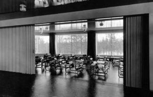
This theme continues in the major new build element of the project, a glass pavilion that sits in the garden. This new glazed rectangle, which looks out on the beautiful and steeply sloping garden (currently being relandscaped by art/architecture collective Muf), is on one hand a pretty conventional response to the need for more space. However, green velvet curtains can be drawn all the way around the room to create a very special venue for dinners and receptions. The coffee bar itself is another custom-designed piece in timber, which attracts visitors by forming a ledge which can be seen from the foyer. This cafe is a genuinely positive addition in an area of London not overburdened with places to sit with a quiet coffee. The ambiguity of such a sanctuary-like space as this garden and cafe sitting on one of London’s major traffic arteries will be exacerbated by the planned glass acoustic screen which will eventually replace the temporary fence that currently forms the site boundary. It will be an odd experience to sit and watch traffic flying down Finchley Road from the haven of the Camden Arts Centre garden.
The external expression of the cafe is deliberately understated, a single-storey glazed box. For the most part it defers to the existing fabric, but Fretton has managed to carve a new courtyard between the cafe and the office, which can be accessed from the office through large glass sliding doors.
Although Fretton’s work at Camden is more partial than at his classic Lisson Gallery, similar concerns are still present. The transparency of the new glass box entrance allows art to face the city, affecting the street life of this part of London and making an art institution that feels genuinely like a community resource as well as a high-class small art gallery. Art centres such as Camden get much of their charm from the gradual accumulation of additions and the sense of them being well-used and customised over time. Fretton has managed to make a project that retains this charm, by making interventions that avoid antiseptic generic contemporary aesthetics in favour of a richer, more idiosyncratic look.

