|
|
||
|
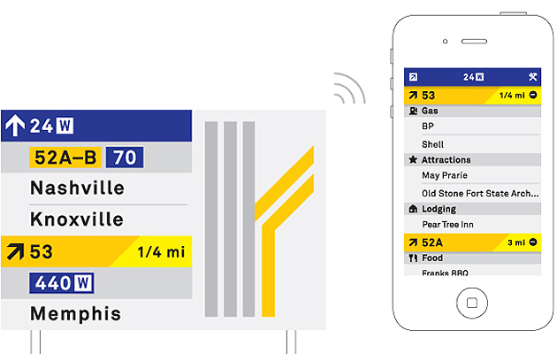
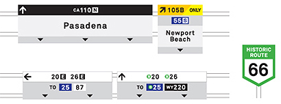
For a country so heavily reliant on cars, US road signage is confusing, inconsistent and messy. It is due an overhaul, both from a functional and an aesthetic standpoint. Staying within the constraints of sign production (we refrained from introducing digital signs), we have tried to modernise, and add clarity to, something that millions of road users, including many confused tourists, rely on every day. Modernisation The current use of shields of varying width feels dated and too “police state”, so we have abandoned them in the main system. However, we have retained a simplified shield for historic routes (such as Route 66), as we appreciate they may have a certain Americana charm. We have introduced a simplified, rectangular numerical system that saves space on the signs and can be placed more consistently. The rounded sign corners are replaced by sharp edges. Arrows are consistently sized and used only in 90 or 45 degree rotations, while a diagonal graphic element is introduced to draw the eye to exit instructions. The typography is set in Akkurat Bold.
Hierarchy Information is placed consistently on all road signs to enable drivers to read multiple instructions quickly. The top strip states the highway that the driver is travelling on. The strip below contains all highway markers, simplified to colour-coded rectangular modules. The middle area states destinations, and the lower portion provides simple lane guidance. Colour Dark green signs are replaced with a colour-coded system. Colour is introduced into the upper strip of the overhead signs. Currently, interstate highways are depicted by a blue shield, US highways by white, and state highways by (mostly) black. For consistency and ease of recognition, we have retained these colour associations. Smart phone integration Exit signs emit a wireless signal that speaks to a smartphone app, provided for free by the Department of Transportation. As a driver passes upcoming exit markers, the app displays fuel stations, attractions, accommodation and places of interest that can be reached from the turn-off. The app provides publicity for local, smaller independent businesses that aren’t directly visible from the highway (unlike Starbucks, McDonald’s or Best Western). The app would be designed to encourage discovery, spontaneity and scenic routes — perfect for the all-American family road trip. |
Image Manual Creative
Words Manual Creative |
|
|
||

