|
|
||
|
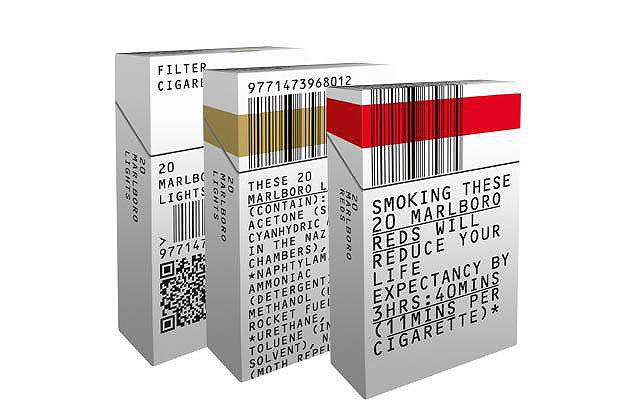
The government proposes selling cigarettes in plain packaging to limit their appeal – could they still look good while warning smokers? We asked graphic design studio Build to light us up When we got the brief we already knew about the government’s proposal for unbranded or plain packaging. We chose to approach the design almost from a non-design perspective. Stripping out any superfluous design elements and taking it down to an ultra-“generic” feel was quite liberating. We went through quite a few routes, from grotesque pictures of the perils of smoking, to really disgusting typefaces, but felt the best approach was one of reduction and genericism. Take anything off the packet that wasn’t necessary, and focus on the information. It was an exciting process, even if it was only for fun. 1 A lesson in reductionism OCR-B, a monospace typeface, was chosen for its clarity and genericism. The QR code [beneath the barcode] links to a government website on the effects of smoking and how to quit. We introduced a very small strip of colour to help indicate from a small distance the cigarettes’ brand. This is for two reasons: to aid people selling the cigarettes and to add a small level of anti-piracy measures (the colour would be foiled). I feel this is the most successful version of the three. 2 Information What is actually in a cigarette? There is no hierarchy, with the brand taken down to the same level as the information. Food packaging now has to list its contents by law – why should cigarettes be any different? This is what is contained in the cigarettes you are about to smoke. This design brings that information to the foreground, and the branding takes a back seat. 3 The warning message What are the possible consequences of smoking this packet of cigarettes? Real-time messaging, real consequences. Branding is taken down to a strip of recognisable colour – brand allegiance reduced to a colour strip only. As a designer, this approach is really refreshing: no gloss, just information.
|
Image Build
Words Build |
|
|
||


