Creative Director of LOVE, Russell Ashdown, shares how filmmakers use pace for dramatic effect and how designers can apply this to creating more impactful brand experiences
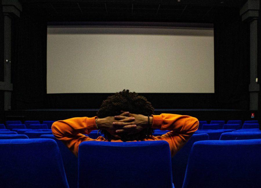 Photography by Marius Gire, Unsplash
By Russell Ashdown
Experience designers should go to the cinema more often. One of the most memorable film scenes of recent times popped into my head when we were discussing the flow of brand spaces in the studio. It’s a pivotal moment in Whiplash, the psychological drama about a promising young drummer’s pursuit of greatness.
Over a tense five minutes, the pace of the scene ebbs and flows. The drama of a high-octane drum solo gives way to a complete slowing down of film and audio, with abrupt silence underscoring a key narrative moment.
The reason that scene stuck with me is because it uses this change of pace as a hugely effective tool. Changing the pace is the device used to resolve the main conflict of the story.
It is a playbook that us brand experience designers can take a huge chunk from to create more impactful brand experiences. Just as Whiplash’s scene gripped me and heightened my experience and memory of the film, we want brand experiences to stay with people, to be recalled with ease and fondness.
Punctuating the noise
Experience designers are storytellers after all, so why not use the tactics of different disciplines to make our work more impactful?
Look to the likes of Christopher Nolan, another filmmaker that does this so well. In Interstellar’s airlock scene, for example, there is a moment of complete silence. It marks a transition between two action sequences but also represents the death of a main character. From a high-energy maelstrom of drama, it comes to a complete stop.
These scenes use voids in sound or dialogue to not only tell a story, but to make it more resonant on an emotional level. The viewer gets snapped out of the action, so that what they’ve seen can compute on a deeper level.
In experience design, we can – and should – do the same. Experiences shouldn’t be “always on”, an onslaught of energy and noise. There need to be the breaks between the sprints, the calm among the noise, the space that allows us to process an idea or a message. It’s a saw-tooth graph of on and off, loud and quiet, up and subdued that ultimately makes an experience more memorable.
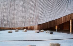
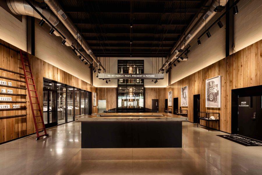 Photography by LOVE and Luke Hayes
Pressing pause
Key to this change of pace is the way you build in moments of pause. Creating a chance for wakeful rest in spatial design results in greater place attachment. This works for the wider built environment but should also be front-of-mind when designing brand spaces. Scientific research shows that resting states – or the opportunities to ‘mind wander’ – benefit memory and allow people to consolidate what they have just experienced.
When designing the new James B Beam distillery tour, we realised that such moments of pause were just as crucial as the high-impact wow factors. Allowing guests to sip bourbon on the porch, encouraged by landscape design and areas of rest and reflection, was just as crucial as the gigantic working distillery on show.
The drama sits alongside the contemplative quiet, allowing the experience as a whole to be more than the sum of its shop-restaurant-distillery parts. Spaces for pause increase our comprehension of what we’re seeing – and therefore our attachment and our love for it.
So, when designing a new space – whether a large-scale visitor tour or a one-off retail store – let’s explore more often how we can offer room for silence as well as moments of intense immersion. In film, this often plays out over just moments. Imagine the possibilities within a physical space for deepened brand attachment, loyalty and love.
Get a curated collection of design and architecture news in your inbox by signing up to our ICON Weekly newsletter

