|
Most people living or working in and around London have an Oyster card. We chose to redesign this electronic ticket for the capital’s transport network because, while it’s something Londoners use every day, the design is starting to look tired. The card reflects poorly on the city, and should be communicating higher British design standards to visitors. We wanted to get away from the current blue-and-white colour scheme and use a fresh, new typeface that could be employed across different items, such as route maps for tubes, buses and trains. For the design, we used multi-coloured, overlapping route lines that start in one place and then spread out, to suggest several journeys. These lines have a strong graphic appeal and, after all, routes are what the Oyster card is all about.
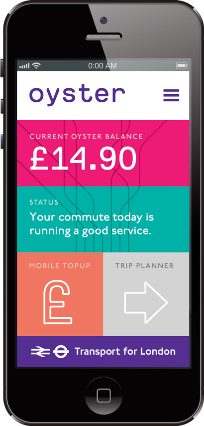
The design also has to work in places such as newsagents’ windows – here, the clean background helps the design stand out among all the other graphics vying for attention. Wouldn’t it be nice to pick from a selection of designs when getting a new Oyster card? You could pick from cards in a variety of colours such as matt black with varnish or bright fluorescent yellow. There are lots of fun ideas here – why not commission artists or illustrators to create limited-edition cards? Our next step was to think about how we could improve how the card works. At the moment, to view your balance you must either go to a ticket machine or go through the long-winded process of logging into the Transport for London Oyster website. In an age when smartphones are now commonplace, we find it astonishing that TfL is yet to bring the Oyster card into the modern day by introducing an official app. We would envisage such an app linking to the card either by scanning a QR code on it or by integrating NFC (near-field communication) functionality, which is the same technology used in contactless payment, which is now being included in most smartphones. The Oyster app could be used as a central dashboard where the user can manage all aspects of their travel. They can view their balance, top up on the go and more. An inbuilt trip-planner could warn the user of any potential delays to their commute or simply show them the quickest route to their destination.
|
Image Ranch
Words Ranch |
|
|

