|
|
||
|
Manchester studio MayNinth decided to test its mettle by declaring war on the image of one of its least favourite institutions The opportunity to redesign anything we wanted was an exciting one – any designer would bite another’s hand off for such a brief. But most would want to rethink something they love or can instantly relate to. We decided to turn this thinking on its head. For us, this commission was an opportunity to try to detach ourselves emotionally from our hypothetical client. We wanted to see if we could design for a client who doesn’t fit in with how we think. Our existing client base consists of all of the kind of companies that we want to be working with; clients that fit well with the company’s ethics. The Ministry of Defence is a perfect example of the antithesis of our belief system.
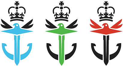
Looking at the existing MoD style guide, we can see that there has not been much love given to any aspect of the brand. When examining the identity we could see that the antiquated marque used is supposed to sit alongside the army, navy and air force logos. We stripped back the logo to its basic elements — a sword, an anchor and an eagle, representing the three armed services — and through colour used the logo as a device to represent each area separately. Sectioning the logo off allows us to extend its use within the brand, to create photographic image crops from an existing database of photos supplied by the MoD. The existing typefaces used by the MoD are Myriad and Arial – hardly an inspiring choice. We devised a new typeface influenced by technology and general “ruggedness”. The angular forms create a contrast to the smoother graphics deployed throughout the rest of the brand.
|
Images and words MayNinth |
|
|
||

