|
The bilingual manual for Expo 67 in Montreal |
||
|
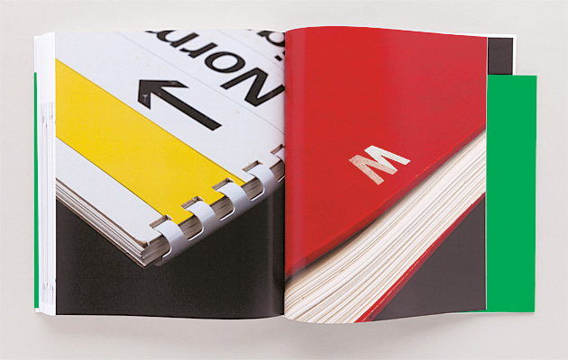
The way that corporations styled themselves in the 1960s and 70s was ruled by big books full of the smallest details, says Steve Parnell After the Second World War, every large corporation that wanted to control its image and be universally recognisable created a design manual. These tomes would outline in great detail how to reproduce and maintain the authenticity of the company’s logos, typeface and colours across geography and time. Manuals 1: Design & Identity Guidelines is an archaeological dig through 20 such manuals from 1963 to 1981. A book for graphic design cognoscenti, it comprises a short section of essays and interviews on the thinking and history of corporate identity, followed by a much longer section that includes comprehensively photographed highlights from the manuals. In an age before branding, developing corporate identities was graphic design’s big opportunity to change the world in its own image, and the new discipline gained momentum alongside advertising and mass consumer culture. The approach that became dominant in corporate identity design arose in the 1950s. Derived from the Swiss neue grafik style, it was characterised by white space, sans serif fonts and “the grid”. The introduction of this approach into American corporate culture was not widely welcomed due to its whiff of European socialism. But even “Big Blue” IBM was susceptible to such influences. Its identity, devised by Paul Rand in 1956, was influenced by the strategy of pervasive design – from products to advertising to shops – of Italian typewriter manufacturer Olivetti, a benevolent company in terms of giving back to its workers. IBM’s identity eventually evolved into a brand that was valued at $112 billion on its own in 2013. Sean Perkins of branding expert North identifies five characteristics of great manuals: they should be easy to read and understand, inspiring, intelligent, timeless and beautiful. Of course, most of these characteristics could apply to any design, and timelessness just seems wrong.
|
Words Steve Parnell
Manuals 1: Design & Identity Guidelines edited by Tony Brook, Adrian Shaughnessy and Sarah Schrauwen |
|
|
||
|
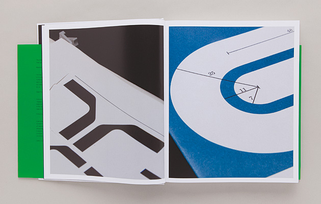
The precise specifications of the British Steel “S” |
||
|
All 20 of the manuals presented here can be quite easily dated; that’s precisely their charm. Longevity might be a more desirable aspiration, and perhaps placelessness would be a more accurate description. The rise of digital design effectively killed off the identity manual. No longer would there be a single source of authority or a physical engagement with a design dictat. Perkins claims that with digital manuals, you lose certainty that everyone is using the same reference – digital manuals are scaleless and colour reproduction spurious. Furthermore, digital guidelines never feel complete or definitive as they are constantly updated. There are some beautiful designs reproduced here that demonstrate the thought and attention that went into the minutest detail. Pages of blocks of a specific colour, dimensions, example applications, layouts, fonts, occasional what-not-to-dos, all demonstrate just the right level of constraint without causing designers undue frustration. The best examples, such as the New York City Transit Authority by Unimark International in 1970 (350 pages, weighing in at 4.04kg) show how the subtleties of font and colour choice address the requirements of way-finding as a public service. The simplest design is British Steel’s famous blue “S” (David Gentleman, 1969, 16 pages, 0.1kg) which was all that was needed to define the proud nationalised industry. A personal favourite is Nasa (Danne & Blackburn, 1976, 122 pages, 2.02kg) which had to be (almost literally) universally recognisable. Seeing it drawn on everything from letterheads to space shuttles brings home the importance of a simple identifiable, adaptable design, whether it be used for propaganda, advertising or just a link with an emotion such as pride. The final inclusion is British Telecom (Banks & Miles, 1981) whose manual one could cynically see as part of the preparation for the company’s privatisation in 1984, as the field of corporate identity moved irresistibly into the modern age of branding.
|
||


