|
When Icon asked us to redesign an existing brand that we thought could do with a refresh, our default setting in the studio was to think about things in life that annoyed us. Things soon started to get heated as we thought about how we could put the world of bad design to rights.
While we pondered which of these irritants to tackle, we looked down at the table and noticed that permanent fixture in our studio…Haribo Starmix – responsible for Jason’s frenetic keyboard shortcuts and, no doubt, years of expensive dental work for us all in the future.
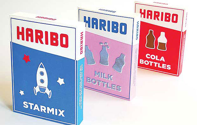
We tuck into these sweets almost compulsively every day, but we realized that their cheap-and-cheerful packaging is never as enticing as the contents. So we decided to set about creating an identity and packaging that isn’t just for kids, and that grown-ups might be proud to have on their desk or dashboard.
1. Logo design
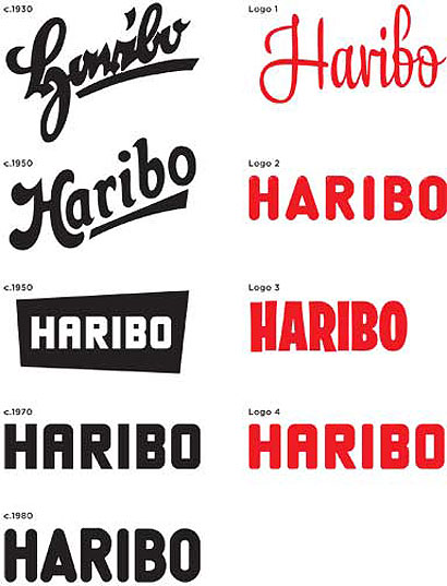
We felt that the logo had become too childish and had lost some of its charm over time. The version first used during the 1950s, which was revamped during the 1970s, has far more character, but feels too angular. By rounding off elements of the 1970s mark, we have given it a softness to reflect the confectionary (logo 4).
2. Packaging
Crinkly plastic bags that show off the sweets inside may appeal to children, but not to adults. We propose using a cardboard box instead, with a wide opening for easy sharing.
3. Simplification
The current packaging features bright colours, illustrations and gradients and suffers from an unstructured design. Typographically, there is a lack of consistency between products, and different sweets are given random adaptations of the logo. Simplification keeps the box clean, eye-catching, cost-efficient – and collectible!
4. Colour
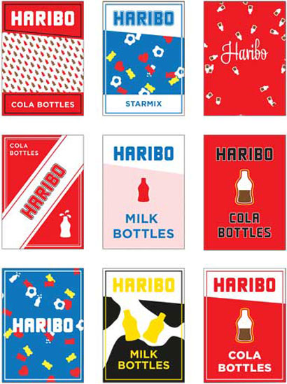
Because there are so many products in the Haribo range, colour plays an important part in customer recognition. Limiting designs to a maximum of three colours avoids confusion; these can then be embellished with patterns and textures. Bright colours keep the identity playful.

5. Icons
When shopping for food products, it is important to know what’s on the inside of the box. As the sweet shapes are so instantly recognizable (they have been unchanged since 1922), simplified icons can be used to tell customers what they are buying at a glance, without the need for photography or a clear window.
6. Extended use
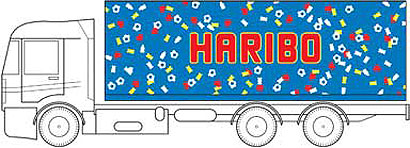
This identity would extend to other areas of the company, from marketing to vehicle livery. Taking the icons and presenting them in a random pattern keeps the brand looking fresh.
|

