|
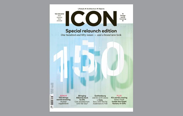
The Norwegian practice has integrated graphic design and architecture in creating and photographing an installation for the cover of our new-look magazine. Here, the designers talk us through their thinking At Snøhetta, we always aspire to work across disciplines and professions, and this project was no exception. We put a great deal of focus on creating a concept that would integrate graphic design and architecture because it reflects both Snøhetta’s and the magazine’s focus. To that end, we decided to do this as a group project, including designers and architects in the discussion. It was also important to have an open dialogue with Icon – in particular with the magazine’s art director Anja Wohlstrom. Early on, we started experimenting with the relationship between analog and digital, with the aim of presenting qualities such as tactility and depth in a two-dimensional format. We ended up categorising the ideas into three main headings: “Topography Typography”, “Encode Decode”, and “Dissected Types”. The first refers to the study of the surface of the earth through typography: in the way that topography records a terrain, we wanted to explore three-dimensional qualities through typography. Encode Decode was based on the idea of using a system of rules to convert information – in this case, the number 150 – into another form. Dissected Types referred to the process of disassembling something to determine its internal structure and discern the function and relationship of its components. By disassembling typography, we experimented with bringing forward unknown qualities in a traditional two-dimensional format. The final design plays with typography in a three-dimensional space. By dissecting the typography, we could play with irregular kerning, overlap and height differences, distorting the natural features of the letters without affecting legibility. Natural shadows and realistic depth emphasise the three-dimensionality. Using early digital sketches as a starting point, we began by experimenting with analog expression by spray-painting on 6mm Plexiglas before cutting it into pieces. We also made other versions, testing different materials and colours, such as 5mm Kapa cardboard with black paper letters. After preparing the installation in our own workshop, we did the photo shoot at photographer Calle Huth’s Studio in Oslo. The Plexiglas installation was hung from a steel beam with steel wire, and the Kapa installation with a fishing line. Experimenting with distances, lighting, colour and materials with different qualities, we ended up with a result that brought both tactility and a special three-dimensional feature to the installation. The font used is Akkurat Pro, which works great as a legible typeface despite being dissected. As the primary font used by the practice, it also brings a piece of Snøhetta into the design. We are lucky to have offices with large workshops, allowing us to experiment with materials and models and better imagine and manifest concepts. We think what makes this a distinctive Snøhetta design is actually making an idea into a full-scale installation, working with three-dimensional space, switching between digital and analog, and solving it as a multidisciplinary team rather than as individuals. The cover represents what Icon and Snøhetta have in common: an interest in both architecture and design, with the two working together in symbiosis. |
Words and images Snøhetta
|
|
|
||
|
|
||


