|
|
||
|
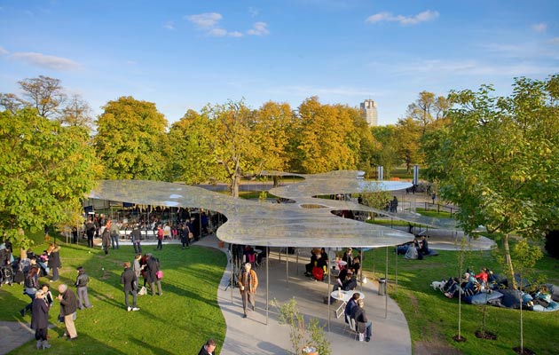
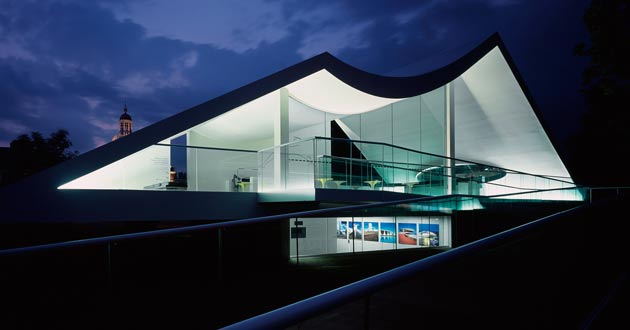
As Julia Peyton-Jones steps aside after sixteen years of commissioning the Serpentine Pavilion, Edwin Heathcote ranks his ten favourites of the series of annual pop-ups – and picks out two major blunders Well, pavilion pickers, here it is. Sixteen years in and plenty to choose from – so many, in fact, that it makes it a pretty difficult choice. But here is a ranking of my ten favourites designs from the ultimate series of pop-up pavilions, arguably the most influential programme of micro-architecture in the world – as well as two unsuccessful attempts that prove it’s not always the biggest stars who do best. 1. SANAA, 2009 (pictured above) This sinuous reflective roof balanced on impossibly slender columns was extraordinarily elegant and seemed to capture the ephemerality of the idea of the temporary pavilion. SANAA’s work depends on a delicacy that is, perhaps, easier to achieve in an open-sided shelter than it is with the demands of weatherproofed architecture, and this was among the practice’s best buildings. It was a rainy year, yet even as the drops accumulated on the shiny surfaces it seemed to become more beautiful. Absolutely stunning. |
Words Edwin Heathcote |
|
|
||
|
2. Sou Fujimoto, 2013
|
||
|
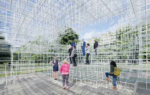
A cloud made of sticks sounds like an unlikely success, but Sou Fujimoto’s ethereal climbing frame was a fascinating exercise in the creation of an architecture without walls or a roof. A simple construction of welded, white-painted slender steel sections, this was a truly engaging pavilion – although one that also divided opinion, as some critics dismissed it as too cool, a one-liner. I think the pavilion is exactly the part of architecture where one-liners work best. |
||
|
3. BIG, 2016
|
||
|
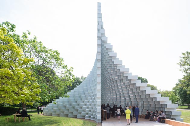
This one might yet grow on me more, but I already think Bjarke Ingels’s structure is both deceptively simple and a weirdly complex one-liner. A series of stacked, open-ended boxes, it achieves the paradox of being simultaneously open and contained. Look straight ahead and aligned with the boxes, and the wall almost disappears; turn your head slightly and the wall configures itself into a complex piece of sculptural op art. Ingels called it an unzipped wall, perfectly capturing its anomalous nature. Quite wonderful. |
||
|
4. Toyo Ito, 2002
|
||
|
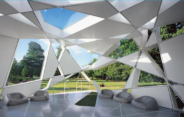
We’re through the top four and three of the architects are Japanese. Does that say something? Are they used to working with smaller structures? Is it to do with ideas about impermanence? Zen Ethereality? The tea house? Whatever it is, the Japanese have certainly made an impact on the lawn. Toyo Ito’s pavilion was based on a complex mathematical geometry that I never quite understood, but as an organising principle it made a lovely load of shapes. Subsequently assembled beside Battersea Power Station as some kind of sales office – and now who knows where – it also had a strange and interesting afterlife. |
||
|
5. Zaha Hadid, 2000 and 2007
|
||
|
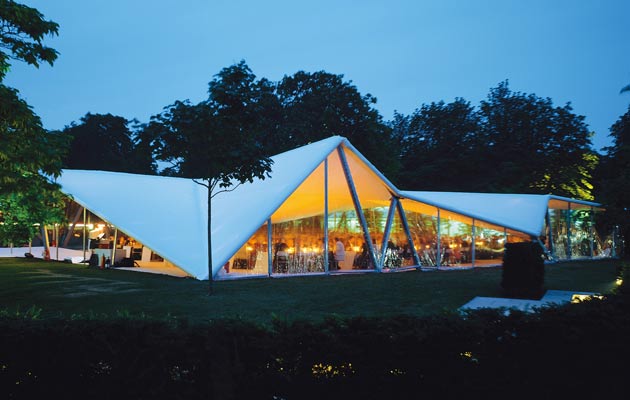
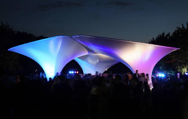
Zaha Hadid designed the first of the pavilions (above, top image) in 2000, before it was clear that it was going to be rolled out as an annual event. Her first London building, it was a simple geometric tent – angular and crystalline. It was cheap and initially intended to be for one night only, until the then culture minister Chris Smith finagled an extension. Her second effort was in 2007 (above, bottom image), this time to host the Serpentine’s annual summer party as there were delays on the main pavilion designed by artist Olafur Eliasson and architect Snøhetta. This one was also stretched fabric, but almost the opposite of her first: an organic mushroom field that mirrored the change in the architect’s own style from jagged to fluid. It made a great disco floor. |
||
|
6. Rem Koolhaas/OMA, 2006
|
||
|
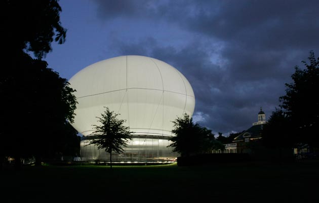
More a concept than a building, this one was shoddy, sweaty and slapdash but, I thought, absolutely great. It seemed to spring from the 60s – a world of personal inflatable pods and floating cities. Its walls were simple, cheap, translucent polycarbonate, its roof a balloon that was supposed to lift off when it got too stuffy inside. It didn’t really work, but the idea and the image evoked a lost world of Cedric Price and Archigram – a failed visionary future. |
||
|
7. Herzog & de Meuron/Ai Weiwei, 2012
|
||
|
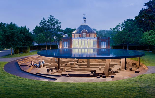
Conceptually the most interesting of all the pavilions, this one attempted to reveal the archaeologies of its predecessors, the buried remains of pavilions past in a palimpsest of strange, dark memory that completely countered the sunny superficiality of a folly in the park. This was more of a grotto – subterranean, unlit, smelling of the musty cork it was lined in and capped, even more strangely, by a rainwater-storing roof that became a pool and a favourite with local ducks. It wasn’t the most enticing of settings, but it was, perhaps, the most haunting of excavations of modern angst. |
||
|
8. Oscar Niemeyer, 2003
|
||
|
The great Brazilian modernist was far too old to travel to London and perhaps he misread the brief but this one, frankly, wasn’t really a pavilion. It was a monumental chance of concrete executed in his characteristically flamboyant style – a little fragment of Brasilia in Kensington Gardens. Nuts, but really kind of cool. |
||
|
9. Smiljan Radić, 2014
|
||
|
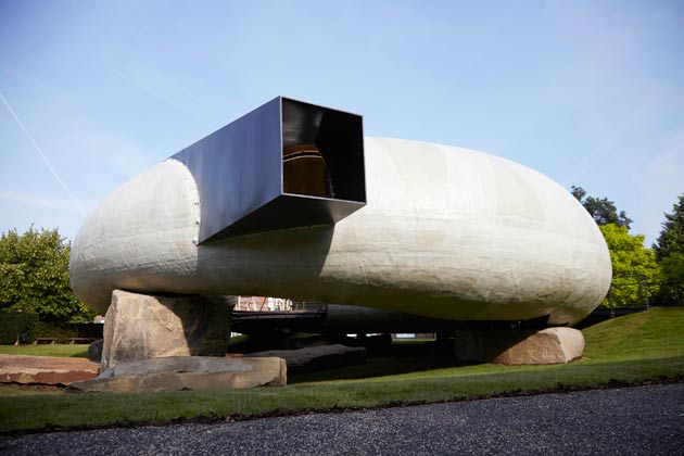
It gets harder at the bottom end of the top ten. Radic is here not so much because I thought it was one of the best, but because it was so damned weird: a big bean perched on rocks and accessed by a ramp, it looked like a Flintstones house crossed with a future dystopia and a spaceship model made by a five-year-old. Plenty to get it on the list. |
||
|
10. Jean Nouvel, 2010
|
||
|
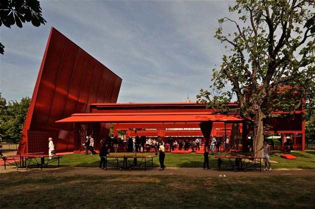
I may have been the only critic who liked this. Nouvel made an ugly object (very, very vividly red), which worked rather as a landscape of pleasure: ping-pong tables, loungers, places for picnics and conversation, this was a way of extending the pavilion into its surroundings and creating a place for enjoyment. It was a fascinating mongrelisation of British park culture and French ideas about publicness and rights to the city. |
||
|
AND TWO HOWLERS Frank Gehry, 2008
|
||
|
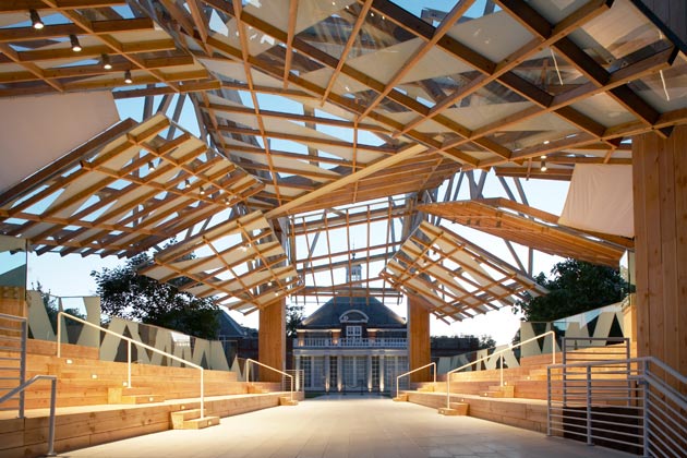
It could have worked. The revival of the language of the ad-hoc – so wonderfully articulated in his own LA house – the wonky timbers, the skewed panels, the unsettling angles. But the scale was all wrong. This was a massive structure that forgot it was supposed to be a pavilion – a triumphal arch for a long-dead deconstruction. Not fun. |
||
|
Peter Zumthor, 2011
|
||
|
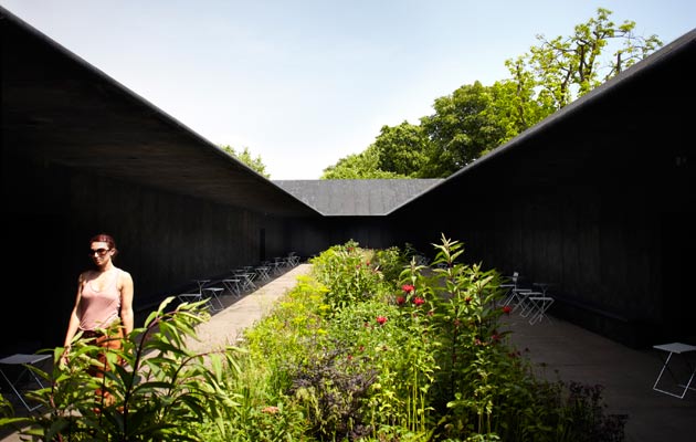
Zumthor’s architecture, at its best, embodies time. He is slow, deliberate and expensive, a monk of luxury. With little time and no money the weaknesses were exposed. The grim black box he built did what, exactly? It was there to contain a garden for contemplation. Claustrophobic, dark and crowded, this presented the weird spectacle of an unpleasant garden (albeit nicely planted) amid of a massive, spacious park (a lesson here surely for the misconceived Garden Bridge). There was some spurious spiel about the hortus conclusus, the enclosed garden, as a metaphor for Mary’s sacred womb, which proves that theory and pavilions belong to different parts of architecture. Do you agree with Edwin Heathcote’s selection? Tell us on Twitter using the handle @iconeye |
||

