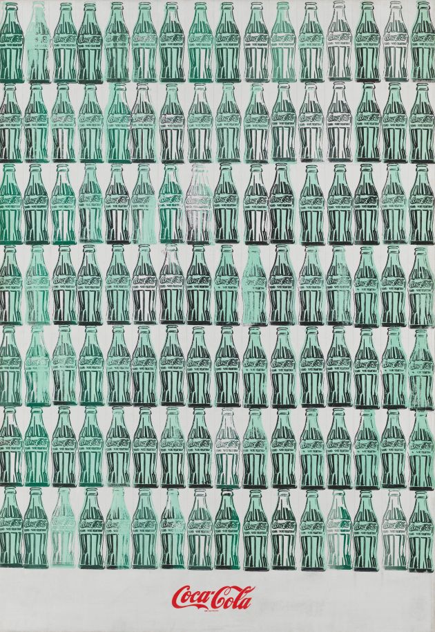
 Andy Warhol, Green Coca-Cola Bottles, 1962. Whitney Museum of American Art. All images © 2020 The Andy Warhol Foundation for the Visual Arts, Inc. Licensed by DACS, London.
As the Tate Modern prepares a wide-ranging retrospective of Andy Warhol, Joe Lloyd argues for the Pop pioneer’s influence on design and visual culture.
On 6 October 1964, an exhibition named The American Supermarket opened at Bianchini Gallery on New York’s Upper East Side. It did almost exactly what it said on the tin. A range of artists had painted and sculpted foodstuffs and arranged them into a simulacrum of a grocery store. Entered through a turntable designed by the furniture-fixated artist Richard Artschwager, replica produce included chickens, lobsters, cheeses, salumi, fruit, cakes and cookies.
Perhaps the strangest work, however, belonged to Andy Warhol, then emerging as a prominent fixture on the city’s art scene after a decade as an advertising illustrator. Below a painting of a Campbell’s Soup can, he had assembled a pyramid of genuine Campbell’s tins. Each of them was signed by Warhol and sold for $6 apiece. A quotidian, commercial object became not just the subject of a work of art, but a piece of art itself. Warhol chose an item remarkable not for its curiousness or uniqueness but for its banality and ubiquity.
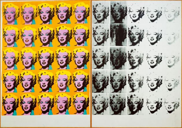 Andy Warhol, Marilyn Diptych, 1962. Tate.
Warhol is the subject of a new career-spanning retrospective at Tate Modern, the first of its scale in London since 2002. Spanning everything from his early erotic ink illustrations to the self-portraits of his final years, it shows an artist consistently engaged with design, albeit seldom in a straightforward manner. His prodigious output – he produced paintings, silkscreens, drawings, sculptures, installations, films and even television shows – contains little that might be neatly and singly placed under the rubric of design. Yet his output is riddled with design influences, and has come to have an important role in how design is perceived.
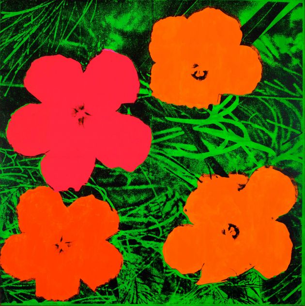 Andy Warhol, Flowers, 1964. Private collection.
Before he was an artist, Warhol was a graphic designer. He had studied commercial art in his native Pittsburgh in the late 1940s, and moved to New York to become a magazine and advertising illustrator. Over the course of the following decade he built up a broad portfolio, with a particular focus on shoes (‘He somehow,’ recalled artist and writer John Coplans ‘gave each shoe a temperament of its own’). Advertisements from this early period in the Tate exhibition include a whimsical unicorn-centred spread for Schiaparelli gloves, a delicate circle of pointed shoes for I. Miller and a vividly-hued depiction of a Pepsi bottle top.
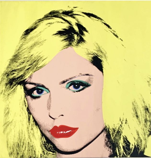 Andy Warhol, Debbie Harry, 1980. Private Collection of Phyllis and Jerome Lyle Rappaport 1961.
When Warhol chose to paint Campbell’s tins – as well as Brillo pad boxes, Del Monte tinned peach crates, dollar bills and Coca-Cola bottles – he did so not merely because of their status as ubiquitous American brands, but also because of the visual qualities of their particular design. The tins’ strong red-and-white colouration, with a cursive script that imitates handwriting and a golden medallion adding a seal of quality, had been in place since the turn of the century.
The original 1962 work known as Campbell’s Soup Cans consisted of 32 individual paintings. Warhol continued producing them until the late 1970s. In doing so, he referenced and imitated the process of mass production, by which everyday design objects are perpetuated and circulated. From 1963 onwards, he shifted the production of his paintings and silkscreens to a series of assistants, imitating the working practices of a graphic design office. Not for nothing was his studio called The Factory (he would later take this even further, and have his art produced outside New York in workshops he never visited).
 Andy Warhol, Sixty Last Suppers, 1986. Nicola Emi Collection.
This approach immediately prompted strong reactions. At one 1964 party, the abstract expressionist painter Willem de Kooning accused Warhol of artistic homicide ‘You’re a killer of art,’ he howled, ‘you’re a killer of beauty, and you’re even a killer of laughter.’ Warhol’s rise coincided with the bloated tail-end of ‘ab ex’ a movement that had hinged upon the image of the artist as a brooding genius. Although there was a growing appreciation of design as a form with creative merit, it was still regarded as too commercial, too functional and too reproducible to bear comparison with higher artistic pursuits. By collapsing the figure of the artist with that of the graphic designer, using image to sell products for others, Warhol made a mockery of these norms.
In this, Warhol opened a fissure between the two disciplines that many artists have exploited since. I would argue that his example has also enabled another movement, perpetuating a world where art museums have broadened their purview to show creative forms once seen as lesser, whether photography, graphic design, product design or advertising films.
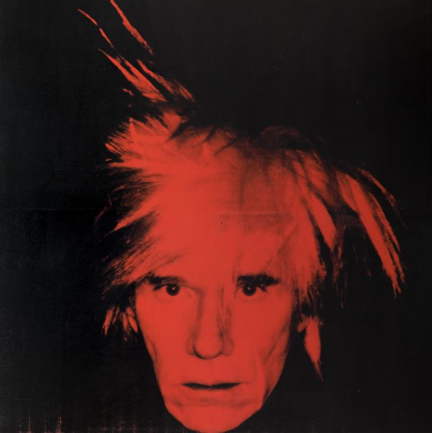 Andy Warhol, Self Portrait, 1986. Tate.
It has often been claimed that Pop artists elevated low-status objects to the higher one of art. In Warhol’s case, it would perhaps be more accurate to say instead that he argued for the entire world of the visible, from the Mona Lisa to photographs of Marilyn Monroe, as something that could be perceived and understood in the same way. For this — a change almost imperceptible to those who have lived in its wake — it would be no overstatement to declare Warhol the most significant artist of the American Century. Whenever you contemplate the artistic merits of a reproducible object, whether the EU flag or a Zippo lighter, you’re partaking in the world that Warhol helped to shape.
Andy Warhol is at Tate Modern from 12 March to 6 September 2020.

