|
|
||
|
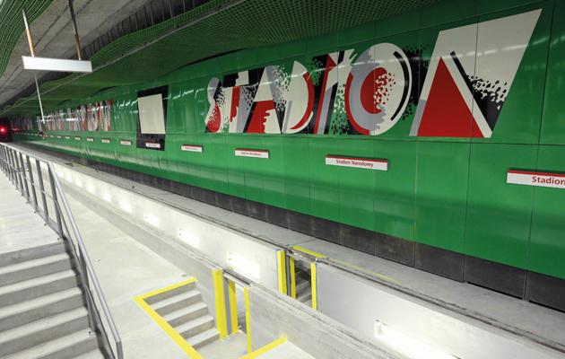
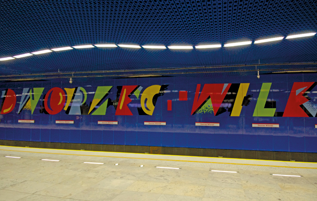
The city’s long-awaited second underground line is a riot of colour, with psychedelic signage by the father of Polish abstract art, Wojciech Fangor There’s nothing unusual in a modern artist being engaged by a city to design urban infrastructure – especially a metro system. It was something of a tradition for much of the 20th century, particular for Soviet metro stations, which often featured murals, mosaics and sculptures by excellent, if relatively unknown, artists. And, as recently as 1984, London Underground commissioned Eduardo Paolozzi to create a series of complex mosaics for Tottenham Court Road station. Sadly, it’s rare for avant-garde artists of such stature to produce work underground today, let alone design a whole tube line. Yet it has just happened in Warsaw, which opened its long-awaited second line this March after two decades of delay. The whole of this east-west line will carry signage and more designed by the abstract painter and graphic designer Wojciech Fangor, who came to prominence among a talented generation of artists just after the Second World War. Now 92 years old, his career has spanned multiple styles, including socialist realism, abstraction, pop art, op art and back to realism again. And he’s the only Polish artist to have been given a solo show at New York’s Guggenheim, back in 1970, just three years after he emigrated to the US. This project is Fangor’s great comeback to public art. So far, only portions of the seven stations have been opened to the public, after almost five years of construction that involved drilling tunnels underneath the Vistula river to link the two banks of the city. Much attention has been paid to the luxurious finishes of the project, with its marble cladding, metallic tunnels and, arguably, over-bright lighting. But the most unexpected element remains Fangor’s lettering of the stations’ names. The concept is based on a strong, almost psychedelic, use of aggressive, suffused colours. His palette employs bright shades of red, yellow, lilac, green, orange and blue – an explosion of colours absent since the construction of postmodern stations in cities such as Prague, Berlin or Brussels during the 1970s. Each station has its own combination, with walls and futuristic ceilings clad in the same colours. The effect is completed by blazing illumination, making it perhaps too dazzling for a daily commute – relief is offered by the generous use of bare concrete, especially for the huge supporting columns.
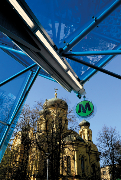
The entrance to Dworzec Wilenski, overlooked by the Metropolitan Church of St Mary Magdalene The composition of the lettering is reminiscent of Ettore Sottsass and Memphis: characters are adorned with whimsical, artsy splashes of colour, slanted to evoke the movement of the trains. Names of stations are either shown against a coloured panel or against a white background, the latter allowing travellers some visual respite. There has already been significant criticism of the excesses of both the project’s design and its expenditure, as if these exuberances were intended to compensate Warsaw for the decades of delay, while other wider ailments, such as the painful lack of public housing, remain unresolved. The origins of such debates go back to the Socialist era. Stalin had decreed that every city with a population of one million or more in the Soviet Bloc was to have a metro line, but the geology of Warsaw proved too challenging. During the “Polish thaw” of 1956, first secretary Wladyslaw Gomulka abandoned the Warsaw Metro, prioritising social housing instead. It was only in the 1980s that the project was revived, and the first line was finally completed in 1995, in the “new”, democratic Poland. As a result, Fangor’s first experience in station design was for the city’s central Srodmiescie railway station. He decorated the walls with ceramic mosaics in his trademark colourful palette, creating a series of optical illusions. Depending on the speed of the train, passengers saw the strong greens and blues dissolve into misty azures and whites. The project was just one of several ultra-modern stations that were overseen by the talented avant-garde architect Arseniusz Romanowicz, with interiors designed by an additional team under Jerzy Soltan, a major participant in the later years of Le Corbusier’s CIAM organisation. Fangor’s versatility is characteristic of the rich vein of talent in the post-war Polish art scene. Despite the compulsory enforcement of a socialist-realist style for a few years in the early 1950s, a strikingly original modernism emerged across abstract painting, architecture, and textile, furniture and graphic design. Fangor today is probably most celebrated as a poster designer – his style is instantly recognisable, with an aggressive 1950s colour palette and bold, modern juxtapositions of the abstract and figurative. Fangor was an artist who reconciled an understanding of pop with a feeling for the sublime. By the 1960s, he was already arranging his canvases into environments, suggesting a rapprochement with architecture and sculpture. He is the last survivor of the great post-war project that proposed art for society – he functions as a symbol of both of the Polands that have contributed to building the Warsaw Metro. And this is the reason why his paintings adorn its walls today. |
Words Agata Pyzik
Above: Wojciech Fangor’s signage at the National Stadium station |
|
|
||
|
The platform at Dworzec Wilenski station |
||

