The continued success of Finnish design and architecture is empathy, says Hanna Laikola
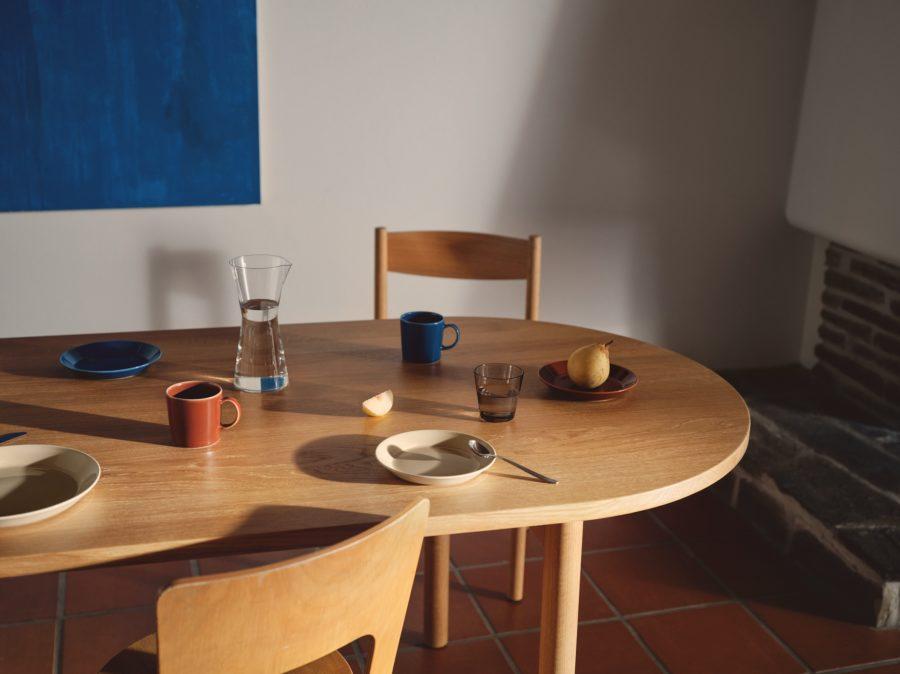 Photography courtesy of Iittala featuring the brand’s iconic Kartio glass
ICON: As a designer and the creative brand manager of Design Helsinki, can you tell us: what is empathetic design?
Hanna Laikola: Empathy in design describes the ability to have a deeper understanding and to put yourself in another person’s shoes to truly see the world through their eyes.
As a designer, it goes beyond the superficial, aesthetic or what something looks like. We have to change our mindset to build empathy at every opportunity – so, getting to know your user’s feelings as if they were your own.
However, I also think the user should understand why an object or space was designed the way it was. When both sides have a better understanding, we can apply and use empathy to make smart design decisions in the future.
ICON: What role has empathy played in your career?
HL: Empathy helped to define my path in design – to create objects and curate spaces and events that make a connection with as many people as possible. What led me there was realising that by surrounding myself with objects that are meaningful to me and that tell a story from my past, it gives me a real sense of connection and happiness. Since having a family, I realised that I wanted to pass these happy memories on to my children. Just like my parents and grandparents have done before me.
I’m not referring to an heirloom, but more so meaningful design that forms part of our relationships with the past, with others, to the future, for example through children. If we connect to our belongings in a meaningful way, whether it be a story or a memory, we tend to take better care of our things. Ultimately, they will last longer, and we move towards a circular economy.
ICON: Can you explain why empathy is fundamental to design thinking?
HL: The world is in deep flux. It’s changing and challenging, but a sense of belonging is important. For example, take the humble Iittala Kartio glass. The timeless design is functional and attractive. It’s good quality and almost every household in Finland owns one. Why? Security with the past; it’s been around for years. It’s functional; one size fits all in this case, and it’s available in many colours to suit different tastes. This is a small but good example of empathetic design in our everyday lives.
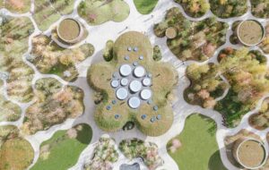
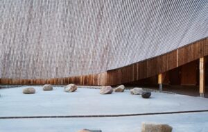
An empathetic approach in design takes us further afield, however, to the realms of spaces and places, such as the architecture we see in Helsinki like the relatively new Amos Rex building. The Amos Rex project is an excellent example of inclusive design. Its unusual sculptural exterior is engaging and not out of bounds, yet it is an art museum. We are used to the ‘Don’t touch!’ approach with these types of museum spaces. However, in this case you can touch the exterior of the building, walk on it, ride your bike or ski over it in winter. It’s a playground for all ages.
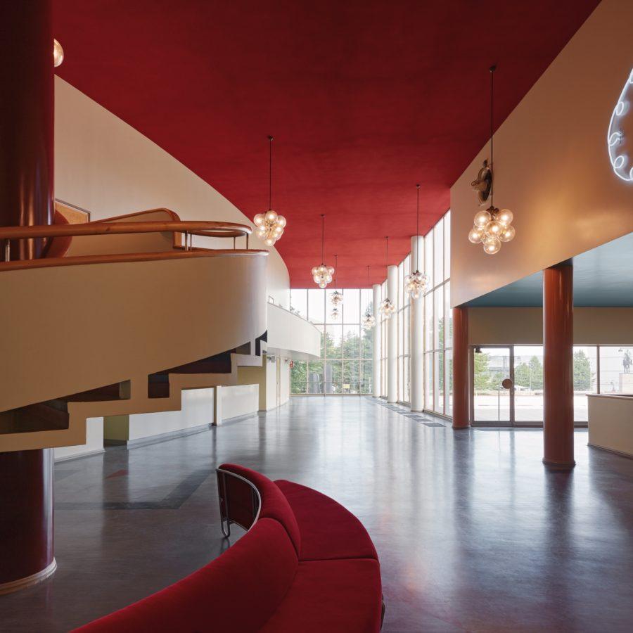 Photography by Tuomas Uusheimo featuring the Amos Rex art museum in Helsinki
ICON: Can you share other examples of empathetic architecture in Helsinki?
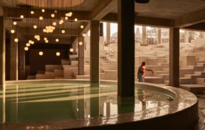
HL: Oodi, Helsinki’s newest library, similarly caters for all. Mothers have space for their pushchairs, schoolchildren have engaging and fun reading rooms, as do teenagers and adults. It’s all there in one place, regardless of your background. It’s a welcoming environment.
A further good example is the Paimio Sanatorium, one of Alvar Aalto’s masterpieces, which was designed to help people get better. A bright yellow staircase leads the patient towards the balconies to make the most of the natural light. Just by stepping into the building makes you feel better. Surrounded by forest, it has a strong connection to nature. Empathetic and biophilic design thinking was there a long time ago, without the fancy title.
ICON: How does designing with empathy improve accessibility and inclusivity in cities?
HL: Transport is another area where an empathetic approach has an impact. The pavement for example, is overlooked. In
Finland the pavements generally are wide for good reason. Not only does the width fit the snow ploughs that clear the way for pedestrians and cyclists in winter, but they enable safety. As a mother, I know that a wide pavement will ensure a safer walk to school for my children.
This gives me and other parents confidence to let our children walk to school safely, which will help them develop confidence and independence. I specifically refer to Finland in this case where children walking to school is the norm and considered safe.
ICON: What impact does empathetic design have on urban transport?
HL: Well, the London Underground comes to mind. I remember travelling in and out of the capital city for many years, sitting on the bouncy, upholstered seats. When I relocated to Finland, I was surprised by the orange, hard plastic seats I found on the Finnish transport system and metro.
On first impressions, I thought the seating might be uncomfortable. However, after reflection and some research, I came to realise that there was indeed a practical and empathetic reason for this choice of seating. The seats were designed by designer Antti Aarre Nurmesniemi (1927-2003) with the intention to use the bright colours as a contrast to the heavily grey Helsinki.
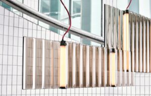
While on the subject of transport, the capital region’s metro stations are a great example of recognising empathy in design within society. While each stop conveys its own message, the Keilaniemi metro station, designed by ALA Architects, stands out with its architecturally interesting sea of trapeze-like lighting hanging from the ceiling.
You do not feel as though you are underground. Rather more that you are in a curated design space. True to form, like most Finnish design, the element of practicality is evident in the metro stations as they were designed to also serve as a network of bomb shelters, making the effects of empathy more visible.
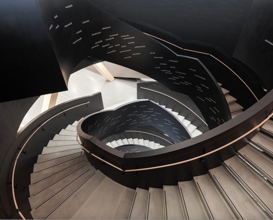 Photography by Tuomas Uusheimo featuring Oodi Helsinki Central Library
ICON: Perhaps if we were then to describe Finnish design in one word it would be ‘empathy’?
HL: Empathy in everyday Finnish design is all around us. This is why Finnish design is so unique. It is known as simplistic, functional and timeless. The more we practise empathy in the outside world, the easier it will be to put yourself in a user’s shoe when it comes to a new design project. A lack of empathy prevents us from utilising everyone’s expertise and making decisions which will ultimately be a factor in our future choices.
As already mentioned, setting aside our assumptions is critical when it comes to building empathy. We all come with our own preconceptions, experiences, and misconceptions but if we connect to our belongings in a meaningful way, we tend to take better care of our things and move closer to that all important goal of sustainability. The continued success of Finnish design is empathy.
Read more in ICON 210: The Finland Issue or get a curated collection of architecture and design news like this in your inbox by signing up to our ICON Weekly newsletter

