|
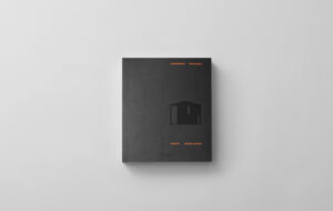
In graphic designer Sarah Hyndman’s book, a series of games reveals the complex way in which we interact with everyday typography, says Icon art director Anja Wohlstrom Sarah Hyndman’s book, The Type Taster, had a choice of five different covers – the one you select apparently reveals something about your personality. My choice, featuring the typeface Clarendon, indicates that I’m “practical and confident” but also that my guilty pleasure is “enjoying a nostalgic moment, like crying at a sentimental film in the dark”. Sad, but true. A graphic designer for 20 years, Hyndman set up Type Tasting in 2013. Based on the concept of wine tasting, the idea was to start a conversation about typography beyond the world of designers through “tastings” and talks to explore and demystify the subject. Hyndman’s website offers challenges such as the Spot The Font quiz, which asks you to pick out a font based on a description of its personality. She is also conducting a Font Census, a survey about the kind of personality traits and objects fonts remind us of. The book draws on the findings of this research and sets out to celebrate and understand the choices we make based on typeface. It also comes with a pair of blue and red glasses to wear when examining type combinations – looking through the blue lens simply shows you the typeface (for example, “Edwardian Script”), while looking through the red lens reveals its associations (“pretentious”). “I am interested in using these experiments as a fun way to start conversations and dispel the preconception that typography is a ‘dry’ subject for academics and experts,” Hyndman says. Typefaces, she argues, help you choose the food you buy, navigate new areas of a city and keep you safe on roads. One of the areas she explores is how we relate taste and fonts – for example, how distressed typefaces, which we associate with handmade items, can make us believe that a burger tastes better. She points at the kind of fonts that indicate cheap and cheerful foods and those that we link to more expensive, refined products. Low-fat options use lighter, “thinner”, fonts, she says, sparkling water is associated with angular, harsher typefaces and still water with more rounded, mellow ones. Another test looks at “what typefaces would sound like if they were music”. Bodoni Poster Italic, for example, is “classic”, “mellow” and “smooth” – it makes me feel calm,” said one respondent. Designer Jurgen Weltin says his typeface Balega (2003) has the “fat sound of a Jimi Hendrix guitar” – bold and slightly italic, as if charging forward, the stencilled display font is used for larger titles in the book. And then there is the Dating Game, which reveals the font that best captures the kind of dating type you would be. Most men chose to be the “simple, easygoing and slick” Futura (22%) while most women chose the “serious, intellectual and classic” Didot (26%). The least datable type was found to be Cinema Italic – associated according to the research with the words “maths teacher, “IT” and “some dull data processing job in a dimly lit office”. The results of Hyndman’s engaging yet well-considered games are sometimes surprising. The Font Census reveals that designers and non-designers view fonts differently – designers, for example, would describe Helvetica, famed in design circles for its Swiss origins, as “intellectual” and “stylish”, while non-designers think of it as “everyman” and “dull”. But we are all type consumers and The Type Taster offers a fun way to think about how we value fonts and navigate today’s visual world. The Type Taster: How Fonts Influence You, £18, was published on 14 February 2015 and is available at typetasting.com |
Words Anja Wohlstrom
Images Sarah Hyndman |
|
|


