|
|
||
|
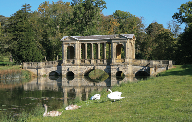
Spanning a river was once an exercise in elegance and beauty, but today’s bridges express nothing but their own structural virtuosity. Bridge design, it seems, has become the prog rock of architecture, says Charles Holland Is there a more terrifying combination of words in contemporary architecture than “bridge” and “iconic”? Why do bridge design competitions invariably turn into architectural pissing contests, with designers competing to make the longest, curliest ramp or the most extravagant suspension system, invariably rendered in garish purple light? The recent Nine Elms bridge competition is a case in point, offering up a veritable orgy of kitsch extravagance. Now don’t get me wrong: a bit of bad taste isn’t necessarily a terrible thing in architecture. But the over-indulgence of contemporary bridge design is of a very particular kind, a neo-expressionist zoomorphism for which there can only be one person responsible: Santiago Calatrava. There was a time, not so long ago, when no European city considered itself complete without a Calatrava bridge erupting over its river like an explosion of fibre-glass dinosaur bones. Calatrava’s particular combination of retro kitsch and faux-naive “look-at-me-ism” has somehow convinced everyone that a bridge, even one that spans little more than a small puddle, has nothing to express but its own structural virtuosity. Like a prog-rock concept album, bridge design has become obsessed with technique at the expense of coherent meaning. The result has been an endless series of bridges like so many tedious guitar solos – epic acts of engineering onanism. Sure, on occasion the sheer audacity of span or technical challenge justifies some formal celebration. But mostly, the act of spanning is not the only issue at hand. There are other subtleties such as style, language, occupation and use to express, not to mention the symbolic and spatial differences between one side and the other. It was not always thus. The Ponte Vecchio in Florence, for instance, has little to say of note about heroic engineering. Instead, it takes a typical city street and stretches it out across the river Arno, houses lining the sides of the bridge in higgledy-piggledy fashion. This not only creates an enduring surrealism when viewed from afar, it also offers a vertiginous thrill to the inhabitants of the upper floors. Some of the best bridges have the barest functional justification, such as the exquisite Palladian bridge in the gardens of Stowe in Buckinghamshire, which spans a picturesque trickle of water merely for the hell of it. And some combine the function of crossing with another, entirely different programme, like the Kapellbrücke in Lucerne, the interior of which is lined with religious paintings. From now on, excessive numbers of tension cables and ludicrously over-elaborate ramps should be seen for what they are: the last refuge of the bridge design scoundrel. It’s time for a moratorium on such things. A little restraint perhaps, maybe even – good grief! – some minimalist understatement. Or, failing that, the return of a bit of rusticated masonry, neo-Egyptian support pylons and castellations. Anything, really, but the dreaded dinosaur bones. |
Words Charles Holland
Image: David Hunter / Alamy |
|
|
||

