|
|
||
|
Intended to shed light on a story, these turds of lurid colour now curse all of our newspapers, says Tim Abrahams In April 2016, the Guardian published the Panama Papers, the findings of an extensive, crowd-sourced investigation into how tax havens operate. Although this investigation is cited in journalism schools as a template for how the profession might operate in a new age, after a short peek into the affairs of David Cameron’s father, the wider ‘story’ was met by other media outlets and by the public at large with something of a ‘meh’. (Putin launders cash, you say? Well. We. Never.)
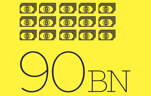
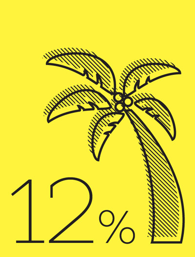
The problem was that those who worked on the project were so overwhelmed by the mechanisms of collaboration and the sheer bulk of data that they forgot the narrative: what was the story here, what was new to this situation that we didn’t already know? The story, though, was told pre-eminently in graphic form – arrows from photographs of nefarious cello players who’d set up dodgy bank accounts for autocrats that wiggled their way to stock footage of Mediterranean islands. Then there were the graphics: palm trees represented tax havens. Ickle pictures of the bad peoples. Numbers raged from everywhere: big ones, high ones. And not always to convey the levels of larceny at work. One of the main purposes of the infographics seemed to be to show how many documents the journalists had read as part of writing – what we used to call – ‘the story’. Well done, guys. Good job. The Guardian is not alone, of course. These turds of lurid colour, these cross-hatched blocks of something or other, curse all of our newspapers, signifying little more than the dire state of contemporary journalism. People may talk about a ‘post-truth’ landscape as something emerging from the political events of 2016, but it happened long before. Into an intellectual climate created in the 1970s, wherein philosophers such as Jean-François Lyotard questioned the entire concept of ‘truth’, arrived a once-in-a-millennium shift in technology from printing presses to websites, throwing the whole economics of collective news gathering and distribution into doubt. The infographic is a desperate attempt to reassert newspaper as an apogee of truth in a world in which we don’t trust what we read any more.
There is, of course, an irony in that the infographic is created by digital design packages. Half of the time, print journalists are complaining that the tools of the digital revolution are being used to kill print, (websites, digital publishing and so on), and the other half, they use them to reassert the pre-eminence of print (Photoshop). Yet what one gets in fact is a clusterfuck of what-does-this-button-do formal exuberance and a deep neurosis as to their aim. Infographics are also increasingly a cheap gap-filler. And they are everywhere. In an interview with Fast Company, Christian Chabot, co-founder of Tableau Software, boasted that the sort of graphic that would have cost $100,000 in the mid-noughties from an expert company such as Stamen could today be knocked out in a few minutes with his company’s free demo. Why not have a bit more faith in writers and writing? Why not invest in that? If not, we aren’t far away from a publication simply producing one massive infographic that is the history of infographics itself, which ends with an arrow disappearing up an all‑too-bumlike hole. |
Words Tim Abrahams
Icons: Rachael Healey and Sandra from the Noun Project |
|
|
||


