|
One of the ironies of Communism was that, while the West was in thrall to the Hollywood studios, Polish artists had the freedom to advertise US films with bold and arresting visuals, says Andrea Marks In 1946, Henryk Tomaszewski, then a 32-year-old artist living in Lodz, received a phone call from the Polish Office of Film Distribution that would forever change the way film posters are imagined. The woman on the phone said there were American films coming into Poland for distribution, but the posters sent to advertise the films were in English, and no one would understand them. She asked Tomaszewski if he would be willing to design new posters to advertise the films. Tomaszewski agreed under one condition: that he and his colleagues could create posters in their own unique way, with no resemblance to film posters from other countries. What followed was an unparalleled tradition in Polish poster design, made all the more exceptional because each poster had to be screened by a censor board. This was one of the fascinating incongruities of the Polish poster – it was an artform that flourished in spite of, and most likely thanks to, the fact that it was created within a system of constraints.
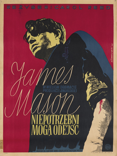
Odd Man Out, by Henryk Tomaszewski for Film Polski, 1947 Tomaszewski and a small group of artists would first watch the films in a small room to glean the essence of their message. An early example of Tomaszewski’s ability to extract this essence can be seen in his poster for the 1947 British film Odd Man Out, starring James Mason. Tomaszewski had been trained as a painter, and in contrast to the British theatrical release poster, which uses photographs of the film’s stars, the Polish version is simply a bold painted portrait of Mason, using an unusual perspective. Mason’s larger-than-life presence on the poster, and the subtle white bandage on his left arm, give the viewer a couple of subtle clues about his character. The abstracted colouring of Mason’s face, with its greenish glow contrasting with the blue shirt and red background, add to the poster’s visual boldness. Most Polish posters used hand-painted type, helping to ensure a seamless integration of type and image. These colourful film posters dotted the streets of Warsaw and other Polish cities, with each artist displaying their own individual style.
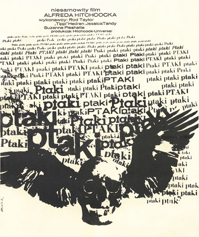
The Birds, by Bronislaw Zelek for Centrala Wynajmu Filmow, 1965 The US theatrical release poster for the 1963 Hitchcock film The Birds uses an illustration of Tippi Hedren being attacked by birds, with a photograph of the actress tucked at the bottom of the poster. An illustration of Hitchcock is also shown to one side. In contrast, the Polish version, created in 1965 by Bronislaw Zelek, creates an abstract, chaotic, bird-like texture by overlapping the word “ptaki” (birds), with an image of a skull with wings placed in the foreground. The disturbing content of the film is not given a literal representation, yet an unsettling feeling is still communicated to the viewer through abstract imagery. Tomaszewski and his fellow artists had more freedom, even under Communism, than one might expect. Images of stars were not needed to sell these films, as Poles were thirsty to see what the rest of the world had seen, and flocked to state-run cinemas, regardless of whether actors were featured on the poster or not. This freedom gave Polish artists a unique opportunity to be inventive, and the visual tradition established by the initial artists in the late 1940s continued to influence generations of Polish graphic designers. The Polish poster soon became a global symbol of the power of visual interpretation. Following the collapse of Communism in 1989, the number of commissions for film posters decreased and it became common to see US film posters on the streets, with only the title translated into Polish. Though seen primarily today in galleries and museums, the Polish film poster remains an icon of what is possible when talent and courage collide. |
Words Andrea Marks
Images: Courtesy of Filipa Pagowskiego |
|
|


