|
|
||
|
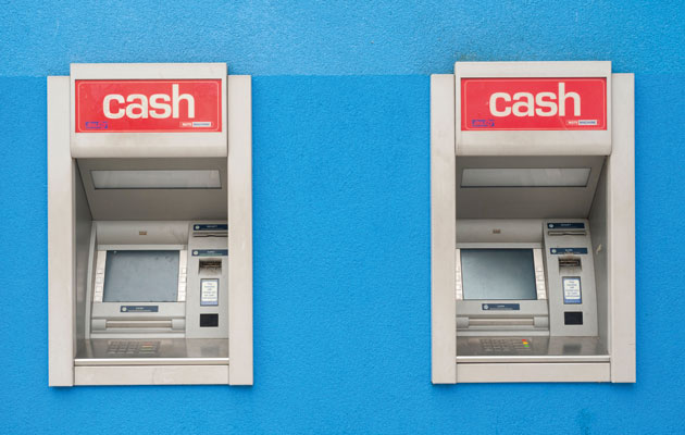
Never mind the scammers – you’re getting ripped off by the designers of these vital but dated, limited and ugly machines “If you notice anything suspicious attached to this machine …” Well, where to begin. In the past decade or so, the thieves who try to get their hands on your card details and PIN at the cashpoint have refined their equipment beyond all recognition. Gone are the clunky superglued plastic growths the scammers started with – now all that’s needed is a wisp of circuitry inserted in the card slot. In the meantime, the machine itself has begun to look ridiculous, with all kinds of glowing sockets, keyboard-flaps and extrusions intended to foil their efforts. We are instructed to arrange ourselves into ever-more contorted poses while getting our readies, and that’s after having to go CSI to detect tampering. Score several for the criminals – they have doggedly improved and minimised, while cashpoints have grown uglier, more complicated and more difficult to use. If they weren’t trying to rip me off, I’d salute their shoestring resourcefulness, their ingenuity and dedication. But they are and I won’t. Scammers have turned to scamming because of design – the old way of stealing from a cashpoint was a blunt-force attack on the cash compartment itself. But the compartments were improved, and cash is now ruined by dye if any attempt to force an opening is detected. Via this innovation, the operators beautifully palmed off the risk of theft onto the public. Perhaps we should be somehow grateful to the thieves for obliging operators to make any changes to their dismal machines, which enjoy the high-quality, reassuring look and materials of an appliance purchased from a market stall. It’s still commonplace to come across a cashpoint screen with graphics resembling the two-tone screen of my old ZX Spectrum. Which is often a blessing, as it means it’s not running Windows XP and won’t be showing you a blue screen of another kind. Or an advert. Often the buttons around the screen don’t obviously line up with the options they select, or the screen is so high or so low or at such an angle it’s unreadable. At least they’re still mostly free. That’s the only way such rotten, basic, obsolete design can be justified. You can’t even choose what denominations you get – let alone charge your Oyster, or call a cab, or use the banks’ own mobile apps if you don’t have your card, or any of the scores of services the cashpoint could offer. Still, it’s only money. |
Words Will Wiles |
|
|
||

