The east London duo has long been fascinated by how typefaces can become the voice of a place. Now they are to take over a whole London square with Bauhaus-inspired letters, writes Anna Winston
‘Sometimes people aren’t so keen to talk about relying on their intuition, but it guides us a lot,’ says Sebastian White. ‘We don’t list off a load of ideas and go through rejecting them until we have one left. Our projects come out of conversations and making sketches and passing the paper to the other person and them adding to it. It grows. It’s very intuitive.’
White and design partner Eva Kellenberger have built a reputation as one of the UK’s most innovative and experimental graphic design teams since founding their eponymously named studio ten years ago. Working predominantly within the cultural sector, their list of clients includes major galleries and museums – The Barbican, V&A, Tate, and Wellcome Trust and an ongoing project with the Middlesborough Institute of Modern Art (MiMA) – as well as designers, artists, curators, publishers, architecture and design schools and a small number of design-savvy brands like Really, the recycled textile particle-board company owned by Kvadrat.
Although typographically driven, the studio’s influences and outcomes sprawl across various design disciplines, from branding to books and magazines, wayfinding and exhibition design and, more recently, furniture. It is perhaps no surprise then, that one of the first inspirations the duo bonded over was Italian artist and inventor Bruno Munari’s seminal book Design As Art.
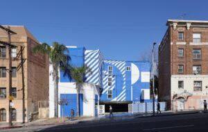
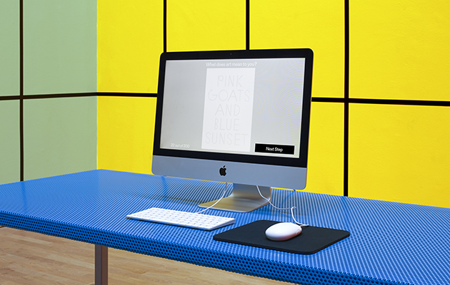 Visual identity for Middlesbrough Institute of Modern Art, 2017
‘The book captures the idea of a designer being curious about things and experimenting with different materials and disciplines, either found objects or making products,’ says White, talking over the phone from their studio just off Old Street in east London where the duo has been based since 2012. ‘Design and make has been a really important thing for us.’
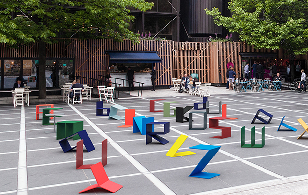
Design and make is at the heart of their latest project Alphabet, a landmark installation for the London Design Festival, consisting of folded metal chairs in the shape of letters to occupying a public space in Broadgate, the City of London office campus owned by the festival’s headline sponsor British Land.
‘The installation is an engineering experiment and creates a typographic system that people can play with,’ says Kellenberger.
‘There are 17 designs – if you rotate various ones you can get different letters, so B, D and Q are the same design,’ explains White. ‘We worked with set lengths and widths and built the font through these basic elemental pure principles. You want to make something that can encourage interaction but also something that can maybe prompt conversations about the way we design and the way we make things.’
Alphabet draws on references including Munari’s photo series Seeking Comfort in an Uncomfortable Chair from 1944, as well as Johannes Itten’s Bauhaus metal workshop experiments in the 1920s and Broadgate’s Exchange House – a structure designed by the architecture firm SOM that is part office building, part bridge, spanning the train tracks of Liverpool Street Station. Each of the letters was finished with Industrial Marine paint in colours used on bridges around the world, like the International Orange of San Francisco’s Golden Gate Bridge and the Cornflower Blue of Middlesborough’s Transporter Bridge.
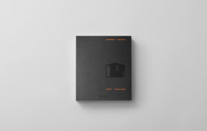
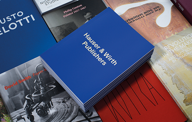 Hauser & Wirth Publishers’ catalogue for the LA Book Fair, 2016
This slightly sideways take on a site-specific reference is typical of Kellenberger-White’s approach, which often involves multiple field trips and finding unexpected ideas in overlooked details. For the magazine Elephant, they created a typeface by observing actual elephants playing with water and translating this into a process involving screen-printing and a hosepipe. For the Glasgow International Festival of Visual Art they made an identity, campaign materials and signage using a typeface inspired by the city’s warehouse signs and anti-nuclear protest banners, clearing out their entire studio to paint an alphabet using rollers on huge pieces of paper. The project was among the Design Museum’s Designs of the Year in 2015.
‘For us, working on the Glasgow International identity was quite transformative. We were making a visual language that looked like it was physically made and really enjoyed exploring how to articulate this construction process,’ says Kellenberger.
‘When I look back at projects, what makes them favourites is when I see how they were milestones in us learning or trying something new and it was part of a development path for the studio,’ adds White.
Another example is the identity for the new CCA Goldsmiths at Goldsmiths College in South London, which has seen the transformation of a former service building for a bathhouse into an art gallery. Touring the building, the designers spotted overlapping holes drilled through the concrete floors of the structure where the piping had once been – a process known as core drilling – and translated these into the basis for a typeface and an overarching design strategy based on the idea of construction.
‘Responding to Assemble’s approach to the building, we found a moment in its infrastructure, which then became symbolic,’ says Kellenberger. ‘Recognising parts of the building that are old and new is important because then you can understand and read the building for what it is.’
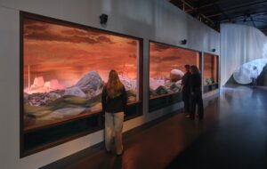
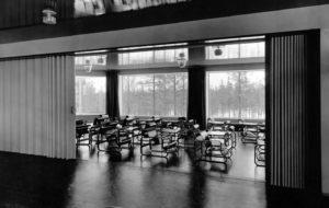
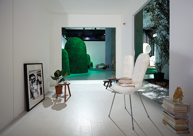 The Barbican’s Japanese House exhibition. Kellenberger-White designed all of the graphic elements
On paper, Kellenberger and White might not have seemed the most likely pair given their geographic roots. Kellenberger is originally from Zurich, Switzerland, while White was born in Bristol and grew up in Shropshire. Kellenberger had access to the works of Peter Zumthor and Max Bill, while White was exposed to creativity and making through his painter father, joiner grandfather and literary mother. Kellenberger studied graphic design at Camberwell College of Art in London at undergraduate level. White studied textile design at St Martins. They met when they both ended up studying for a masters at the RCA.
‘There was a course called Communication Art and Design, which mixed together artists, illustrators, graphic designers and filmmakers all in one course, which was great and kind of the only way we could have met,’ remembers Kellenberger. ‘We were encouraged to work together. There was one occasion [on a project] when we were stuck and called each other. We talked for hours on the phone and that’s how we ended up working together. That time together was really important to find a design language before we had to worry about writing invoices and corporation tax and finding a studio space and all of that.’
‘Weirdly, both of us wanted to be architects when we were younger,’ says White. ‘We enjoy changes in scale a lot. We really like going into detail and we both welcome projects becoming more complex. I don’t think we want to do everything – there are some core values in our practice that change and develop over time, but we want to build on the things that we’ve done.’
‘Both of us have had this wider view of design,’ adds Kellenberger. ‘Even though we came from different fields we had a lot of similar reference points from the beginning.’
They pitched for and won the job of creating the catalogue for the graduates of their own course while they were still students – ‘we realised how hard it is to work for other graphic designers because they are all so invested in their images. With other designers it’s easier because you are photographing their work’ – quickly followed by a collaboration with designers Dunne and Raby, then in charge of the RCA’s Interaction Design department, on a catalogue, exhibition and installation, and created the identity for the RCA’s end-of-year show. Dunne and Raby became regular clients. Through friends, the duo found a room that had previously been used by Ruby Wax as a writing space, and set up shop.
They now employ two other staff and take a collaborative approach, with everyone contributing to every project, and have lunch together every day at 12 as much as they can. They often work with clients in a similar way – MiMA, in particular, has had a deeply participatory strategy, involving consultation with all 40 of the museum’s staff – and have built up strong partnerships with regular commissioners, such as architects Carmody Groarke and OMMX.
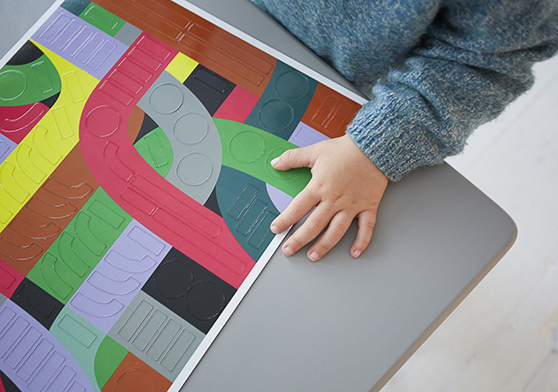 Design Souvenirs Magnet Set for the London Design Festival at the V&A, 2016
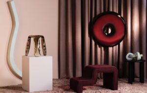
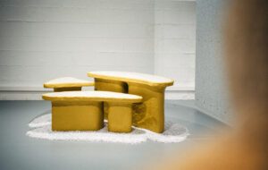
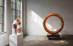
The last two years have offered more opportunities for exploring 3D objects. Among them are the plinths, tables and chairs designed for the Jane Withers-curated sauna-themed exhibition at London’s Roca Gallery in 2015 and created using materials referenced in projects presented in the show, and exhibition furniture for a collaboration with the artist Elizabeth Price at the Museum für Naturkunde Berlin, with stools based on the notion of remaking the iconic 1955 Ulm Stool by Swiss designer Max Bill in metal. Alphabet is an evolution of these experiments, unbound by someone else’s exhibition concept.
‘What’s interesting in branding is making a logo or a typeface that becomes such an important ingredient for how that place can communicate,’ says White. ‘Typefaces become voices and that’s exactly what the Goldsmiths CCA project is. Design can become an artefact or an intervention. In a pure way, that’s also what our LDF project is: a 3D typographic project landing in a specific space, introducing a new voice for the nine days of the festival.’

