|
|
||
|
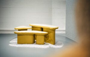
The Chinese duo created a series of rooms piled high with furniture to explore the tensions between rapid urban growth and the “blind” consumption of design, at IMM Cologne in January Last December, Rossana Hu and her partner Lyndon Neri took to the stage at Singapore’s Inside Festival to impart an important lesson. Do not, they told their audience, confuse design that makes you feel good with successful design; to do so denies the discipline social agency in a messy and contingent world. Design needs to engender questions, they added, not supply answers. In this way, we become more engaged in our surroundings, experiencing them more richly – if a little less comfortably. It is an attitude that has long been evident in the work of the pair’s Shanghai-based Neri&Hu Research and Design Office. Their Vertex series is a case in point: each of the tables plays with perspective across three axes so that the viewer struggles to obtain any stable idea of its form, or even relative position. But Neri&Hu’s 2012 adaptation of a Shanghai lane house is probably their most challenging interior treatment to date. They used the typology, based on interconnected split levels, to question concepts of privacy. Originally occupied by single families, these dwellings now often contain several. Neri&Hu inserted a continuous stairway between levels – a public structure onto which private domestic arrangements spill out – then took the provocative step of installing bathrooms, shielded only by sandblasted glass, directly next to this public space. In this, they showed a desire to use the domestic interior to explore the pressing social concerns of rapid urban development.
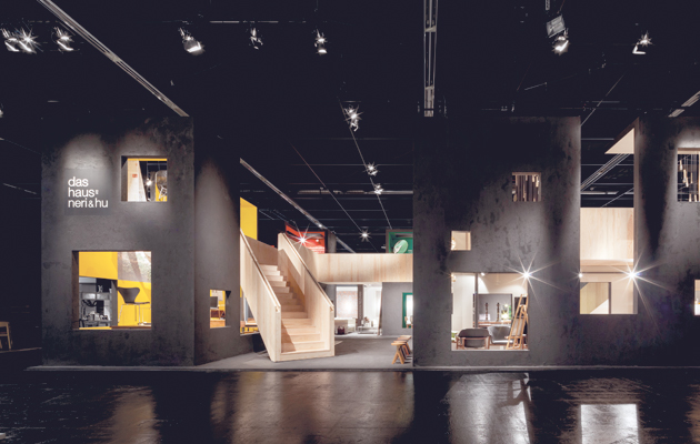
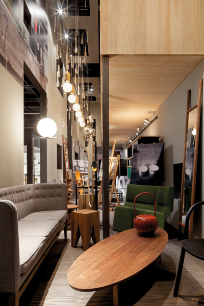
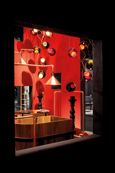
Narrow spaces between each “cage” recall the tight alleyways of Shanghai Neri&Hu returned to the lane-house type at this year’s IMM Cologne interior design show, using the event to expand upon their Singapore lecture. Invited to curate the annual Das Haus installation – a kind of domestic stage set – they injected an element of disquiet into the trade-show atmosphere. Their proxy home was dominated by a bridge-like viewing platform offering glimpses into rooms that the designers described as “cages”, referring to their ability to offer refuge, but also to act as containment devices for our personal possessions and rituals. The installation was simulated residential space only in the broadest of terms. More accurately, it appeared as several homes layered one over the other, creating an abundance of objects that made each room readable as, say, the dining area or the bedroom, without being harmonised by any guiding principle or identity. This over-occupation served several ends. Its surreality was destabilising, with functions and forms doubling and tripling to create furniture-scapes that were grotesque in their profusion, especially the bathroom’s arabesque of copper piping and suspended lighting. Reflecting the office’s debt to artists such as Louise Bourgeois and Magritte, it read like a comment on the commercial tectonics of trade-fair and showroom display. The partners freely admit that they find the idea of “consuming design blindly” disturbing. The crowding of items also allowed Neri&Hu to create a dialogue between three series of objects: the canon of international modernism, vernacular Chinese artefacts and the pair’s own products. Familiar silhouettes that have so inflected the language of today’s furniture design – an Aalto stool or Arne Jacobson chair – were placed alongside culturally specific articles, such as birdcages and tea sets. Between these poles, Neri&Hu’s products sat as a bridge just as functional and coercive as the one built through their domestic theatre.
The bathroom includes a profusion of lights and copper piping The partners have previously talked of the absence of a defined modern Chinese design discourse, and are often celebrated for the precedent their work sets in acknowledging both the hegemony of international modernism and the vagaries of their national culture. As such, this display provided a backdrop to products such as their Extend Mirror, which apes the bamboo ladders found in many Chinese homes, and Emperor lamps, based on a well-known folktale. Each appears “of a place” but does so without seeming enigmatic or foreign. Neri&Hu recognise that the home has become ground zero in a country experiencing unprecedented economic growth and societal transformation. Despite the persistence of entrenched values, decisions are now defined by the pressures of hyper-urbanism. “There is the notion of ‘wo ju’,” the pair explain, “a term that means the home of a snail, depicting the desperate, unbearable living conditions of the young urbanite who fights to survive in the city.” For Neri&Hu, embodied in their curation of Das Haus are the narratives we project onto our living spaces to contest and manage the distance between ideals and reality – a gap in which design’s social value must be fully employed. IMM Cologne took place from 19 to 25 January 2015 |
Words Peter Maxwell
Above: The rooms, or “cages”, were built from plywood and painted black on the outside |
|
|
||
|
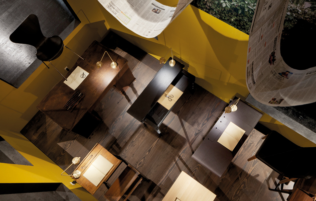
The “yellow room” is filled with desks, while chairs are hung above |
||

