|
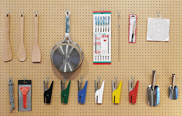
Some “super normal” design in Morrison’s shop |
||
|
Jasper Morrison is a quiet man. You need to pay attention or you could miss what he’s saying. Luckily he also speaks slowly. Sitting in his brick courtyard behind an anonymous black door on Kingsland Road in east London – incongruously, he is in the eye of the churning Shoreditch nightlife, with bars or kebab shops at every turn – it’s as though he can barely muster the energy for speech. Dragging one word after another, he says just enough to answer a question. There is a pattern here. Just enough words, just enough volume, just enough design. He is a philosopher of the adequate. “Super normal” is the term Morrison likes to use. Aside from being the name of a book and exhibition that he curated with his Japanese fellow product designer Naoto Fukasawa, it is a condition that he aspires to in his design. It is an almost moral attribute, where goodness is directly related to usefulness and simplicity. Morrison has just opened a shop full of super-normal items: perfect sieves, exemplary staplers, impeccable wooden spatulas. A few items are designed by him but most are anonymous. The shop is a chapel of everyday design. In fact, it is more private collection than shop because, located at the front of his studio, hardly anyone knows it exists. This is typical Morrison, to underexpose, to give it the soft sell. But he is proof that it works. Ever in demand, Morrison is about as big as designers get yet he likes to remain as invisible as they used to be, before they started popping up on magazine covers and TV screens. Part of the appeal of interviewing him is that he almost never does it. Q. What was the last magazine interview you did? A. “I can’t remember at all.” An introvert, he doesn’t have the cartoon charisma of a Starck, nor is he as lens-loving as Newson, Lovegrove or even Grcic. You won’t find many photographs of him. But he has other reasons for the low profile. “I’ve always blamed the media for distorting the role of the designer,” he says. “Young students see what gets published and imagine that that’s what is design.” There is no disputing that design students everywhere have been influenced by design’s migration into the gallery over the last five years. I suggest that there are two kinds of design: the kind that’s interesting to write about and the kind you want in your home. “Yeah, well then you’re into design as entertainment. And there I find it really not interesting at all. What’s the point?” The point, I argue, is not to publish meretricious design but to treat the magazine as a forum of ideas rather than turning it into the Habitat catalogue. He concedes that there is some logic to that, and we settle on the fact that the battle for young designers’ hearts and minds needs to be fought in schools. Morrison, who turns 50 this autumn, was one of the RCA’s star students back in 1985. His graduation project, a piece of screwed-together fibreboard origami called the Wing Nut chair, launched him onto the scene – in so far as there was a scene. “You know what my tax status was?” he asks. “It was ‘furniture restorer’. There was no such thing as furniture design.” Morrison looks back over the last decade as the time when design suddenly became a fashionable job, the way fashion photography or advertising was when he graduated. Youngsters may look up to Morrison as the pinnacle of what can be achieved: a man with studios in multiple cities who is working on between 10 and 20 products at any one time (he is currently in a quiet, 10-product period) and who lives rather well off his royalties. Does he feel successful? “I like where I am now – I like what I’m doing and that’s important. Because there have been times when I’ve been very unhappy with being a designer.” Was that for ideological reasons or because of the financial strains that come with the territory? “I think it was just feeling that it was worthless – a worthless job, and not having any optimism for the job, and that’s the worst.”
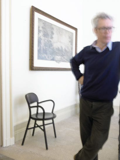
Morrison with his Pipe armchair for Magis, 2008 That was when Morrison was based in London. These days he leads an itinerant life that keeps him in a perpetual triangle between his studio in London, a second studio in Paris and his current preferred city of residence, Tokyo. “I’m really terribly bad at routine. It doesn’t work for me,” he says. And there is something surprising in that. You’d expect his work to be the product of a stable, reflective existence, not this nomadic helter-skelter. “I’ve discovered that working a lot less is a good thing – and it doesn’t necessarily mean you do any less, you just become much quicker at making decisions.” Constant travel keeps him fresh and his observations sharp. He notices when things work and when they don’t, the shape of a pot in this country and the curve of a frying pan in that one. “Thinking about the world and how it works is what it’s about,” he says. In the manifesto he published in icon’s 50th issue in 2007, Morrison wrote that design has become “a major source of pollution”. That may sound like a truism, except that he wasn’t referring to landfills but to a cultural pollution, the visual noise of products fanning their feathers for magazines and marketing departments, shouting Pick me! Pick me! It ends with the words “Preserve Normal, resist Special!” Q. Can you define “normal”? A. “I think it’s to do with how an object behaves in an everyday atmosphere or in an everyday setting. Not in a showroom or on the page of a design magazine but in real life. And when I say ‘normal’ I mean something that will fit into that atmosphere without unbalancing it or disturbing it. And it may be subjective, but for me it’s such a strong sensation when things are wrong. And I can identify why they’re wrong, which is why I think it’s not that subjective. When things have been designed with how they look in mind, then they tend to look wrong in a setting with other things.” In the only lecture I’ve ever seen Morrison give, he confessed to having taken four years to design a fork, which suggests a degree of obsessive perfectionism. “It takes a long time to know what it has to do, how it should behave,” he explains. Designing a fork is about knowing what forks have been and distilling that knowledge. I joke that his process reminds me of those computer programmes that overlay a thousand faces to produce the ideal face. Perhaps a similar process could produce the essential fork. “Or you might just get all their mistakes,” he deadpans, and it serves me right. The point is, for Morrison, designing is an act of tremendous pride and ambition. Every object he takes on he is aiming to reduce to a cultural archetype. “It’s as if you trick yourself that you are able to play the endgame of whatever you are designing.” Once he’s done it, it shouldn’t need to be done again. It sounds arrogant, but it is unsurprising that he thinks that way given that he surrounds himself with objects that meet such criteria. He nods toward a set of Vitsoe shelves in his studio designed by Dieter Rams in 1960. “There’s no point trying to do another one, it does it perfectly.” Morrison is a latterday modernist, or a humanist modernist even, since the point is not the machines that make his objects or their modernity but the fact that you are just as likely to recall their forms from your grandmother’s house. Perhaps it’s just postmodernism. Either way, he still advocates what sounds like the modernist project: good design for all. In that regard, he feels society still has a mountain to climb. Launching into what could be a second manifesto, he says: “I would like to imagine that design could come of age. That it could lose its special status. I think in the minds of the public, design is something special. You would buy something to put on your dining table as a talking point but it’s not because you want to use it everyday. It’s more about showing that you’re cultured in some way or knowledgeable about some theme that’s relevant to us today. So it’s succeeded in popularising itself in that area but in so many other areas it’s failed completely. People don’t trust design, they think it’s shit – products are badly made or they don’t perform. Nine times out of 10 you’re better off to buy an ordinary corkscrew than a designer corkscrew just because ordinary corkscrews know what they’re doing.” All of which means, of course, that that other stuff made by many of his feted counterparts – formalist design, fun or gimmicky design, conceptual design, design for the glossy pages and the nouveau riche – is a pile of shit. And that is a difficult position to sustain without at least a couple of contradictions. One: though he decries formalist design – “creating shape” – he is obsessive about form; not the gestural, expressive kind but shape nonetheless. And he knows that an object needs something, a visual “hook”, to sell it. Two: he is complicit in the “designer” economy. “Jasper Morrison” is as designer an epithet as they come, a brand in itself, and his products will be marked up and marketed accordingly. It’s difficult to design anonymous, affordable, normal things in those conditions. “I realise that that’s my category, that that’s my role and that’s how it’s going to be. But within that category I think it’s good to try to break down the barrier between the design world and the normal one.”
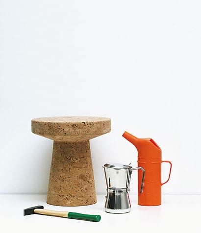
Cork table for Vitra, 2004, with other items from the shop I wonder what the designer does when he’s not designing. Wine, food and cycling are his simple pleasures. The brick extension of Morrison’s studio, which sits beneath his flat, also seems to have his fingerprints on it, and he confirms that he helped design it along with two architect friends from Herzog & de Meuron. Swiss architects, the pale bricks, it all makes sense. He says he was inspired by his memories of visiting Le Corbusier’s Sarabhai House in India. Is Jasper Morrison’s flat full of Jasper Morrison tables, chairs and utensils? “That’s the real test,” he replies. “When you’ve designed something, say that Air chair, you can’t visually take it in for about a year. You’re looking at it all the time thinking, ‘Is it any good? Could I have done it better or is it OK?’ and then at the same time you start using things and getting to know how they work. So for me that’s a really important part of the job.” And sometimes he encounters his work out in the world, where he likes to see it best, and has to cringe. A cluster of Air chairs scattered outside a Paris cafe, all pink. A restaurant with his lights but bad lighting. The world can be a source of pride and angst to a man of Morrison’s sensitivities. As the interview draws to a close we discuss taking a portrait. Morrison is reluctant. He has good excuses but the real one is in his faltering apologies – he is uncomfortable with the very idea of being photographed. Q. Is there anything we can try to make it more bearable? A. “Probably not.”
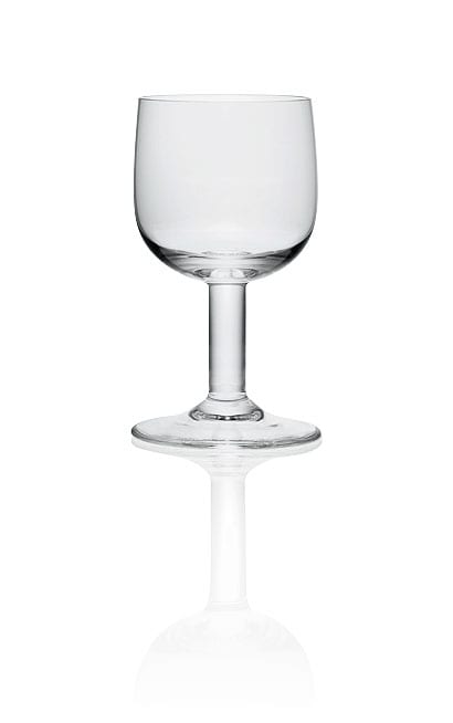
Wine glass for Alessi, 2008
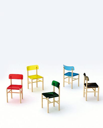
The Trattoria chairs for Magis, 2009 (image: Jasper Morrison/Magis) |
Portrait Hervé Lefebvre
Words Justin McGuirk |
|
|
||
|
|
||
|
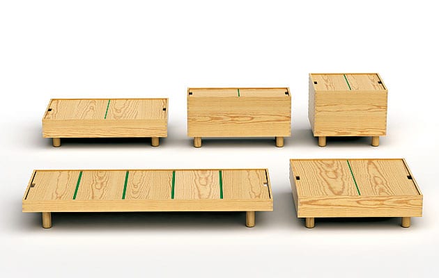
The Crate series for Established & Sons, 2007 |
||

