|
|
||
|
The youthful creators of psychedelic graphics transformed visual communication in the late 1960s. Rejecting the cold precision of modernism, they set off a riotous explosion of ‘hot’ colours and organic forms. You could call it a revolution … With the death of David Bowie in January serving to remind us of the imminent passing of the classic rock generation, it’s perhaps unsurprising that 2016 has been characterised by an apparent need to celebrate the highpoints of popular culture past. So, while Punk.London continues to honour the 40th anniversary of punk, much to the chagrin of purists, a new exhibition at the Victoria and Albert Museum takes us back even further to examine the lasting legacy of the tumultuous second half of the 1960s. The timeline of You Say You Want a Revolution? Records and Rebels 1966–70 begins with what for writer Jon Savage was ‘the year the decade exploded’. But one could argue that, in London at least, the fuse of the more overtly countercultural manifestations of this explosion was lit a year earlier. The sell-out International Poetry Incarnation at the Royal Albert Hall in June 1965 was promoted by the San Francisco-based poet Allen Ginsberg. Featuring readings by Ginsberg himself alongside other beat-era literary figures such as Lawrence Ferlinghetti and Michael Horowitz, the event helped to establish vital links between the emerging proto-hippie scenes in London and the US West Coast. It was a year later, at the V&A itself, that jazz musician and writer George Melly became aware of the coalescing of a group of young individuals who shared a common look and attitude. Melly was in attendance at that year’s major Aubrey Beardsley retrospective and recalled of the arty young crowd that ‘almost all gave the impression of belonging to a secret society which had not yet declared its aims or intentions’.
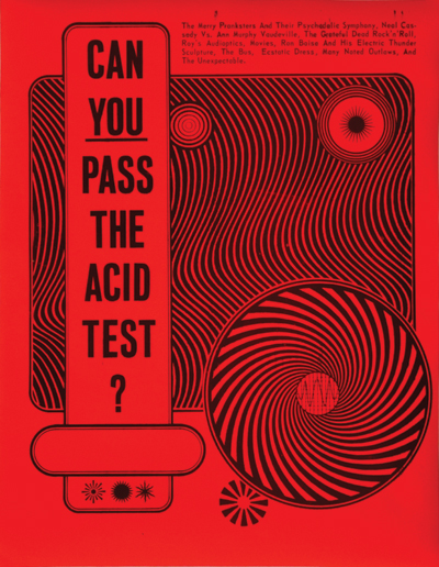
The Acid Test poster, designed by Wes Wilson, 1966 Melly, who subsequently dubbed this group ‘the underground’, was one of the first commentators to write seriously about pop culture, and having stumbled into the presence of this secret society, he went on to note that ‘the underground is the first of the pop explosions to have evolved a specifically graphic means of expression’. By the time Melly wrote this in 1967, this means of expression had already erupted out of the underground and into wider public consciousness amid a blaze of vividly coloured concert posters, album covers and magazine layouts. But in terms of the common visual aesthetic of these artefacts, it is significant that Melly first identified an emerging psychedelically inspired subculture at an Aubrey Beardsley display. The work of Beardsley, alongside that of William Blake, the Pre-Raphaelites, Arthur Rackham, John Tenniel (original illustrator of Alice in Wonderland) and others, would go on to strongly inform the aesthetic of British psychedelia. Just as the Beardsley retrospective served as a kind of coming-out party for London’s pop-cultural avant garde, over on America’s West Coast, an exhibition called Jugendstil & Expressionism in German Posters was held at the University of California and at Pasadena Art Museum from late 1965 onwards. This exhibition of Teutonic art nouveau had a similarly huge impact on the visual aesthetic of the American psychedelic underground, which was eventually to consolidate around Haight-Ashbury in 1967. While London and San Francisco operated as the dual epicentres of psychedelic-inspired cultural production, there were a number of marked stylistic differences, both musically and visually, between the British and US protagonists. Such differences were numerous and nuanced, but on the whole British psychedelia tended to be a more whimsical affair than its more politically engaged US counterpart. Indeed, with LSD held to offer an understanding of unconscious processes formed in early childhood, hallucinogenic experimentation among British musicians seemed more inclined to draw them back to the nonsense verse of Edward Lear than the acid evangelism of Timothy Leary.
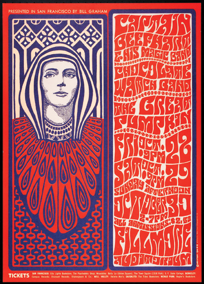
Concert poster for Captain Beefheart & His Magic Band at the Fillmore Auditorium, by Wes Wilson, 1966 Irrespective of such differences, in terms of graphic output, practitioners in both countries were of a common mind in performing a ‘headlong leap over almost the entirety of modernism’, in the words of art critic Jean-Pierre Criqui. Indeed, in consciously drawing from such pre-modern influences, the so-called ‘love generation’ was in effect rejecting modernity itself, and reacting against the increasingly technocratic nature of Western society. In the UK, artists such as Martin Sharp and Hapshash and the Coloured Coat were eschewing Harold Wilson’s technological optimism in favour of bucolic visions of the past. The situation in the US may have been more visceral – curator and author Amélie Gastaut describes the hippie movement as nothing less than ‘the extreme expression of a break with society, caused by a crisis in American moral and political values’ and brought to a head by the Vietnam War – but in purely graphic design terms, the aesthetic of psychedelic artists such as Rick Griffin and Stanley Mouse constituted the extreme expression of a break with the tenets of formal modernism. Speaking in 1908, within the context of the continued influence of art nouveau on architecture and design, the early modernist architect Alfred Loos declared: ‘The evolution of culture marches with the elimination of ornament from useful objects.’ But in rejecting the prevailing ethos that geometric forms represented the modern world more accurately and purely than organic ones, the psychedelic underground was effectively serving notice that it was less interested in representing the modern world than in seeking alternatives to it.
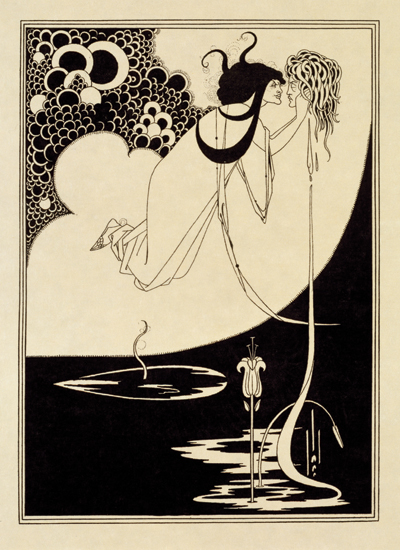
The Climax, an illustration for Oscar Wilde’s play Salome, by Aubrey Beardsley, 1893 So it should come as little surprise that art forms such as art nouveau and symbolism, which were conceived to appeal directly to the senses as opposed to the intellect, should find favour with those seeking to bypass the rationalising function of the ego through Eastern mysticism or the consumption of drugs. Certainly, if modernist poster design was all about the rational ordering of information to deliver clear and concise messages by way of text designed to ensure optimum readability, then it’s safe to say that there is not a great deal that is ‘rational’ about the graphically rebellious form of the psychedelic poster. This was especially so in the case of West Coast artists such as Wes Wilson and Victor Moscoso, who seemed intent on pushing typographic legibility to its very limits. In fact, psychedelic posters turned the whole notion of formal communication through design on its head, in the sense that they weren’t even conceived as open forms of communication. Instead, they were designed to have meaning only to those who were already tuned in to their message and to be wholly alienating to anybody else. To quote the media guru Marshall McLuhan, fashionable at the time, the medium here was, very much, the message. The posters’ function as advertising became even more questionable given that many of them were to be found plastered inside the very clubs and concert venues that they were supposedly promoting, where their ‘hot’ colours would react to ultraviolet light and LSD to mind-bending effect. Some artists, such as Moscoso – notable for creating some of the most visually discombobulating examples of the genre – even went so far as to pioneer a form of rudimentary animation, using different-coloured bands of circular text, which would simultaneously appear and disappear under white light shone through a revolving colour wheel.
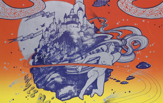
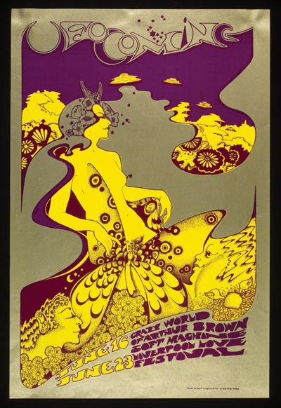
Concert poster for The Crazy World of Arthur Brown at the UFO Club, London, by Hapshash and the Coloured Coat, 1967 However, by the end of 1967, the psychedelic rock poster craze had reached its zenith. In July of that year, the work of leading US artists such as Moscoso, Griffin, Wilson, Mouse and others had been showcased at a successful exhibition in San Francisco, the Joint Show, and international recognition was afforded two months later by way of a feature on the phenomenon in the September edition of Life magazine. Psychedelic graphics continued to adorn posters and album sleeves on both sides of the Atlantic. However, just as the Klaus Voormann’s cover for The Beatles’ Revolver album had, in 1966, effectively ushered in the arrival of the psychedelic aesthetic, then by the end of 1968, Richard Hamilton’s minimalist design for the band’s White Album signalled that the style had become passé. Sheer ubiquity had drained psychedelic graphics of vitality and, divested of overtly druggy or countercultural associations, they were swiftly assimilated into the mainstream, deployed to denote a general sense of youthful grooviness in clothing catalogues and lifestyle magazines.
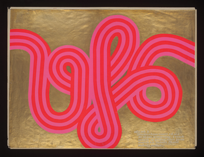
UFO Mark II poster for the UFO Club, by Hapshash and the Coloured Coat, 1967 But, in line with the V&A’s ambition to examine how life has been shaped by the five revolutionary years of 1966–70, I would argue that psychedelic graphics have had a profound, enduring impact on visual culture. Far from being mere 1960s kitsch, they have left an aesthetic vocabulary that is often used by today’s graphic artists alongside other subcultural styles such as punk and hip-hop. And like punk a decade later, psychedelia relied upon the energies of a significant number of amateurs, whose untutored involvement disabused established design studios of the notion that there was a right or wrong way to go about creating effective visual communication. But perhaps psychedelia’s foremost legacy within the realm of design was the introduction of the notion of engagement on an experiential, intuitive level. Flying in the face of modernist concerns with order and rationality, psychedelic artists sought to explore the relationship between a graphic image and the experience of the viewer perceiving it. And in doing so, they emphasised the value of nuance and ambiguity in creating work for audiences literate enough (or stoned enough) to negotiate such complexities. |
Words Ian Lowey
Above: CIA v UFO Poster, Hapshash and the Coloured Coat, 1967
Images: Victoria and Albert Museum, London |
|
|
||

