|
|
||
|
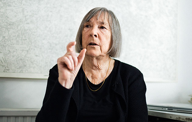
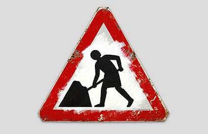
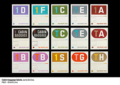
Using the European standard shapes for warnings, Calvert designed the pictorial instructions for road users, referencing what was familiar to her – a cow for livestock crossing, modelled after Patience, her favourite heifer on the family farm; children crossing the road, inspired by her upbringing and including a subtle self-portrait.When Calvert began her career, graphic design didn’t exist as a profession. Six decades later, her work is all around us – from the signs on Britain’s roads to the website for the UK government In the fireplace of Margaret Calvert’s studio, on the ground floor of her north London home, is a self-portrait, produced for a Royal Academy exhibition. “I found the sign out on the street,” Calvert says with a smile, “so I nicked it and turned it into me.” The “men at work” road sign has been modified to include Calvert as the character with a shovel, her silhouette revealing a knee-length skirt, a neat bob and Wellington boots. In this room, the warning is clear: Calvert at work. When Calvert arrived in the UK from South Africa in 1950, graphic design did not exist as a discipline or profession. There were typographers, designers and illustrators, but the idea of a “graphic designer” had not been mooted. It was while studying illustration at Chelsea College of Art that Calvert first encountered Jock Kinneir as a tutor. “I think Jock recognised that I was serious,” Calvert says. “He approached me and said, ‘I’ve got this job and I need an assistant.’ ‘What does it involve?’ I asked. ‘Design,’ he replied. ‘Like nothing you do here.'” He asked her to work for him, having been appointed to design a signing system for the, then new, Gatwick Airport. While working at Kinneir’s office in Knightsbridge, Calvert became “hooked on lettering”. Through commissions for clients such as P&O and the Milk Marketing Board, she honed her skills. In 1957, the office set about designing a road sign system, commissioned by the Anderson Committee, for the new motorways that were to be introduced across Britain. Each sequence of signs, orientated towards the driver, was designed to deliver concise information that could be read at speed. “We started from scratch,” Calvert says. “At that time Jock didn’t even have a car, but I had passed my test.”
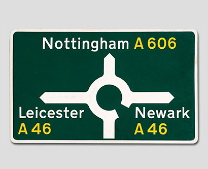
Together they created Transport, a typeface that featured both upper and lower-case sans-serif lettering. The spacing was developed from a grid system that Kinneir devised using the width of the capital letter I as the gap between each character. “Despite having the full support of the Anderson Committee and modernists such as Herbert Spencer and Colin Forbes, the early signs came under heavy attack from traditionalists such as the calligrapher and stone carver David Kindersley, who had his own ideas, especially regarding the design of the lettering,” Calvert says. The road signs were tested in 1958 on the Preston Bypass, now the M6. “In your life you have a few high points,” says Calvert, recalling the trip she and Kinneir took to see the installed signs. “We climbed into Jock’s Fiat 600 and I remember it being completely surreal. There was nobody on the motorway, and the banks were still terracotta, as the planting hadn’t grown yet. There were just these enormous blue signs. We ended up taking a wrong turning and ended up in a ploughed field.”
Following on directly from the work for the Anderson Committee, a new committee under the chairmanship of Sir Walter Worboys was set up to review the entire network of road signs throughout Britain. This resulted in the publication of the 1963 Worboys Report and signage that came into effect on 1 January 1965. “It was at this point that we changed our name to Kinneir Calvert and Associates,” she says. Using the European standard shapes for warnings, Calvert designed the pictorial instructions for road users, referencing what was familiar to her – a cow for livestock crossing, modelled after Patience, her favourite heifer on the family farm; children crossing the road, inspired by her upbringing and including a subtle self-portrait. Over the years, the system has been modified as the measures to control and inform road users have increased. By and large, however, it has stayed true to Calvert and Kinneir’s design.
More recently, the Transport font has been given a new lease of life in digital form. Calvert was working on a slightly modified version of the lettering with Henrik Kubel – who had once been a student of hers at the Royal College of Art – when she was visited by Ben Terrett, head of design for Government Digital Services. Terrett’s team had been developing a project to consolidate more than 400 government websites, and he invited Calvert to comment on a work-in-progress. She recalls: “They were using a number of fonts – Gill, which is the official civil service typeface, and Georgia – but he said they were thinking of using Transport. The road signs worked as a network, and this could be applied to the new website.” When the government’s gov.uk website went live on 1 July 2012, its previously disparate sites were unified by a simple design and two weights of Calvert’s New Transport font. The typeface that was used to link some 390,000km of British roads (and many more abroad) now links the digital presence of the UK government to its citizens. “She became an unofficial mentor/fierce critic of the project,” said Terrett during a presentation at Design Indaba this year. “She comes in and speaks to the team. I think partly because she taught at the Royal College of Art for so long, she’s great at giving constructive, helpful feedback.”
Calvert had a long career at the RCA, starting in 1966 teaching typography to industrial designers, before becoming head of graphic design between 1987 and 1991. She also designed its visual identity, which proudly announces the institution on its ever-expanding network of buildings. She is optimistic about the opportunities that young designers have at the moment, and says that, over her long career, graphic design has “mushroomed”. “Being a graphic designer is like being a brain surgeon,” she says, remarking on the myriad media and technologies that professionals now have at their disposal. Graphic design may have diversified in ways that were unimaginable when Calvert began work in the fifties, but her willingness to adapt to contemporary demands has allowed her career to burgeon. Her work for the Tyne and Wear Metro (a typeface originally designed for a French client that dismissed it as “too English”) and British Rail is, like Transport, familiar to millions. Calvert, whether we consciously acknowledge it or not, is a constant presence in our lives. |
Words Owen Pritchard
Image Dan Wilton |
|
|
||

