|
|
||
|
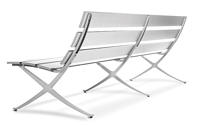
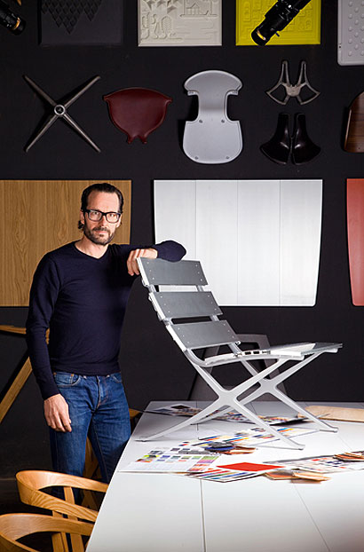
Bench B is a modern twist on a classic archetype. Its designer, Konstantin Grcic, spoke to Icon about his inspiration and upcoming shows ICON Why do you think people have responded so enthusiastically to Bench B? Konstantin Grcic I have no speculations about that. I always think that pieces of furniture are slow to take off. To be honest, I don’t even know everything that happens with my products [once they leave the studio]. I’ve seen some nice photos – I think the company can do a lot to promote the piece – but the turning point would be to see the bench used in a real project. I’d love to see it in an airport or a museum. That happened with Chair One – it was well-received and appreciated, but it took three years for a big project to use it, and then it just took off. I’m waiting for a project to do the same for Bench B. ICON Your new collection Traffic for Magis bears some resemblance to Le Corbusier’s Grand Confort pieces – you seem to find endless inspiration in the classics. KG The classics are great. I can’t tell you why that I am now suddenly referring to them so directly. What I do know is that it’s not deliberate or because I’ve run out of ideas so have to copy others. Now is a strange time – everything is a bit difficult. In doing projects, I’m looking for something that is essential, pure and simple – that often makes you revisit these pieces. They come from another time, when they were innovative and brave and bold, because people like Corbusier and Mies van der Rohe didn’t have the technology and possibilities that we have today. They had limited resources and technology, which gave their work a certain purity. There’s something so simple and amazing about what they were able to make out of so little.
ICON It seems that the design world still has difficulty with the ideas of copying and originality and authenticity. KG I’m not the most vocal on the subject. I’ve always tried to push boundaries, but at the moment I feel that – whether it’s my own instinct or something to do with the zeitgeist – it’s not about making big innovative leaps. It’s more about having strong references to something we feel comfortable with and the beauty and purity of an idea, which I think is comforting in times when we don’t understand 80 per cent of what’s going on in the world. The few things that are simple, that we do understand, make us feel good. As human beings, we want to know and understand things. ICON You’ve had a very busy year. Any particular highlights? KG It’s difficult to date particular things to any given year because they may have been going on for so long, but I think it’s been a good year. My office has been productive – part of it has been about luck that certain things have happened. Generally, times are difficult. Economically, we feel it with our clients, and also intellectually. That makes it exciting because everyone is trying to understand things, and look for answers. In terms of the creative process, we will look back on these years and say, yes, that’s when things happened. The search and uncertainty leads to new ways of thinking. Being in the middle of that phase, it is hard to judge, but the engine has enough oil and is running smoothly. ICON You have an exhibition coming up soon at the Vitra Design Museum? Talk me through the ideas behind it and what visitors can expect. KG I didn’t want to do a retrospective – I wanted to create something new. It mostly features work that already exists, but the project is about the way we exhibit this. Instead of dealing only with the object, it’s looking at the whole environment. It is laid out across four separate areas of which three have elaborate scenographies, like room sets or stage sets, each with a theme. The first is a private environment; the second, a work space; the third is about public space; and the fourth is an overview, with a narrative rather than being chronological – the link between two objects, for example, could be the colour red. ICON What’s in store for 2014? KG In February next year, I have another show at Galerie Kreo in Paris called Man/Machine. It will feature a series of furniture, but it’s not a collection, as they don’t belong together. What they have in common is the material – industrial glass – and the fact that each piece has a moving part. It’s a strange, but wonderful combination – glass and these mechanical devices. |
Words Crystal Bennes |
|
|
||

