|
|
||
|
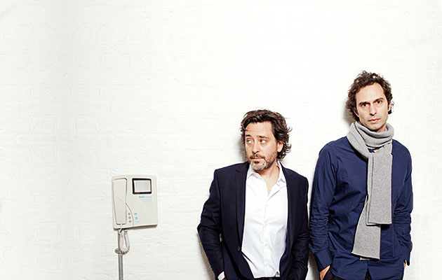
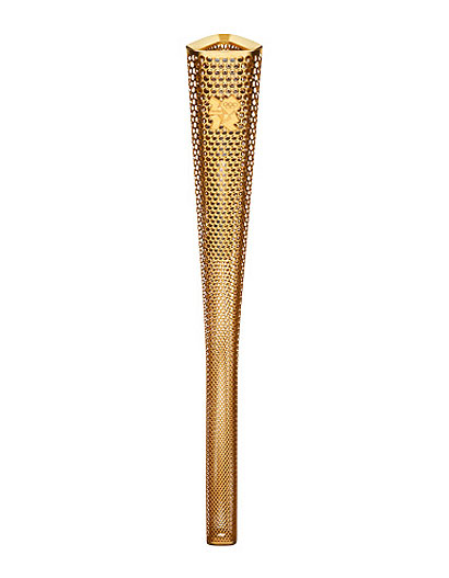
“Amazing” is the word that keeps coming up as Barber Osgerby describe their 2012. “It’s been an amazing year, actually,” Jay Osgerby says. The studio designed the torch for the 2012 London Olympics (as if you didn’t already know that). For weeks ahead of the games in August, their work was paraded around the country, appearing on newspaper front pages and the television almost daily and taking centre stage at the lavish opening ceremony. It’s hard to imagine a higher profile for a design object. “It’s been a whirlwind,” Ed Barber says. “For the first time in our career we’ve designed something of universal interest.” “Also we normally design things that people choose to have,” Osgerby says. “This is the first time we’ve designed something that is essentially imposed on the nation as something that represents it. That was a big shift for us.” “It’s been amazing,” Barber says. “It was something I’m sure we won’t experience again.” “I hope we do,” Osgerby says. “Some way or other.” That’s not just an airy aspiration – Barber Osgerby is thinking big. Ed and Jay met 20 years ago when they started the same course at the Royal College of Art, and they founded their eponymous studio upon graduation in 1996. Success came quickly: the Flight stool and Loop table for Cappellini, both 1998, are established modern classics, as are the more recent Tab lamp for Flos (2006) and the Tip-Ton chair for Vitra (2011). The studio won the Jerwood prize in 2004 and became Royal Designers for Industry in 2007. And then there’s the torch. Where do you go from there?
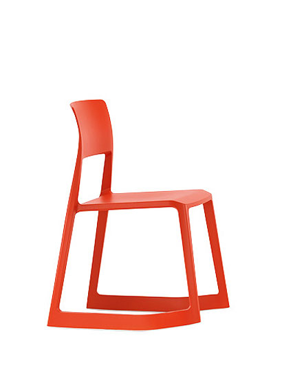
“I’d love to find some way just to continue working at the level of the torch,” Osgerby says, “to do things that are much more about society.” While the torch isn’t going to lead to more work with furniture manufacturers – they are already working flat out with the best houses in the world – Barber agrees that it might bring in “something of a civic nature”. Perhaps something on an architectural scale, a constant undercurrent for the duo since they founded Universal Design Studio, an architecture practice, under the Barber Osgerby banner in 2001. And perhaps they won’t wait for a commission. “The big thing it’s done for us is make us both think really hard about where we want to go next,” Osgerby says. “I think we can make the most of the resources we have and … instead of waiting for [commissions] to happen, try to create them ourselves.” For now, there’s one very large architectural commission in the works: a 35,000sq ft new gallery for the Science Museum in London, about which they can say nothing more. And there’s another project under wraps that fits that society-wide ambition – though it’s hardly on an architectural scale. Barber Osgerby has designed a new £2 coin to mark the 150th anniversary of the London Underground in 2013. Although it’s often used for commemorations and anniversaries, the £2 is a bi-metal coin, with a golden ring around a silver centre, making it a challenge for designers to work with, but they found a simple solution. “It felt very obvious to use the ring to signify the tunnel,” Barber says. The golden outer edge of the coin is the wall of the tunnel, and the train, a 1967 Victoria line model, is appearing through the centre. “It’s something that everyone who’s used the Underground is totally familiar with – seeing the train approaching through the tunnel.” Even without these high-profile commissions, the studio would still be having a tremendous year. The Tip-Ton, a handsome rocking, stacking plastic chair for Vitra, has proved a hit – or is “doing big numbers” in Osgerby’s words, typical of the pair’s down-to-earth manner. “The sales are growing incredibly,” Barber says. “We found out a couple of weeks ago that sales at John Lewis are going through the roof. It’s great because it shows that you can go into the market with an unusual product and people will embrace it. And not just at the niche end.” Meanwhile, the studio is preparing Milan launches for B&B Italia, Vitra and Flos, and a first collection for Knoll. A luxury hand-blown glass travel lamp for Louis Vuitton is also about to be released.
Even as it expands their horizons and its range, Barber Osgerby has retained a distinctive aesthetic – very calm, very restrained. Their success may have something to do with the fact that this aesthetic – with its radiused corners, simple forms and refined surfaces – is happily in line with the immensely influential work of Jonathan Ive at Apple. And, interestingly enough, Barber Osgerby recently travelled to Cupertino to talk to Apple’s design team, a rare look behind the curtain at the technology giant. Now that they’ve known each other for 20 years, has the experience of working together changed? How do they typically approach a project? Interestingly it’s this question that prompts the closest they get to a difference of opinion during our chat. “In the early days we didn’t have so many projects so we’d have a brief given to us and we’d discuss and it was very much a two-person starting point,” Barber says. “Whereas nowadays the end product is very much a two-person product [but] we’ve probably got two starting points, which is different. That’s purely because of time.” So how do they bring two starting points into a single two-person product? Synthesis? “We synthesise, it’s a confluence,” Osgerby says. “But during the process we have quite heated debates about the direction something is taking,” Barber says. “I don’t think it is to synthesise, it’s to go with the best idea, it’s constructive arguments and you’ve got to fight your corner, and in the end there will be one idea that’s better than the other, rather than ‘You win for the top of the table and I win for the leg’.” With experience, the pair have become much more ambitious in their approach to clients. Barber says, “Now we’ve got a track record, they’re interested in our opinion of what they’re doing. So you can have a much more powerful input. We can be strategic.” “In the beginning we just thought, ‘Design a nice table for [the client]’,” Osgerby says. “Now we’re thinking, ‘Where’s this company going?’.” To this end, the studio have founded a design consultancy, MAP, to work collaboratively on design strategy with companies. Tip-Ton is an example of this kind of strategic thinking, emerging out of research into teaching and used to help Vitra expand into the education market. “It doesn’t really hugely interest us just to make another chair,” Osgerby says. “If we made a chair that offered something very different then we’ve done something different. We’re constantly trying to find things that aren’t just ‘another’ – that do something that brings something else to the project.” |
Image Michael Thomas Jones
Words Will Wiles |
|
|
||

