|
This year’s crop of outstanding young designers found inspiration in everything from Mexican folk tales to plastic shopping bags
Icon took over the home of Central Saint Martins for its 2014 graduate review. Behind the formidable facade of Stanton Williams’ campus building in King’s Cross – a vast slab of brick that abuts the fountain-filled Granary Square – is a spacious and light campus, a miniature city in green glass, aged brick, timber blocks and concrete.
Every bit of its 10-acre floor space was used for the school’s popular and busy end-of-year show and it is these halls and doorways, studios and stairwells, that form the backdrop to our selection of ten outstanding projects by graduates of British universities – three of whom spent the last couple of years toiling within the building as students.
We also made use of the newly opened roof terrace. The long wedge of greyed-wood decking is tucked in among towering cranes and busy construction sites; its expansive view takes in both King’s Cross under development and the London skyline beyond.
Graduate designers were chosen from up and down the country for their innovative work in a range of disciplines, whether approaching everyday problems in new ways or inventing new materials and processes. Some projects impressed for their social and environmental nous, encouraging reuse or reflecting a tendency to share resources rather than consume individually.
Others grabbed attention with imaginative storytelling or a professional finish, showing a readiness to work with real-world clients and enter the competitive industrial design market.
Digital manufacturing technologies were on the agenda for many students too, but there was a clear desire to approach new possibilities with a human perspective, testing and defining new ways to create or collaborate.
This year’s graduates (pictured in first photograph, from left to right):
01 Wael Seaiby
02 Mireia Gordi i Vila
03 Luisa Kahlfeldt
04 Daniel Lau
05 Michael Connor
06 Ana Jiménez Palomar
07 Josh Worley
08 Mark Colliass
09 Ying Chang
Not pictured Matej Chabera

Wael Seaiby
Edinburgh College of Art,
MFA Product Design
PLAG
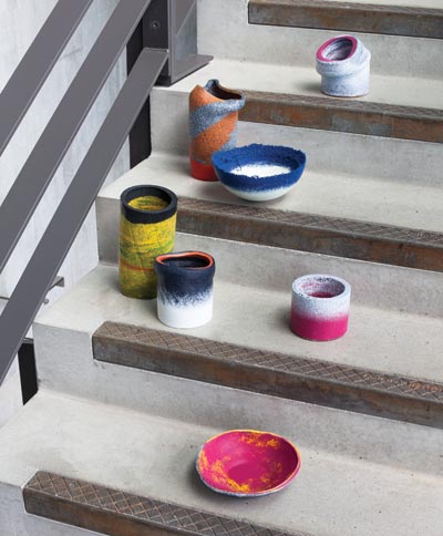
“Reuse this bag” is the modern supermarket’s plea, an act to which Seaiby brings new meaning with his range of recycled plastic vessels. By applying heat and pressure to piles of high street shopping bags, the designer found he could turn them into rigid sheets. He created the series by grinding the sheets down into tiny pellets, which he re-formed around existing bowls and vases. “With heat and pressure, the colour intensity really changes,” he says. “A single bag is a bit transparent, but when you stack a hundred of the same colour on top of each other, it becomes really bright.” The coloured grains also make a good guessing game about the material’s source: orange for Sainsbury’s, hot pink for Superdrug and blue for takeaways. It takes between 80 and 120 bags to make one pot or bowl. PLAG (a portmanteau of “plastic” and “bag”) will be on show at Mint during London Design Festival.

Josh Worley
Central Saint Martins,
BA Product Design
Mini-lathe
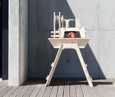
Mini-lathe is part of Worley’s Open Tools project: a website (opentools.cc) where digital kits for building basic workshop machines can be downloaded for less than a pound. The kits contain instruction manuals and CNC-cutting files, for makers to cut the plywood parts themselves or take to a local workshop. The lathe runs on the power of a domestic drill, and its basic components are readily available, such as bicycle inner tubes and skateboard ball bearings. Currently there are three other designs on the site: a workbench, a lathe that transforms to a disc sander and a potter’s wheel. “The means to produce it is anyone’s but what I’ve done as a designer is to bring all these ingredients together. We’ve got all these exciting digital manufacturing techniques that are open to domestic use, but knowing how to interact with them is a problem for most people,” says Worley. “Open Tools was created to really simplify that process.”

Daniel Lau
Nottingham Trent University,
BA Furniture and Product Design
Kai
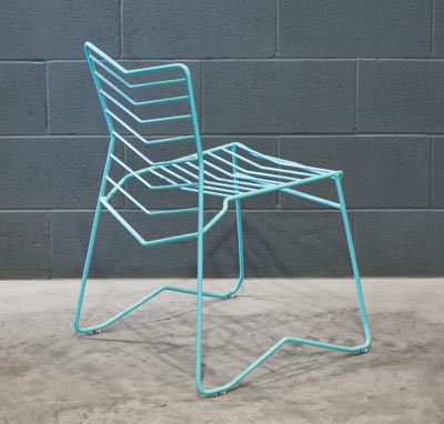
“In Japanese, ‘kai’ means waves or ocean,” says Lau, who gave the name to his outdoor chair, featuring rippling bands of bent mild steel within a frame. The design is a culmination of traditional sketching, model making, CAD drawing and time spent bending metal in the workshop. “The final piece is produced on a CNC wire bender. All the data and angles are inputted and the machine just makes it, it’s incredible.” Eight-millimetre bands are TIG-welded to a 13mm frame and the whole piece is powder-coated in a marine-influenced palette of turquoise, blue black and white. Kai is seriously accomplished for a graduate project, and is already attracting interest from its intended market: cafes, hotels and restaurants.

Luisa Kahlfeldt
Central Saint Martins,
BA Product Design
Essenziale
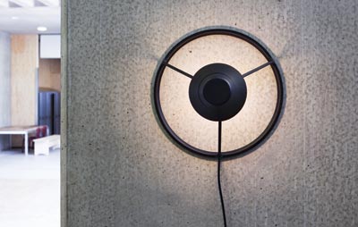
Luceplan set the final project brief for Kahlfeldt and a cohort of fellow students. The Italian lighting company asked for a wall light that would push the typology and explore the possibilities of LEDs. “It was quite tricky, because after doing the whole brand-decoding process, Luceplan’s catalogue is actually quite traditional and safe,” she says. But she did find an affinity for the slim contours of Daniel Rybakken’s lights for the brand, and Essenziale is a similar work of elegant function. Light is projected onto the wall from a central cone, and an outer circle acts as the means for fixing. The design is easily repositioned and doesn’t require electrics to be fitted within the wall. “Working for a real client was great as they are very innovative,” she says. “As the cone is quite small I thought it might not be possible, but they taught me about heat sinks and compact LED discs. It was good to have a dialogue on technical issues with them.”

Ana Jiménez Palomar
Central Saint Martins,
MA Design: Furniture
Los Enmascarados
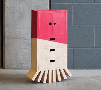
Each of Jiménez Palomar’s five furniture pieces is an interpretation of a Mexican character. The masked figures are embedded in the country’s culture through dance and folk tales; Los Enmascarados is a translation of their personalities into the language of furniture. Jiménez Palomar says: “The Drunk Lady (pictured) is often seen stumbling around, that’s why the cupboard has a rocking base. She wears bright make-up, hence the bold red colour, but it’s badly applied which shows as a slanted line.” The Double Face – which represents the battle between good and evil – mashes together two chests of drawers. “The good has his feet on the ground and the evil is sticking out with his legs upside down.” Door handles are used to suggest eyes which, when turned, give different expressions. A hunched old man is characterised by thick lines, and a party-loving buffoon has wiggly arms and wonky eyes. A devil completes the set.

Michael Connor
London Metropolitan University,
FdA Furniture
Stacking Tables
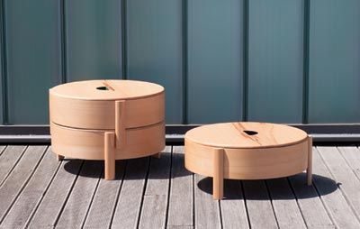
Connor’s set of three cylindrical stacking tables is designed for housemates or family members who share a small living space. Each tier has a removable lid and legs made in solid beech, and also functions as a container for storing small items. “The three pieces are identical, but each one can be identified by its interior colour,” says Connor. “So you could say the green table is yours, the blue one is mine and so on.” Achieving a perfect cylinder required Connor to invest a lot of time in finding a construction method. “I basically cut two circles from square sheets and bolted them together like a drum. Then I lined the inside with veneer, building up layers with glue to create a thickness. I used bicycle inner tubes to create pressure from the inside, keeping the circular shape while the glue set.”

Mireia Gordi i Vila
Royal College of Art,
MA Design Products
Fragile
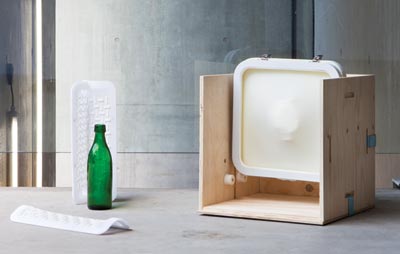
“Right now you have disposable packaging and you have bespoke packaging. I wondered if I could cross the two, and make something that’s reusable but also adaptable to different shapes.” Gordi i Vila’s investigations led to a pair of novel designs: a membrane studded with polyurethane jelly for gripping objects like wine bottles within a three-part frame, and a case system for handling valuable museum objects that is lined with a continuous skin of the material. At the global scale, she imagines a company like Amazon adopting her reusable packaging as part of its locker system. The website has plans to deliver its goods to local sites where they can be retrieved with a swipe of the user’s credit card. “Either the case would stay in the locker, and you’d just empty it. Or you could take it home and return the packaging to the same place. Just like a library really.”

Ying Chang
Royal College of Art,
MA Design Products
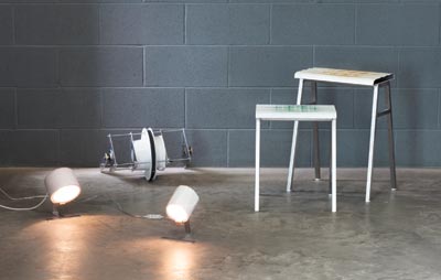
Grid System
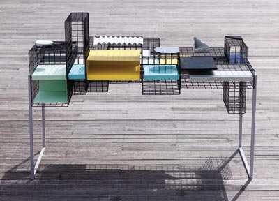
Why does a desk have to have a flat surface? It’s not as ridiculous a question as it sounds, according to Ying Chang, whose student research led to new discoveries about how we use our workspaces. “People adapt tables and desks to their own preferences, accumulating a lot of objects over time,” she says. “The clearance space one actually needs is quite tiny. And it’s often taken up by a laptop.” Grid System is her alternative – a piece of adaptable furniture with wire-mesh boxes that can be positioned at different heights to create storage above and below the surface. “I see it as a skeleton object, for people to add their own meat and muscles onto.” Folded metal shelves help the user to organise their documents by colour, and smaller accessories in wood and concrete indicate where to put something precious or easily lost.

Matej Chabera and Mireia Gordi i Vila
Royal College of Art,
MA Design Products
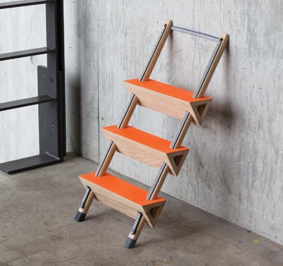
Sling Step
Basic physics defines the design of Sling Step, a small ladder that functions without nails, glue or screws. The step is part of a playful collaborative project between RCA students Matej Chabera and Mireia Gordi i Vila, who looked at principles of weight, tension and friction as ways to replace traditional joints. “It’s neat conceptually because every material is what it is. It performs because it’s been chosen for its qualities,” says Gordi i Vila. The posts and rungs are kept in place by a self-locking textile “sling” that weaves in and out. “The moment you put weight on it, it actually makes the structure stronger.” An accompanying side table works in a similar way; the weight of a book or coffee cup keeps the table’s surface horizontal, when removed it folds itself away. The designers say that applying the rules of mechanics to larger furniture could work, but all elements must be scaled up proportionally to stay functional, which may make the products excessively heavy.

Mark Colliass
Nottingham Trent University,
BA Product Design
Make Your Own and Wear Away
Both of Mark Colliass’s final projects encourage deeper interaction between product and user. Make Your Own is a rotational-moulding attachment for a bike that spins a cylindrical lampshade or vessel as you cycle. Jesmonite, a type of resin, is poured into the drum-like device at the start of the ride, and after 30 minutes, the main shell of a product is formed and set. He says: “Instead of just buying an end product, you have to put some valuable time and effort into it. That’s what gives it a value.” Wear Away is a pair of stools with layers of coloured paint, coated in white. As the surface is rubbed down by use, the colour reveals itself. “It’s to encourage people to keep things longer instead of always throwing them away. And to encourage patience – people tend to want a final result straight away.”
|
|
Words
Riya Patel
Images
Peter Guenzel
|

