|
|
||
|
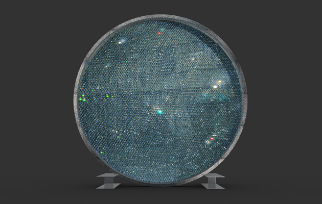
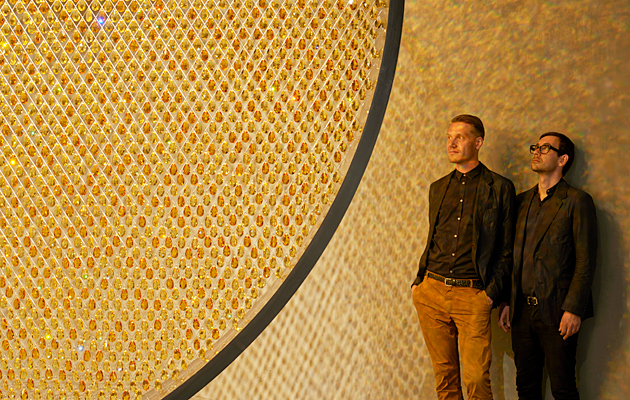
At Design Shanghai this month, Fredrikson Stallard will unveil a new version of the Prologue installation for Swarovski. Its previous incarnation at Design Miami/Basel last year was a 4m-high structure that held more than 88,000 topaz crystal chandelier droplets, which together created a golden, shimmering artificial sun. This is how they described the work The installation is made of chandelier components: traditional pear-shaped crystal that were designed as reflective lenses to amplify candlelight. Crystal can become overwhelming if merely used to be bling, but, with Prologue, it isn’t there for decoration – it is supposed to create an impression of the sun and I don’t think any representation of the sun can be overwhelming. It could never be bright enough. If you cut anything at sharp angles, even metal, it would be bling, but that’s what draws people in. That’s what’s really amazing to people, that’s what’s awe-inspiring. And though we’ve been working with crystal for some years now, it’s something we only have limited control over. In daylight, the two different shades of gold produce violet and blue, which is unexpected – they’re so efficient at refracting light. Prologue was first shown at Art Basel/Hong Kong at the former Police Married Quarters – a space that’s being converted into a design hub. It was displayed in the courtyard of an art deco block, outside, resting on two steel construction beams. We allowed it to rust, so the city ate into it, and people touched it, so their handprints became part of the piece. At Design Miami/Basel, in Switzerland, that was all removed – it was inside, suspended from a rolled steel joist, which gave it a new energy and movement. Prologue is a simple emotional form. There is something very calming and moving that draws people to a representation of the sun. One only has to consider Olafur Eliasson’s sun in Tate Modern’s turbine hall to understand that. One phenomenon we really didn’t expect was the selfie. People feel compelled to take selfies in front of it – as it hits you right in the middle from the first moment you see it. Prologue will be on display at Design Shanghai from 27-30 March 2015 |
Words Icon
Above: The new version of Prologue in Shanghai will be blue |
|
|
||
|
The design duo at the previous version of the installation, at Design Miami/Basel |
||

