|
|
||
|
Combining the design techniques of the digital avant-garde with pomo’s sense of historic context, a new generation of British architects is stepping into the limelight, says Douglas Murphy British architecture is at a strange crossroads. It’s better than it has been for a long time, but in danger of slipping into tedium. A generation ago, it was dominated by high-tech architects and the commercial mainstream – Rogers, Foster and those who had worked with them – as well as a few figures like Will Alsop and Future Systems at the eccentric fringes. Underneath this generation, there were new currents bubbling, each competing for the intellectual high ground. In particular, a group of serious architects, such as Tony Fretton and David Chipperfield, and others centred around the Cass school (occasionally nicknamed the ‘whisperers’), were competing for attention with the experimental digital tendency, centred at the Architectural Association (AA), which included offshoots from Zaha Hadid (ZHA) and Foreign Office Architects (FOA).
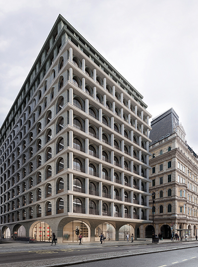
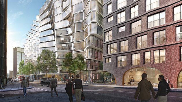
Alchemi Group’s proposal for 5 Strand in London by Adjaye Associates Today, the old practices are still plowing on with their airports, offices and infrastructure, but they don’t exactly look as though they’re leading the way on anything any more. However, a remarkably coherent mood seems to have set in for the younger generation, mostly in their 40s, exemplified by the architecture now known as the ‘New London Vernacular’. This is intelligent and historically informed stuff, but it is in real danger of being watered down by all the hacks pastiching their work to get an easy ride through planning. But what of the digital avant-garde? Zaha Hadid’s sudden death robbed the architecture world of one its most powerful personalities, but Patrik Schumacher has vowed to continue along the curving paths of parametricism, ruffling many a feather with his outlandish pronouncements on free markets and libertarianism. He may have got a slap on the wrist, but ZHA has indeed been picking up new work.
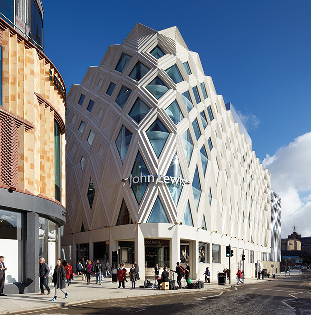
ACME’s John Lewis at Victoria Gate features a decorative concrete facade In a recent issue of Icon, Tim Abrahams praised Hadid’s Antwerp port building, but in highly defensive terms (‘haterz gonna hate’), which shows just how much the mood has shifted. In the years since digital form became mainstream and its protagonists got a chance to build their visions, attention has drifted off in another direction. Problems with build quality, shady politics and a sense that the experience doesn’t live up to the rhetoric mean that the digital future has never looked weaker. So what happens next? The passion for brick is being pushed further and further. Maccreanor Lavington, one of the key New London Vernacular practitioners, is finishing off the facade of a block of student housing in Bloomsbury that takes brick panelling to a seriously historicist level, with deep corbelling and a rusticated base straight out of Serlio. Elsewhere, Caruso St John has recently invoked brick expressionism with its bank building in Bremen. |
Words Douglas Murphy |
|
|
||
|
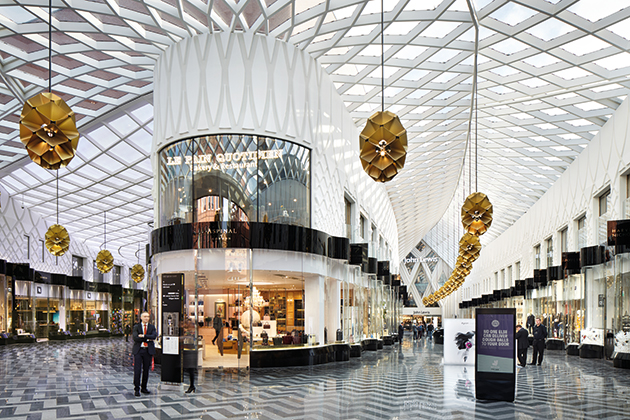
Victoria Gate’s interior harks back to the classic age of the retail arcade (also lead image) |
||
|
This mood is appearing in the work of architects you might not expect, such as David Adjaye, whose massive £600 million housing and hotel project in London’s Piccadilly features curving brick walls resembling the flutes of a gigantic doric column, as well as tell-tale curving filigree balustrades. Adjaye has also submitted a scheme for the Strand, next to Trafalgar Square, whose thick facade is made up of round arches, a very classical composition with hints of the sort of 1930s Italian buildings at EUR in Rome. This might seem odd coming from Adjaye, whose jobs elsewhere remain as brooding and abstract as his early work, but he doesn’t see a difference: ‘All my work is interested in history,’ he explains, although he acknowledges that London’s massive growth presents an interesting case. ‘The challenge and opportunity for design is to find ways to offer new typologies that accommodate this new density without losing the sense of place and heritage that makes London recognisable and iconic.’ New architecture like this suggests that pomo is back on the rise, although we are lucky that this generation are simply more talented architects than the polished pink granite lot of the 1980s. And whereas there’s very little going on in practice to suggest that the ever-wider public acceptance of brutalism is being reflected in a return to rugged modernism, it’s much more likely that the increasing wave of critical reflection on the postmodern years – with No 1 Poultry now the youngest listed building in England – will bear fruit in terms of actual buildings. For years now, a decorative tendency has been hiding around in architecture. Back in 2009 I wrote about it in Icon, wondering if trends at the architecture schools meant that extensive decoration, including figurative sculpture, would soon be making a return to the building site. This promise of a kind of 21st-century Rococo never took off, with clients not ready to stomach something so rich during the austerity years. |
||
|
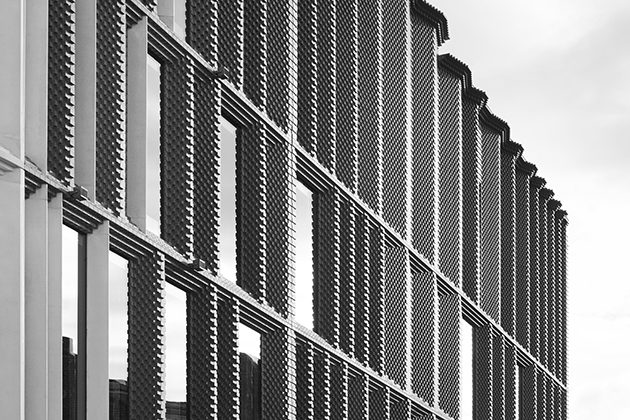
Brick cladding on the Victoria Gate Arcade in Leeds by ACME, completed in 2016 |
||
|
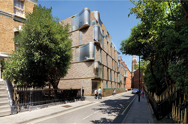
But if the architecture of digital decadence didn’t quite catch on, and the parametric revolution remains the work of one signature firm, there are signs that a certain synthesis is happening, with advanced design techniques being put into the service of creative historic reinterpretation. For example, a few years ago, a small firm called RARE renovated Bethnal Green Town Hall in east London, converting it into a hotel. The scheme included a large perforated steel sheath that was a prominent example of the trend towards large-scale digital ornament. In 2015, RARE secured planning permission for a housing scheme in west London that reigned back on the exuberance, being more or less a conventional London brick scheme punctuated by various curved glass elements, described as reinterpretations of traditional bay windows. Here the more disjunctive quality of the previous work has been abandoned in favour of a more evolutionary approach, ‘intended to present a clearly modern design in a subtle dialogue with its surroundings’, as RARE put it, which isn’t exactly an avant-garde battle cry. Another route is that taken by London-based firm ACME. With links to the AA and a history working for FOA – one of the UK’s only early-millennium digital firms that had any kind of success – ACME recently completed Victoria Square, a retail complex in Leeds that reads almost as a manifesto for this new sensibility. ‘We believe every architectural question has a local answer, one that is firmly contemporary but also rooted in local place and context,’ explains Friedrich Ludewig of ACME. Victoria Square features brick facades with precision-designed undulations that resonate with, but diverge from, local precedent. Its interiors boast all manner of folds, twists, curves and other digitalist tropes, but accompanied by patterns, tiles and varied materials that hark back to the classic age of the retail arcade. The design takes far more liberties with its source material than much current British architecture, revelling in its transformations, but at the same time it makes no attempt to create an alien landscape set apart from the traditional. As Ludewig puts it: ‘We are not interested to say the same thing as our neighbours, but we are keen to say something new, by learning to speak in a local Leeds dialect.’ |
||
|
RARE Architects’ proposed Castle Lane residential scheme in Westminster, London |
||
|
Elsewhere, ACME has submitted planning for a residential development in Aldgate, London, that demonstrates an alternative treatment of the current situation in British architecture. Designed for the Guinness Trust, it is due to replace the 194 rental flats of a 1970s development with 220 new rental and 270 new private units. Existing tenants are guaranteed a place in the scheme at the same rent, with no temporary relocations off site, which sounds like an admirable programme considering what many developers have been getting away with. The project greatly increases the density on site, but splits accommodation into a variety of buildings, each with a slightly different character based upon manipulations of a highly varied local context. Some are reflective, with the facade splitting and folding to increase views and light; others gently undulate in plan, with smoothed concrete units as balcony cladding. One will mimic the deco stylings of a listed neighbour. But much of the estate involves varied treatments of brick, with folds, arches and more, all combined with different textures, courses and tones. ‘We are interested to explore how each building can be made unique in response to specific local conditions,’ explains Ludewig. The scheme involves a number of inventive facade treatments, again using formal invention and advanced digital design tools, but also drawing design elements out of a close engagement with historic context. In Ludewig’s words: ‘It’s not diversity as an applied finish, it is diversity emerging from local context and specific performance.’ The current work of ACME and others may only constitute a small corner of the architectural scene, but it does point to the arrival of some kind of synthesis between the historic design that often descends into timid academic contextualism, and the wanton free-for-all that has previously marked out much of digital design. This article first appeared in Icon 164 – read more about it here |
||
|
ACME’s proposals for the Mansell Estate in the City of London |
||


