|
|
||
|
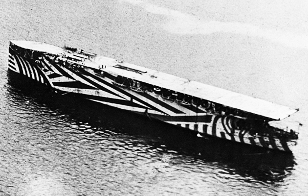
This year is the centenary of ‘dazzle paint’, also known as ‘razzle dazzle’, writes Christopher Turner During the first world war, the hulls and stacks of huge vessels were painted in bold shapes and violent contrasts of colour – zig-zags, stripes and sweeping, disrupted lines. In black-and-white photos they look like zebras as seen on LSD, but they were painted other colours too: red, green, yellow and numerous shades of purple. Why on earth were 4,500 British naval and merchant ships given these strange, eye-catching markings? In April 1917, Norman Wilkinson, a British marine painter and Royal Navy volunteer, was sailing on a minesweeper in the dangerous waters around Britain, a target for German U-boats. Ships were traditionally painted gunmetal grey, but Wilkinson realised the futility of camouflage in the changeable conditions at sea. He hoped to protect allied ships by making them highly visible yet infuriatingly confusing to the visual rangefinders of the German navy’s artillery: floating optical illusions that disguised the course, speed and size of a vessel. ‘Dazzle painting’ took its inspiration from cubist and vorticist art, in which shards of colour and shapes interrupt and bisect each other to simulate movement. Indeed, Picasso is said to have stopped spellbound in the streets of Paris when he saw a tank covered in these bewildering patterns and remarked: ‘It is us who created that.’ He had once suggested to Jean Cocteau that the army might ‘dazzle’ the enemy if it dressed in harlequin costumes rather than traditional uniform. Wilkinson, appointed head of the Dazzle Section, employed a team of 18 artists and model-makers, mainly women, in a special department at the Royal College of Art. Each of the maddening designs they created was unique and tested on a wooden scale model, which was placed on a rotating turntable and viewed through a periscope to simulate battle conditions. Edward Wadsworth, one of the founders of vorticism, served under Wilkinson as a dock officer, supervising the painting of over 2,000 ships. One American newspaper described them as a ‘flock of sea-going Easter eggs’. The Titanic’s sister ship, the Olympic, was requisitioned as a troop carrier and given these asymmetrical markings. Curves created a false bow wave, making it hard to gauge speed; angled smokestacks made the ship look like it was leaning into a turn; geometric shapes at the stern broke the form and added to the sense of confusion faced by a U-boat captain when he ascended to the surface, where his submarine was vulnerable, and he had only seconds to fire a torpedo just ahead of the vessel in his sights. The advent of radar rendered the patterning obsolete but, in the 1980s, the bold lines and harsh colours were revived in postmodern decoration. Wilkinson’s logical successor was Memphis, and in 1983 Peter Saville used Wardsworth’s 1919 painting, Dazzle Ships in Drydock at Liverpool, as the inspiration for his cover for Orchestral Manoeuvres in the Dark’s album Dazzle Ships. But perhaps the most enduring legacy of ‘razzle dazzle’ is in the automotive industry, where these striking markings are still used to make prototype cars confusing to prying cameras. |
Words Christopher Turner |
|

