Bold colours and effortless elegance: &Tradition teams up with the Panton family to welcome five scintillating colours and a 1970s black and white wave pattern to its Flowerpot range this spring
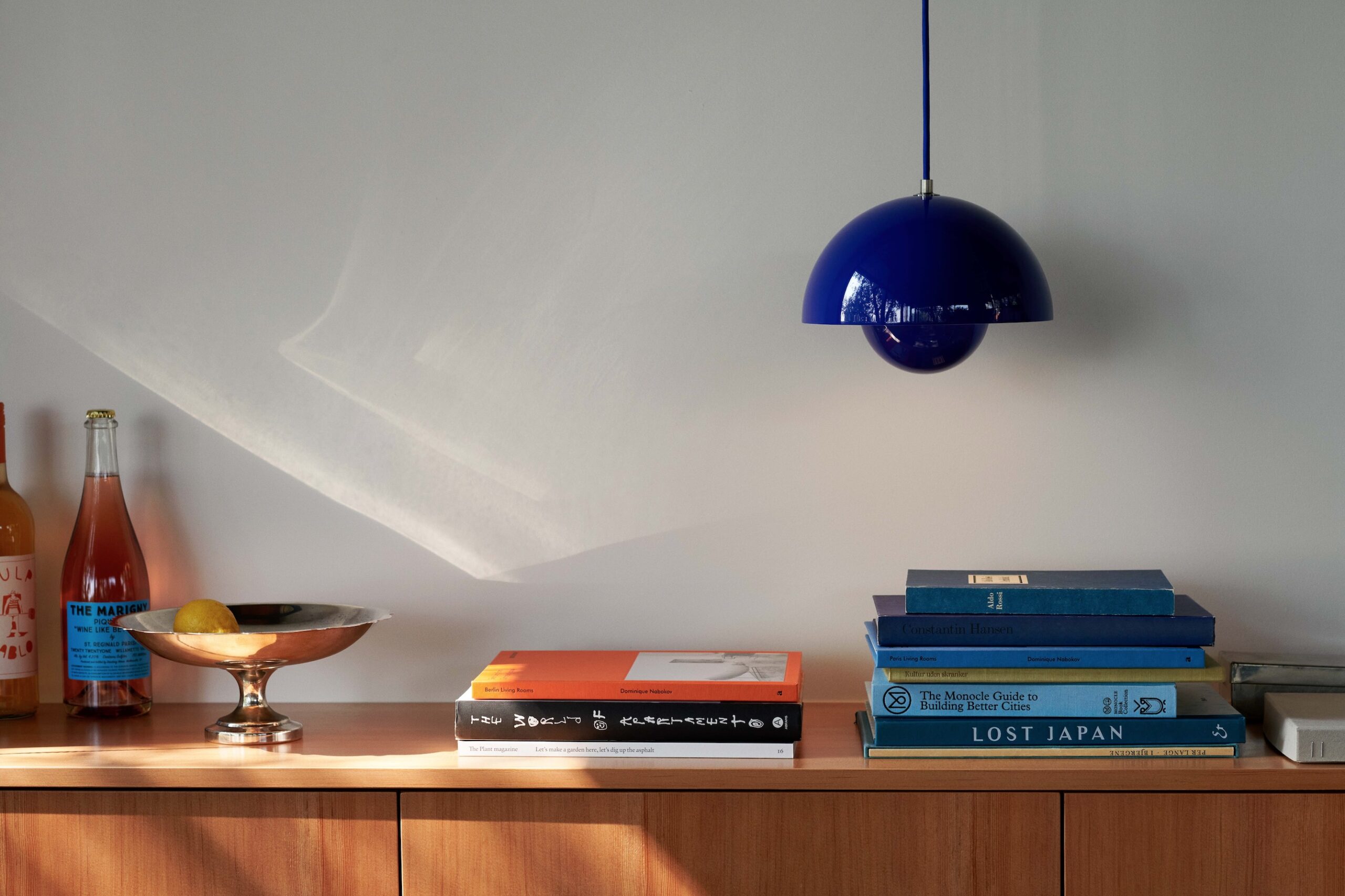 Photography courtesy of &Tradition
Words by Jessica-Christin Hametner
Building on proud traditions dating back to the 1930s, the heritage and design philosophy of Danish design brand &Tradition has been shaped by decades of dedicated craftsmanship, thoughtful illumination and captivating designs.
Established in 2010, the brand’s offerings represent an appreciation for the original designs, which do not, however, hold on to the nostalgia of the past, but prove that these enduring classics remain very much alive today.
The Flowerpot counts among these luminary icons. Originally designed in the 1960s by avant-gardist Verner Panton, widely renowned as a true master of colour, the lamp has become one of the most celebrated examples of norm-breaking Danish designs.
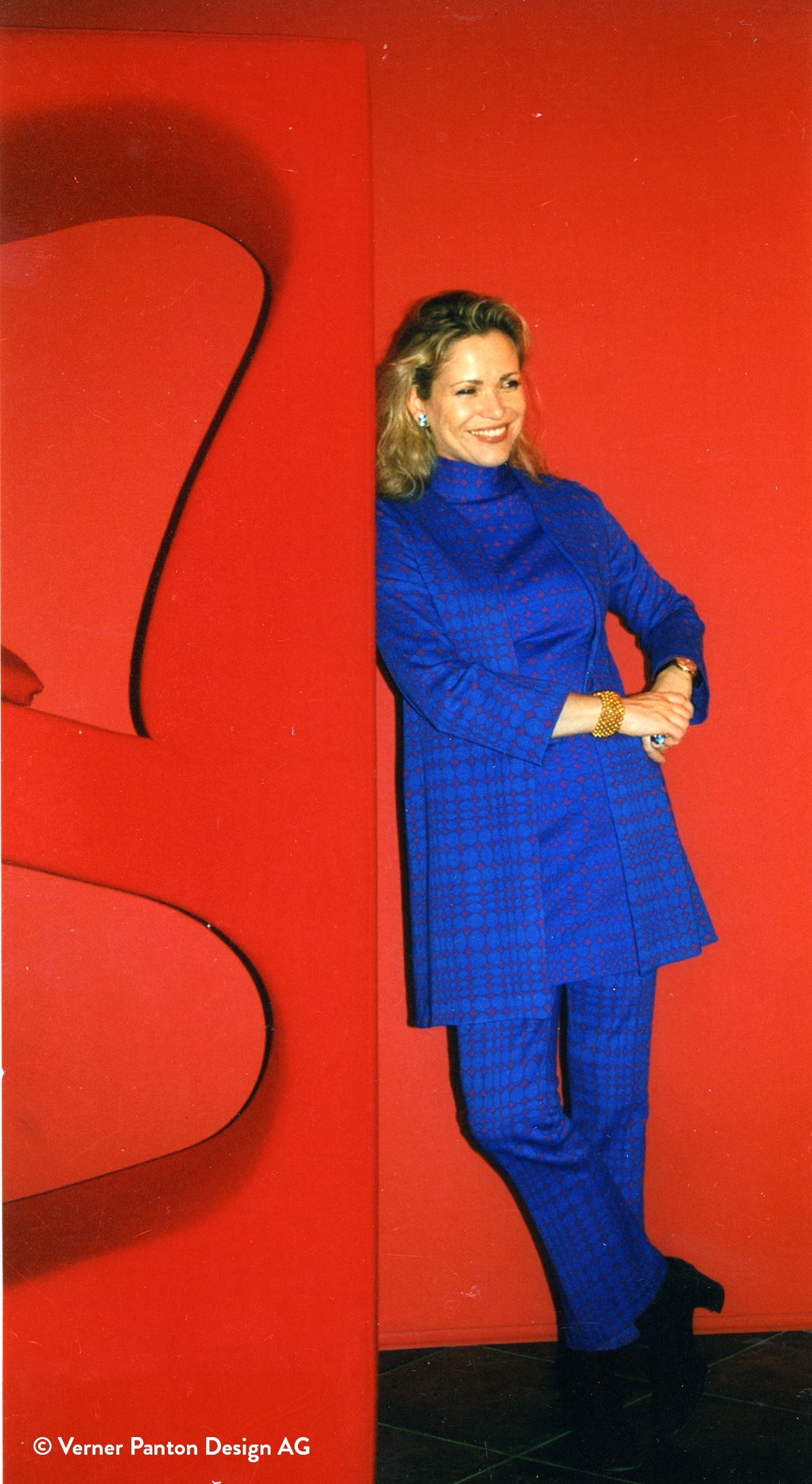 Photography courtesy of © Verner Panton Design featuring Carin Panton, Design by Verner Panton
One never afraid to experiment, Verner was gifted with a unique sense of colour. Understanding that it was more than just a decorative element, but one of many reflections on the function of an object, Verner embraced bold hues wholeheartedly.
‘My father’s journey with colour began in his early childhood,’ shares Verner’s daughter, Carin Panton von Halem. ‘Colour played a crucial and defining role in Verner’s work, whether it was for his furniture designs, lighting, textiles, or as a creator of exhibitions and installations. Aside from his designs like the Cone chair or the Flowerpot, Verner’s name is always associated with colour.’
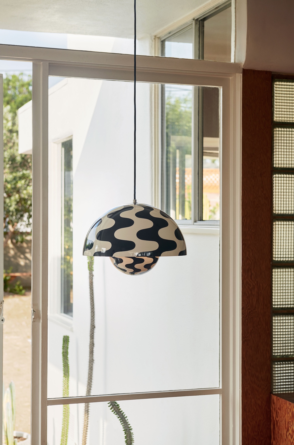
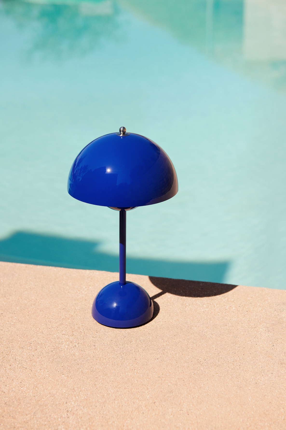
To represent Verner’s vision and his enduring legacy, &Tradition has now joined forces with the Verner Panton family to unveil five scintillating, vibrant colours – Cobalt Blue, Swim Blue, Vermilion Red, Tangy Pink, Dark Plum – to the Flowerpot range just in time for spring. Alongside this palette refresh, the Danish design house is also reissuing a Panton original – a hypnotic, black and white wave pattern.
 Photography courtesy of &Tradition
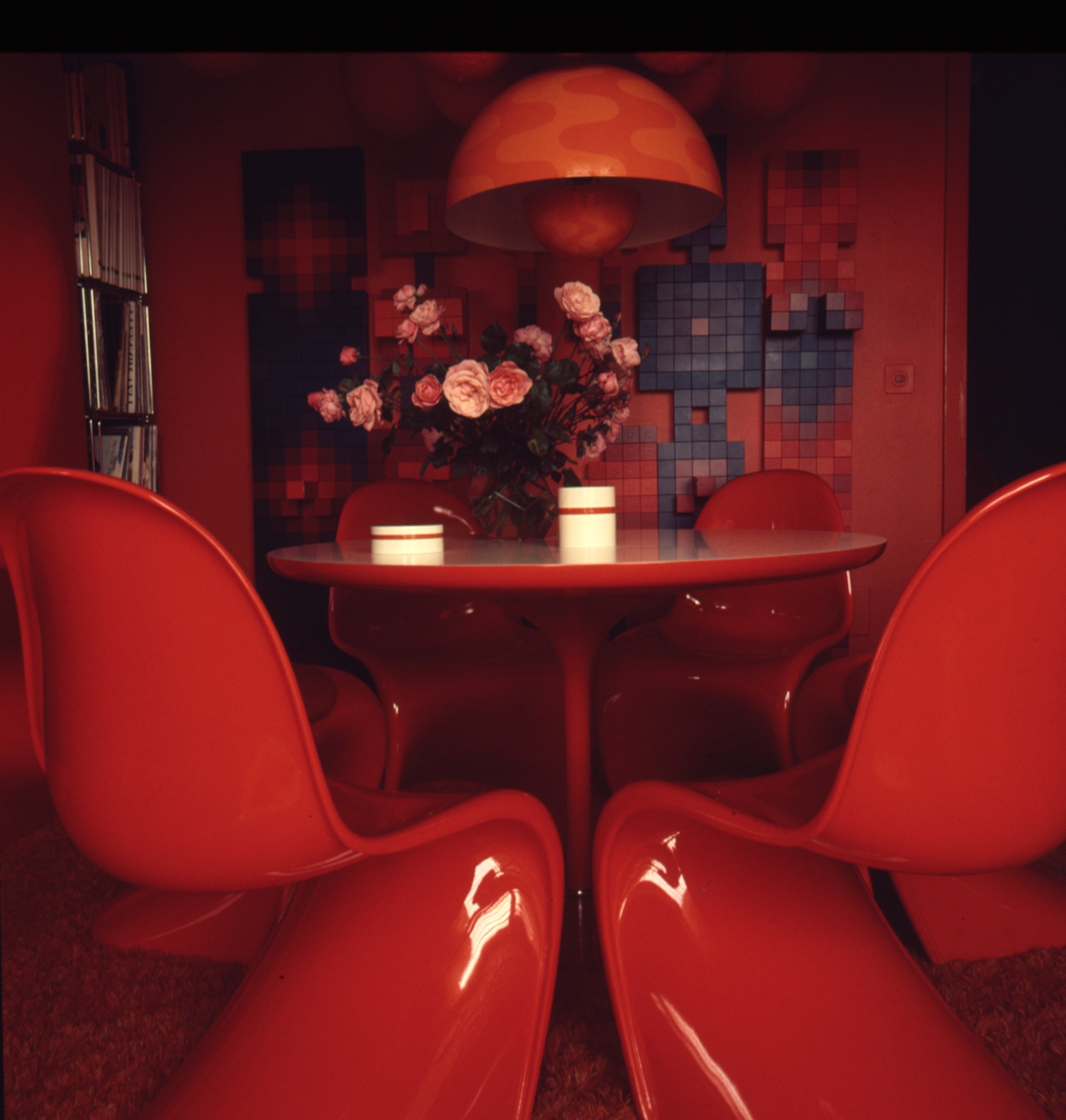
First used in 1968-70, the retro pattern has been pulled straight from the family’s archives and was initially designed to soften the overall appearance of the Flowerpot pendant. The distinct motif reminds of the immersive experience of Panton’s cave-like Fantasy Landscape which was part of the Visiona 2 exhibition for the Bayer textile firm presented at the furniture fair in Cologne in 1970.
‘The installation is considered to be one of the most significant spatial creations of the second half of the 20th century,’ adds Panton von Halem. ‘Spiral lamps in pink and blue were placed at the front of the entrance to a colour tunnel. Throughout his career, my father strongly believed that colour has a meaning and function. Choosing a colour should never be a gamble, but rather a conscious decision.’
The first of the five colourways, titled Cobalt Blue, is an intense contemporary shade that was also an original and popular choice for Panton in his early works, while a cool Swim Blue adds a fresh new look to the Flowerpot range. Besides these two shades, the graphic appeal of the lipstick-red Vermilion Red is informed by the Panton archives and though new to the Flowerpot, the shade was used in an invitation for Panton’s 60th birthday party in 1986.
 Photography courtesy of &Tradition
Meanwhile, a Tangy Pink brings a pop of colour to rooms, while a sophisticated Dark Plum shade can be identified in other Panton classics, including the Ring Lamp, a modular lighting element designed in 1969 for the Visiona installation. Staying true to the original without freezing the design in time, Els Van Hoorebeeck, Head of Design at &Tradition, reimagined the Flowerpot in a contemporary way while still respecting its history.
‘When we chose the colours we worked very closely with the Panton family because you’re touching an icon and it’s crucial to honour the original vision,’ explains Van Hoorebeeck. ‘It’s always important to look back into the past. We spent a lot of time going through all these books and it’s a privilege to get a little bit of insight into that history.’
Creating a warm and welcoming atmosphere wherever it is placed, the Flowerpot shows the powerful impact of understated lighting design, complete with a modern twist and a pop of colour. With its clever use of light and exquisite design, the simple shape and bold colour palette bring interiors to life while also highlighting how colour can be used to enhance wellbeing, creativity and optimism. Perhaps an often-under-appreciated element in product design, colour is making a comeback.
 Photography courtesy of © Verner Panton Design featuring private apartment Hasenrein, Design by Verner Panton
‘People are ready to use colour again, they’re keen to express their personality and step outside of their comfort zone, shares Van Hoorebeeck. ‘Panton’s world is perfect for a time like this.’
Perfectly proportioned and spruced up in a beautiful palette of colours, &Tradition’s head-turning Flowerpot collection pays tribute to Verner’s trailblazing work, creative legacy and revolutionary approach to colour.
A true celebration of Danish design, the Flowerpot blends seamlessly wherever it is placed, but moreover, it makes a statement of modern elegance, which will continue to appeal to generations of design enthusiasts.
Get a curated collection of design and architecture news in your inbox by signing up to our ICON Weekly newsletter

