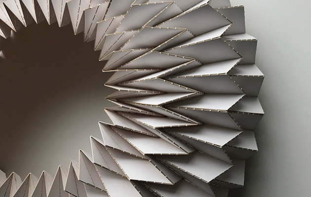
 Kinetech has created a giant folded origami under St John’s Gate
There’s still time to visit some of the most inspiring and challenging installations in Clerkenwell Design Week 2018. Joe Lloyd has had a wander around London’s favourite design festival.
If you head down to Clerkenwell Design Week, beware: something strange hides beneath St John’s Gate. Royal Approval, one of this year’s installations, is a giant wreath of thin metallic panel. Its creators, the recently established Kintetech Design, compare to both to the creased paper of origami and the Elizabethan ruff; to me, it conjures up nightmares of a lamprey’s maw.
Although the oddest installation here, it is also the only one to tie closely to the area’s history: the gate was once the home of the Master of the Revels, where Renaissance playwrights would have had to present their works for his approval, hence the ruff. As the studio’s name suggests, the sculpture is kinetic, in that it can be collapsed to a smaller size and re-extended. When I beheld the piece it had begun, a little worryingly, to sway in the light breeze. A set of blue lights, barely visible in the midday sun, suggest that it might sparkle to life at night.
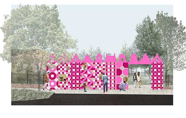 Hakwood’s whimsical Behind Closed Doors installation by Spa Fields
If Kinetech provided this year’s most terrifying piece, Hakwood’s Behind Closed Doors is the most comfortingly whimsical. Grafted onto one side of Spa Green, it is a Lewis Carroll-via-FAT inflected ‘miniature streetscape’ comprising a row of bubblegum pink gable-topped miniature townhouses. In each one a studio had created a minuscule doll’s house-esque room. There are wildly various results, from Studio Bami’s patch of vegetation to Stolon Studio’s people-filled diorama of an exterior ‘room.’ The most tantalising is Grey Griffiths’ River View House, a convincing replica of a Lloyd Wright-style villa replete with windows onto water.
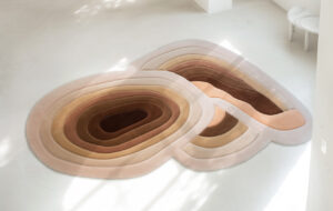
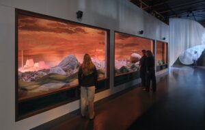
Squashed onto the chunk of paving euphemistically known as St John’s Square is this year’s largest installation. It is essentially a carpet showroom. But what carpets they are. Designed by Timorous Beasties for the luxury flooring manufacturer Brintons, the scaffolding barn is hung and floored with rugs based off things that are seen from above — a little like, you might think, carpet itself. But these elemental patterns— based on sand dunes, stone moss, magma and so forth — are beguiling in their ruggedness and organic complexity. The structure itself is made of scaffolding, and will be given back to the construction industry at the week’s close.
Sustainability was a recurring theme this time around. Three architecture studios collaborated with polystyrene manufactures Bakers Patterns for Reform, which spotlighted that material’s recyclable quality. Reforged into somewhat slight sculptures and painted in so-called ‘Clerkenwell pink,’ it is the texture of these works that intrigues: they less resemble the air-filled packaging favourite than MDF. Unfortunately, although polystyrene can be reused, municipal recycling plants haven’t yet implemented the technology required to do so, and most ends up in landfill. The material used here will be returned to industry, but unless change is implemented soon it is surely only a matter of time before they face a similar fate.
Over in St James’ churchyard, meanwhile, visitors were encouraged to bring their old tote bags — perennial debris of the design fair — and have them reprinted with slogans (the best: “I’m f*cking sick of tote bags”) by UAL students, in return for a small donation to cancer charity Maggie’s. Judging by the queues this scheme was a success, though a disproportionate number of attendees seemed to be using brand-new bags rather than battered old favourites.
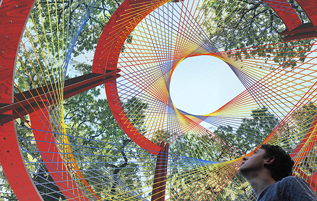 Scale Rule has built a multi-coloured, multi-layered pavilion in the gardens
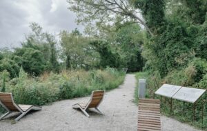
A few metres away, laudable charity Scale Rule presented their latest Next Generation Design Pavilion, a ring of wooden benches for recliners topped by webs of polychromatic threads. This annual scheme sees schoolchildren spend a weekend designing installations, before a team of young architects and designers are drafted into construct the winner, harnessing both the children’s capabilities and allowing recent graduates to realise something in three-dimensions. Fully modular, structure will be deconstructed and reassembled in a Rotherhithe playground.
And another few metres away stood A Piece of Sky, by the Swiss architect Stephan Huerleman and Sky-Frame. A hexagonal tube with mirrored sides terminating in an ever-shifting wall of soft coloured light, it beckoned one in. So ensconced, the viewer could gaze at the illusion of a vast honeycombed sphere, while listening to NASA recordings of the earth’s resonance. These simple elements, when combined, instilled a sense of being out of the world, even out of body — a welcome rest, for a few moments, from the fair’s bustle, and the only piece here to be truly transporting.
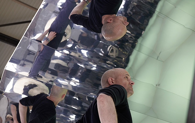 Stephan Huerleman in A Piece of Sky, a moment of calm in a bustling festival

