|
|
||
|
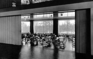
An elegant, contemporary response to Sir Giles Gilbert Scott’s recently renovated New Bodleian Library – which opens tomorrow (21 March)– Barber Osgerby’s bent-oak and leather chair is designed to be comfortable for up to 12 hours of uninterrupted study Last year, the University of Oxford held a competition to design a reader’s chair as part of Wilkinson Eyre’s refurbishment and renewal of Sir Giles Gilbert Scott’s New Bodleian Library, built in the 1930s – and opening tomorrow. More than 60 design studios entered and three finalists – AL_A, Matthew Hilton and Barber Osgerby – were asked to create prototypes. The winner, Barber Osgerby, has had a busy year, with a huge installation for BMW in the Victoria and Albert Museum‘s Raphael Cartoons Gallery during the London Design Festival, and a new gallery at the Science Museum devoted to the information age. Icon visited the design duo in their Shoreditch studio – where work is underway on the design of a new train for Crossrail – to try out the finished design. ICON: Like the Tip Ton, which can be rocked forward, your Bodleian chair allows for a level of movement. How did you hope to make readers as comfortable as possible? JAY OSGERBY: Readers virtually live in the Bodleian – the brief said that it had to be comfortable for up to 12 hours of continuous use, which is a big challenge for any kind of seating, even a car seat, because it’s rare a journey would be that long. We worked a lot, through trial and error, to make sure the ergonomics were completely perfect. It’s quite a spacious chair, so you can fidget without it being constricting. And, of course, the forward tilt is something we learnt from the Tip Ton project for Vitra. Having the tiniest amount of forward tilt is great, because it allows the blood to flow more easily around your body; it’s great for your posture and lower back. Ed and I have the advantage of being either end of the height demographic, because I’m short and he’s tall – and if we’re both comfortable enough in a chair, we know that covers everybody.
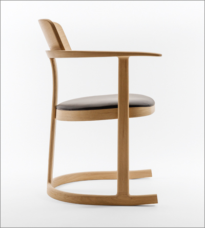
The Bodleian Libraries Chair, with its slight forward tilt ICON: How did your design take inspiration from the historic features of the space? Did you make deliberate reference to the verticality of Scott’s architecture, as seen in the windows of the New Bodleian as well as Tate Modern and Battersea Power Station? ED BARBER: Well, not deliberately – but I like that. Most chairs are seen from the back and we wanted to make sure it had a recognisable graphic language. They work really well in a series and of course that’s a key thing for a chair like this. This isn’t a statement piece – though they did want something distinctive – and during the process we made lots of renders to see how they would look en masse. JO: The chair needed to be something that respected the environment in which it was supposed to live, but be quite new looking. We visited the library, of course, and both already knew it well. It had to sit well not only in the newly renovated Weston Library but in the old parts as well because, in time, the Bodleian is going to replace all the chairs. ICON: Are the chairs now installed? ? EB: Yes, they’re in there and look great all together. The Bodleian is going to sell them in its shop – I think Isokon has a licence too. And there have been a couple of enquiries, actually, from libraries in America. ICON: Since they’re not made of plywood, why did you choose to collaborate with Isokon, famous for Bauhaus pieces in bent plywood? EB: They’re brilliant – we’ve worked with them for years. Actually, our first furniture piece, the Loop Table [1996], was made with them, and we have absolute faith in their craftsmanship. Most of their work isn’t plywood, and they can get their hands on the most amazing, flawless oak, which we wanted to use for these chairs. ICON: How did the finished chair differ from the prototype? JO: It got more refined, basically. Having been shortlisted, the real challenge was converting that vision into something that was super-comfortable. The big change was the seat. At first we had the seat supported with a flying cushion, in the Danish way. EB: Then we decided it was much better to make it a sprung construction, with upholsterers’ webbing, a little bit of foam and then the leather on top. You have a thin, visibly simple-looking seat, but it’s actually really comfortable. It’s incredibly beautifully made: Jay and I are really interested in creating things that have a long life and, if looked after correctly, there’s no reason that these chairs couldn’t last forever. A story about the new library will appear in our June issue |
Words Christopher Turner
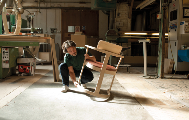
Above: Jay Osgerby with the chair
Images: György Kőrössy |
|
|
||

