|
|
||
|
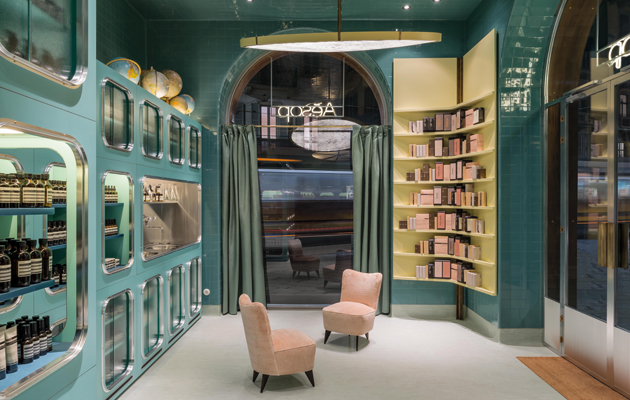
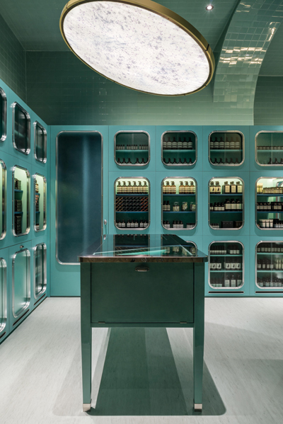
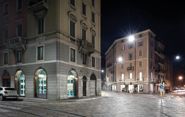
Dimorestudio’s store for the skincare brand is an idiosyncratic concoction, influenced by pop art, local bottegas and grand Milanese villas Dimorestudio’s design for hair and skincare brand Aesop’s new Milan shop is suitably individualistic: well, Dennis Paphitis, founder of this high-end Australian company, which has stores worldwide — from Melbourne to New York — abhors soulless, homogeneous chains. Accordingly, Milan-based Dimorestudio, which also designed Aesop’s Paris store, has dreamt up a space that responds to the shop’s context and idiosyncratically layers contrasting influences, such that its style can’t be deciphered at a glance. Aesop’s brief was relatively open-ended. ‘We were asked to make a beautiful space that ties into the city and neighbourhood,’ say architects Emiliano Salci and Britt Moran. ‘With the Paris store, our inspiration was classical French taste, whereas we wanted to give the Milan shop local, distinctive traits. Its glass-fronted fittings are reminiscent of storage cabinets in grand Italian villas, such as Milan’s Villa Necchi Campiglio, designed by Piero Portaluppi.’ But rather than focus on this 1930s villa’s statelier aspects, the architects zeroed in on its functional elements, namely the linoleum floor in the butler’s pantry and the kitchen’s aluminium sink, the latter inspiring the shop’s grey lino floor and its stainless-steel sink (used by customers sampling Aesop’s products). Another inspiration for what is Aesop’s second Milan store – located on via Meravigli in the city’s historic district (Leonardo da Vinci’s The Last Supper hangs in the nearby Santa Maria delle Grazie) – was traditional neighbourhood bottegas (or shops). Unifying the store’s interior is a predominantly teal colour scheme, occasionally broken up by plain shelves in a buttermilk shade. The display cabinets and glossy ceramic tiles lining the walls and ceiling are in the same lagoon-like blue, a colour that may remind British visitors of Heinz baked-beans cans. This impression is reinforced by the shiny metal that frames the cabinets’ round-cornered windows – a nod, the architects reveal, to early Airstream caravans.
The ‘Heinz blue’ of the cabinets gives a 1960s feel to the interior While the interior consciously references the 1930s, this blue also feels very 1960s: think The Who’s 1967 album The Who Sell Out, the cover of which features a giant Heinz can spewing beans, or the supersized cans used to display Heinz comestibles in the pop art-inspired food hall at London’s hip 1970s emporium Biba. In fact, the Aesop shop interweaves pop and high-culture references: the cabinets might allude to haut-bourgeois kitchens but they also recall supermarket chiller cabinets, while the tiles bring to mind underground stations or municipal pools. Juxtaposed with these industrial and pop elements are sumptuous, old-world touches: Elastoplast-pink velvet-upholstered chairs and opulent pendant lights. The common thread running through the space is its self-consciously retro, off-key palette of muted greens, yellows and pinks, which the architects fancifully liken to talcum powder-dusted surfaces. While this makes for a pleasingly cohesive aesthetic, it’s the shop’s idiosyncratic, contradictory references that give it its true character. (A row of globes, suggestive of travel and exploration, whimsically adorns one shelf.) The architects themselves say they didn’t want to simulate the interior of a villa literally: ‘We aim to create rather than recreate spaces. We wanted to imagine what a bustling, industrious kitchen and pantry may have looked like in an elegantly appointed Milanese villa, then give it a contemporary twist.’ |
Words Dominic Lutyens
Above: The shop’s glass-fronted fittings recall storage cabinets in grand Italian villas |
|
|
||
|
The store is located on via Meravigli in Milan’s historic centre |
||

