words Justin McGuirk
The exhibits at Tokyo’s design week tended to have one thing in common. Justin McGuirk looks at the dark secret behind all those dazzling surfaces.
Kenya Hara is looking away and holding his chin. The graphic designer and creative director of Muji is still as a monument. He hasn’t even twitched for nearly 30 seconds. The silence is not embarrassing, it’s startling. Just as I’m wondering whether to check his pulse, he turns back to me and says in a deep voice, “… I don’t know.” So far, no one has answered the question. To be honest, no one really gets the question. It’s a dumb question, the kind only an unsophisticated gaijin (foreigner) would ask: Why is everything white?
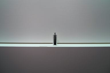
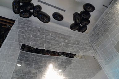
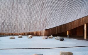
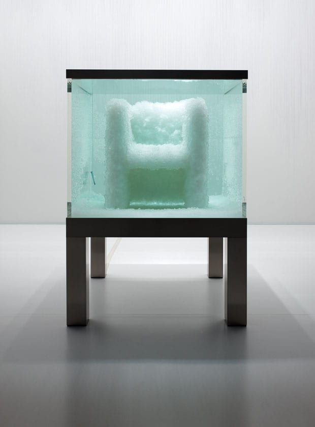
If you made a circuit of the various design exhibitions in Tokyo last November, during the city’s annual design week, you might have been struck by something. Whiteness. Step in from the vibrant city outside and, suddenly, the serene silence of white. In my case, it began on my first day, at an exhibition by Hara called, simply, White. His graphic work and product design at the Ginza Graphic Gallery was displayed against acres of white space. The trail then took me to Tokyo Design Tide, one of the week’s linchpin events, where the talking point was architect Makoto Tanijiri’s ethereal exhibition design – white feathery-fabric walls suspended from helium-filled balloons. Its dreamy whiteness seemed incidental, until I went to Issey Miyake’s new museum, 21_21 Design Sight, where designer Tokujin Yoshioka had curated a show called Second Nature. As a piece of art direction, it was as though Yoshioka was simulating one of the antechambers of heaven. The ceiling was festooned with a cloud-like installation of white straws while, beneath, he was growing furniture out of white crystals in Damien Hirst-style vitrines. Finally, and without meaning to pursue this pattern, I visited Clear Gallery in Aoyama for a show of Shiro Kuramata’s early work from the 1960s and 70s – a puritanical medley of white and transparent plastic.
It’s possible that this was all just a coincidence, but by this point I had a question too obvious to ignore. What is the Japanese designer’s obsession with the colour white? Surely it’s not just anal minimalism. It’s certainly nothing to do with trends. What then, chromophobia?
By chance, the first person I asked was Miyake’s creative director, Dai Fujiwara. At first, he looked at me as though I was wasting his time. “Putting Hara and Tokujin together makes you fresh, like drinking soda water, but they’re very different,” he said, reluctant to make frivolous comparisons. Eventually, though, he opened up. “We live in the information society – very fast – our time needs speed. White is very easy to understand, but how much depth [is there] if you use easy things? It’s very dangerous!” Dangerous? “Yes, white can be cheap and easy, or rich and deep. Information society needs depth as much as surface.”
It was a cryptic beginning, but intriguing. Fujiwara suggested I speak to Hara. He has written a book about the colour white – “shiro” in Japanese – so he ought to know more than most about the reasons for this strand of asceticism (if that’s what it is) in Japanese design. “White is not just a colour. White must be called a design concept,” Hara has written, portentously. But when I meet him, he is reluctant to make any generalisations about the way either he or any other Japanese designers use white. “I don’t know why Tokujin Yoshioka uses white … he is very interested in materials,” says Hara. “When he abandons colour, the expression becomes more focused on the material directly.” So, he’s not choosing white, he’s merely choosing not to use colour. The whole point of Yoshioka’s show seems to be to find a way of designing that is analogous to natural processes – in other words, freed from the designer’s overtly creative impulses to shape or to beautify, for instance, with colour.
Hara explains that in ancient Japan only four colours had names: black, which referred to darkness; red, used to describe the quality of fire; blue, which was ambiguous; and white, which was singular, “like a water drop reflecting sunlight”.
“My profession is making information singular against a background,” he says. So white, for a graphic designer, is simply the clearest context in which to communicate a message. How pragmatic, but what happened to white as a “design concept”?
In his book, Hara links white to the idea of emptiness. In Japanese philosophy, he explains, emptiness is a state of limitless potential, known as “kaizen”. It’s a temporary state, awaiting the influx of energy. And so the use of white is an incredibly humble and optimistic gesture, as though it is not for the maker to complete the work. However, when we meet, he adds a nuance to that idea that has much more to do with the search for a national identity. He shows me a diagram of the influences, both Asian and Western, that have acted on Japanese culture. “White is deeply related to ultimate plainness,” he says. And “ultimate plainness”, it becomes clear, is the Japanese way “to reject all the influences of the world – to refuse other cultures”.
This desire to reject foreign influence is a longstanding one in Japanese design. Junichiro Tanizaki’s classic text In Praise of Shadows, written in 1933, overflows with nationalistic angst. He advocates rough natural materials and darkness as a way of fighting bland Western modernity, with its bright lights and white ceramic toilets. Ironically, whiteness has become the modern equivalent of Tanizaki’s shadows. The 21st-century version of ultimate plainness is a snowy monochrome. “There are two vanishing points in Japanese culture,” says Hara. “One is darkness and the other is white. Contrary to Tanizaki, I like whiteness.”
It seems fitting to end my trail with the minimalist Shiro Kuramata – even his name means “white”. Perhaps it was Kuramata who flipped Tanizaki’s old-fashioned idealism on its head. In the late 1960s he purged his furniture of any expressive details, stripped it down to the colourless plastic, and that purity is now seen as quintessentially Japanese. The architect Arata Isozaki saw Kuramata’s work as a luminous alternative to the “bombastic kitsch” of the developers who, as he saw it, were ruining Tokyo. We call it minimalism, Isozaki called it “tenderness”.
