words Marcus Fairs and Kieran Long
|
|
So farewell Milan and hello, er, Rho-Pero. With the Salone Internazionale di Mobile moving to a new out-of-town location next year, this year’s furniture fair marked the end of an era.
It was a good send-off. The general consensus was that, for the first time in a long while, the official halls of the Salone were more interesting than the melée of off-site events collectively known as the Fuori Salone (which will be staying in the city).
There was less of the radicalism of previous years; instead, independent designers seem to have become so polished and professional that much of their work is indistinguishable from that of the big brands.
The Salone Satellite, traditionally a good hunting ground for hot young talent, was blandly disappointing; the Superstudios were superslick; and designersblock seemed to be suffering from designers’ block.
So our top ten products, shows and designers from this year’s event are rather more skewed to star designers and established companies than we would like. We also make no apologies for the heavy representation of Dutch designers and brands: Milan once again shows how this small nation continues to produce the most innovative and intelligent design. We’ll be showing more from Milan in our next issue.
|
|

|

Paul Cocksedge’s Crystallize
|
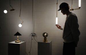
Paul Cocksedge was responsible for the best individual design we saw at Milan this year. His Crystallize chandeliers, part of Swarovski’s Crystal Palace show, each use just a single crystal mounted on a tubular glass frame combined with a single laser to ethereal effect. They looked effortless compared to the baroque creations of Karim Rashid, Yves Béhar and Studio Job, or the high-tech trickery of Ron Arad and Tokujin Yoshioka. Cocksedge has also neatly subverted the objective of the show: to showcase Swavorski’s products. “Swarovski asked me how many crystals I needed and I said just five,” said Cocksedge. “They were a bit worried.”
|
|
|

|

Marcel Wanders’ Happy Hour
|
Marcel Wanders was ubiquitous this year, not only showing work for Moooi, Bisazza, Moroso and a host of others, but also propping up at Bar Basso until closing time practically every night. Yet apart from his kitschy Ballerina chair for Baleri Italia, his work was consistently beautiful, surprising and diverse.
Like his fellow Dutch designers, he’s not afraid to be influenced by both past (baroque seems to be a preoccupation at the moment) and contemporary trends (such as the bug patterns of Studio Job and the delicate florals of Tord Boontje and Hella Jongerius) and give them his own distinctive twist. He was also responsible for the most talked-about party of the week: his Happy Hour chandelier launch featured his girlfriend, Nanine Linning, suspended upside down above the crowd serving champagne. Wanders is probably the hottest designer in the world right now and this was his year.
|
|
|

|

Frank Tjepkema’s laser-cut lamps
|
Droog was once again responsible for the most thought-provoking show in town. Each year, the Dutch collective uses the fair to present a conceptual body of work that then drives its more commercial output for the rest of the year. This time around, their Value for Money show examined the role of value – both financial and ideological – in design, and marks Droog’s move into products aimed at the mass-market.
The exhibition invited visitors to compare three increasingly expensive versions of various products and vote for their favourite. It was accompanied by a shop selling a new range of affordable Droog products such as washing-up brushes. It was Ikea with a narrative, showing Droog is not afraid of tackling one of the great taboos of design – the price tag.
|
|
|

|

Patricia Urquiola’s Divano Bloomy
|
Moroso was the talk of the Salone. The Italian brand, headed by Patricia Moroso, presented an assured collection that took its cue from the exuberant florality of Tord Boontje’s triumphant Happy Ever After show last year, but added touches of computer baroque and a darkly gothic undertone. Most of the big brands are now rolling out products by the same roster of big names, but Moroso – with launches by Konstantin Grcic, Ross Lovegrove, Patricia Urquiola and Marcel Wanders, among others – seems able to tease consistently good work out of all of them. Apart from Ron Arad, that is, whose Ripple chair was the only weak spot.
|
|
|

|

Miki Astori’s nestable serving bowls
|
Cor Unum put on a stunning show this year – low-key but quietly confident – which showed the first collection under new art director Ed Annink. The Dutch ceramics company has produced a selection of tabletop objects – bowls, serving plates, salt and pepper cellars and candle holders – inspired by the painting As the Old Sing, So Pipe the Young (1663) by the Dutch master Jan Steen. Annink said: “I wanted to express and to stress our cultural heritage as well as the thoughtful, natural way in which one can use everyday objects.” The pieces have the quality of loved everyday objects rather than fetishised design icons. Particularly beautiful were the ingenious stacking serving bowls by Miki Astori, and Wieki Somers’ Blossoms vase.
|
|
 |
 |
Konstantin Grcic is developing an aesthetic all his own. His Miura stool for Italian manufacturer Plack is the latest incarnation of his seductive industrial space-age styling. Grcic’s interest in industrial production techniques has resulted in this reinforced polypropylene bar stool, produced in one block, giving it a strong material and formal character.
|
|
|

|

|
Gorilla Luce is the name of a glowing ape-shaped light by Shiu-kay Kan that was on show at designersblock – but we were more taken by the tiny battery-powered LED that he was giving away as a promo gift. After all, no Milan round-up is complete without a novelty, and this was the most desirable this year – evidenced by the fact that the hotel cleaner walked off with a couple of ours.
|
|
|

|

Naoto Fukasawa’s Shelf X for B&B Italia
|
Japan is rapidly emerging as a serious contemporary design force after decades of aping the west, and the confident showing of the country’s designers and brands was one of the stories of Milan. Naoto Fukasawa was everywhere; Tojukin Yoshioka, Shiro Kuramata and Shigeru Uchida were in town and companies including chair maker Nextmaruni, lighting brand Yamagiwa and conceptual team Yamaha Design Laboratory showed strong bodies of work – most of which was white and ethereally geometric, seeming to take its cue from the exquisite modernism of Japanese architects such as Ando and Ito. Unfortunately, the Japanese seem strangely averse to preparing CDs of press images, so we are unable to bring you much of their work.
|
|
|

|
 |
Hella Jongerius’ output is more low-key than her compatriot Marcel Wanders but then her work is more about mastery of detail than showmanship. Once you found it, her work displayed her lyrical touch and gently ironic command of material and decoration. Perhaps her most beautiful showing was for the Royal Tichelaar Makkum, a 400-year-old Dutch ceramic manufacturer. The tange of pots and dishes is based on authentic 17th- and 18th-century Majolica. Each piece appears to have been dipped in the glaze, leaving a small portion in the distinctive beige colour of the raw clay. On this background, Jongerius has designed decorative patterns that blend historical motifs and her own influences.
|
|
|

|

Herzog & de Meuron’s Hocker stool and Jingzi lights
|
Vitra hasn’t shown in Milan for a number of years but its return was triumphant. Its show, which transformed a pelota stadium in the Brera district, showed that the German company has both the most impressive back-catalogue of classics and the most illustrious roster of collaborators of all the major brands. In a space curated by the Bouroullec brothers, Vitra showed their entire Home Collection together for the first time. This included domestic furniture and lighting by the likes of Frank Gehry, Herzog & de Meuron, Jasper Morrison and Hella Jongerius, as well as classics by Charles and Ray Eames, Isamu Noguchi, Jean Prouvé and Verner Panton. This was Vitra flexing its muscles – presenting beautiful reproduction pieces and pleasingly diverse new work by credible designers and architects.
|
|
|

|

|
De Makers Van were featured in our Milan preview in the last issue, but we’ve cheated and slipped their Laced Fence in at number 11 of our top ten in this issue because it genuinely was one of the outstanding moments of the fair. Exhibited at the Design Academy Eindhoven show, the hand-woven wire barrier by recent graduates Joep and Jeroen Verhoeven and Judith de Graauw suggests a whole new avenue of collaboration between craft and industry and takes the recent trend for surface decoration into an area that has until now been a no-go zone for designers. It confirms, if confirmation were needed, that a new generation of Dutch designers is emerging that will ensure the country remains the world’s undisputed design hotspot for some time to come.
|
|


