|
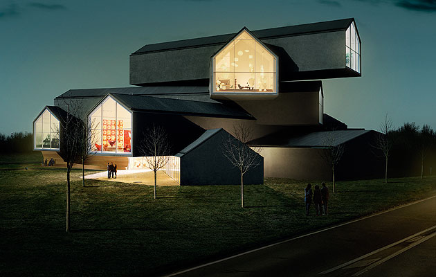
The volumes cantilever up to 15m (image: Leon Chew) |
||
|
The first time I saw Herzog & de Meuron’s VitraHaus it was made of gingerbread The first time I saw the VitraHaus it was made of gingerbread. Carefully stacked and finished with beaded icing, it looked delicious on Vitra’s 2009 Christmas card. It was clear even from this confection that the building was meant to serve as a new emblem of the venerable Swiss furniture manufacturer. But, standing in front of Herzog & de Meuron’s completed structure in Weil am Rhein, it’s hard to shake the mental image of the gingerbread house. It’s partly the easy transition from building to cake – from VitraHaus to LebkuchenHaus – that makes these charcoal-grey walls anticlimactic compared to their dreamy biscuit analogue. But it’s also the aptness of that image. Here, thousands of Hansels and Gretels will come to furnish their homes. Is it too arch to collide the Grimm fairytale and Vitra’s business ambitions? What is Vitra selling if not a fairytale? Come in, my little ones, and choose the home – the life – of your dreams. The VitraHaus embodies the modern idea that consumers want experiences as much as things. It’s the ideology that Miuccia Prada has pursued so effectively with Rem Koolhaas, that the commodities themselves are merely the lovely residue of communion in a temple of culture. The difference here is the context. This isn’t New York or LA, it’s not even Basel – it’s an industrial park in Germany, just over the Swiss border. Having said that, it’s not your average industrial park. Since 1981, when Nicholas Grimshaw was invited to build a new factory here, Vitra chairman Rolf Fehlbaum has been accumulating structures by the world’s most celebrated architects. Frank Gehry built a museum here, Zaha Hadid a fire station, Tadao Ando a conference centre, and those are just a few of the facilities, to which will soon be added another factory building, designed by SANAA. The Vitra campus is an architectural theme park, although with none of the negative associations of that term. Like the gingerbread house, the campus is a fairytale creation, a curated zone where only the best architects in the world are allowed to play – a far cry from the pragmatic mediocrity of real cities. Fehlbaum himself, a man of refined tastes and shrewd business instincts, has done well to take on the mantle of the artistic patron. Because now Vitra is a day out, a complete brand experience for the design pilgrim-cum-shopper. The campus already gets 100,000 visitors a year and Fehlbaum needs to capitalise on that. He is refreshingly honest about what a torrid time the company has been having since the recession, and it’s clear that the VitraHaus represents a brave new strategy. The company is shifting the emphasis from office to domestic furniture, and hoping that it can lure homemakers to its dream factory in Weil. To do this, instead of importing the talent from the far ends of the Earth, Fehlbaum has turned to a pair of architects who went to the same school as him. Herzog & de Meuron are probably Basel’s most famous export after Roche drugs. Sitting on the northern edge of the campus, the VitraHaus is intended as a gateway structure, one that announces your arrival. To that end it rises much higher than the other buildings. Ostensibly, it is a stack of houses. In fact, even in the most literal sense it is a stack of houses – or archetypes, let’s say: the perfect Swiss pitched roof house. The kind that Herzog & de Meuron reified in its lapidary Rudin House (1997). There is a stereotype of Swiss architecture that is quite instructive in this instance. Essentially, it posits taste above genius. In other words, Swiss architecture is well made and refined but above all safe and somehow sterile. The cliche holds that the Swiss architect can only express himself in the minutiae of details. The question is, does the VitraHaus subvert or conform to such truisms? On the face of it, Herzog & de Meuron are ripping up the form book. Surely this heap of structures is too chaotic, too monumental, too expressive, too playful, too – let’s face it – untidy. And yet somehow not. Compared with its low-lying neighbours it is strident, but this is one of those odd buildings that exists in two contexts: one is in Weil, and the other is in the global firmanent of ideas avidly devoured by young architects on the digital hinterlands of the web. There, this building feels more familiar.
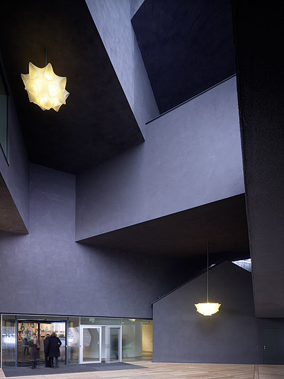
The courtyard entrance is the best place to appreciate the structural complexity (image: Christian Richters) It is impossible to write about the VitraHaus without addressing a phenomenon that has been sweeping international architecture in the last few years: the stack. In the future, architecture historians may trace this typology back to mid-20th century Dutch modernists like Hugh Maaskant, whose comfort with bigness and the honest inelegancies of multifunctional buildings were such an influence on Rem Koolhaas. It was certainly Koolhaas who engendered the stacking of “programmes” – or functions – in the generation to have emerged out of his office in the last decade. REX’s Louisville Plaza in Kentucky is a brute of an example, but the methodology has since been refined in Japanese hands by the likes of SANAA (at the New Museum in New York) and Sou Fujimoto. The timing of VitraHaus is propitious as next month Sou Fujimoto will be opening his Tokyo Apartments housing project, a stack of houses in the most literal sense. Impressively, Fujimoto’s design manages to be more chaotic, more extreme and yet more delicate. More than a device, or even a trope, the stack is becoming a style. Take a stroll through Herzog & de Meuron’s offices and you’ll see it plentifully deployed across the walls: Roche’s headquarters in Basel, another corporate HQ outside Basel, a mixed-use tower in Guadalajara (cancelled), a building in China. In this Swiss practice, neatness and elegance are out. But then Herzog & de Meuron is hardly a Swiss practice – its 280 architects come from all over the world. In the global context of images the VitraHaus is still relatively reserved. It is after all more rural than Fujimoto’s building, a stack of barns rather than houses. It avoids a Swiss-army-knife neatness by being just chaotic enough. On the day it opens, Jacques Herzog is unhappy because the roofs have a dusting of snow and so they read as roofs – that is, distinct from the monolithic grey mass that Herzog intended. Indeed, it looks more like the iced gingerbread house. In person it leaves a surprisingly light impression. It is somehow not – to use Freud’s term – unheimlich enough for a stack of houses. Having seen the model – and of course that mouth-watering gingerbread version – the real thing seems to have little more to offer except for the drama of the odd cantilever. But then it’s easy to forget that we’re talking about a showroom here – and not even a car showroom. This is quite simply as culturally ambitious as furniture showrooms get. As a piece of iconography the building serves a very clear purpose. This is a stack of individual dreams, of infinite houses, none of them alike. It’s a place, as Fehlbaum put it, “to find out who you are”. Or at least that is the marketing spiel – there are those who furnish their homes at Vitra precisely to avoid being individual by buying into the received wisdom of a design canon (they will buy an Eames lounger, a Noguchi lamp and some Jasper Morrison dining chairs and they will feel good about it). Vitra is, after all, custodian of a lineage that stretches from the Eameses to the Bouroullecs, and the point of a curated campus is to crystallise the idea of Vitra as the repository of canonical design. Your money is in safe hands. Internally, the only way you can acquaint yourself with this building is at the windows. At either end of each house a window wall plunges you into the landscape. To the northeast you look deeper into Germany, towards the edge of the Black Forest, to the northwest towards France and the Vosges and to the south towards Switzerland and the city of Basel. But unless you know the countryside the way you distinguish one window from another is that in front of it Vitra has curated its furniture into a themed room (thus the Noguchi Window, the Eames room and so on). How is this different from a showroom in South Kensington or an Ikea in Edmonton? It is the illusion that you are in an idyllic rural home. That is the conceit in a nutshell. And depending on which floor you are on, and which window, you are in a different home. Just what is it that makes Vitra’s homes so different, so appealing? It’s that sense of unlimited potential you feel at furnishing your life from the archives of design history while surveying the landscape from inside your own gingerbread fairytale.
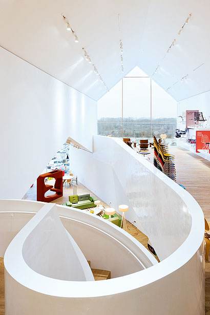
A spiral staircase drills through the criss-crossing floors (image: Iwan Baan) This may be a showroom but it also has the feeling of being an incubator, a place that will influence the kind of furniture that Vitra produces. Since “how does it look in the Haus?” will be the question Rolf asks from now on, the question we should ask is how will the Haus influence what Vitra makes from now on?
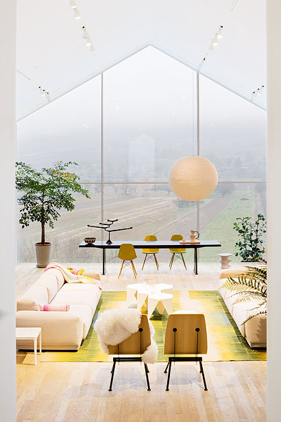
Enjoying the landscape with the help of Eames and Prouvé (image: Iwan Baan)
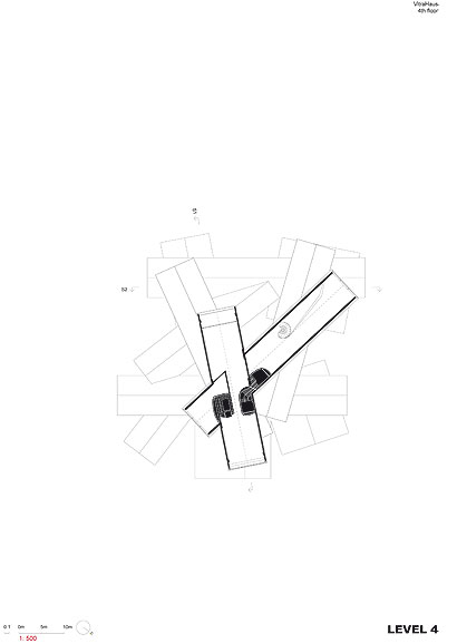
Plan showing the fourth floor
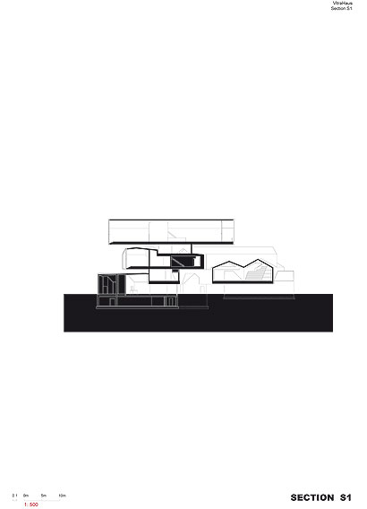
Section, showing the fifth-floor cantilever |
Words Justin McGuirk |
|
|
||
|
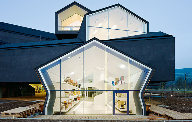
On the ground floor, the Vitrine space shows chairs from the Vitra Design Museum collection (image: Iwan Baan) |
||

