Exploring the intersection of material innovation and design, Snøhetta unites minimalism with tradition in their latest project for Typology at the iconic Printemps Haussmann
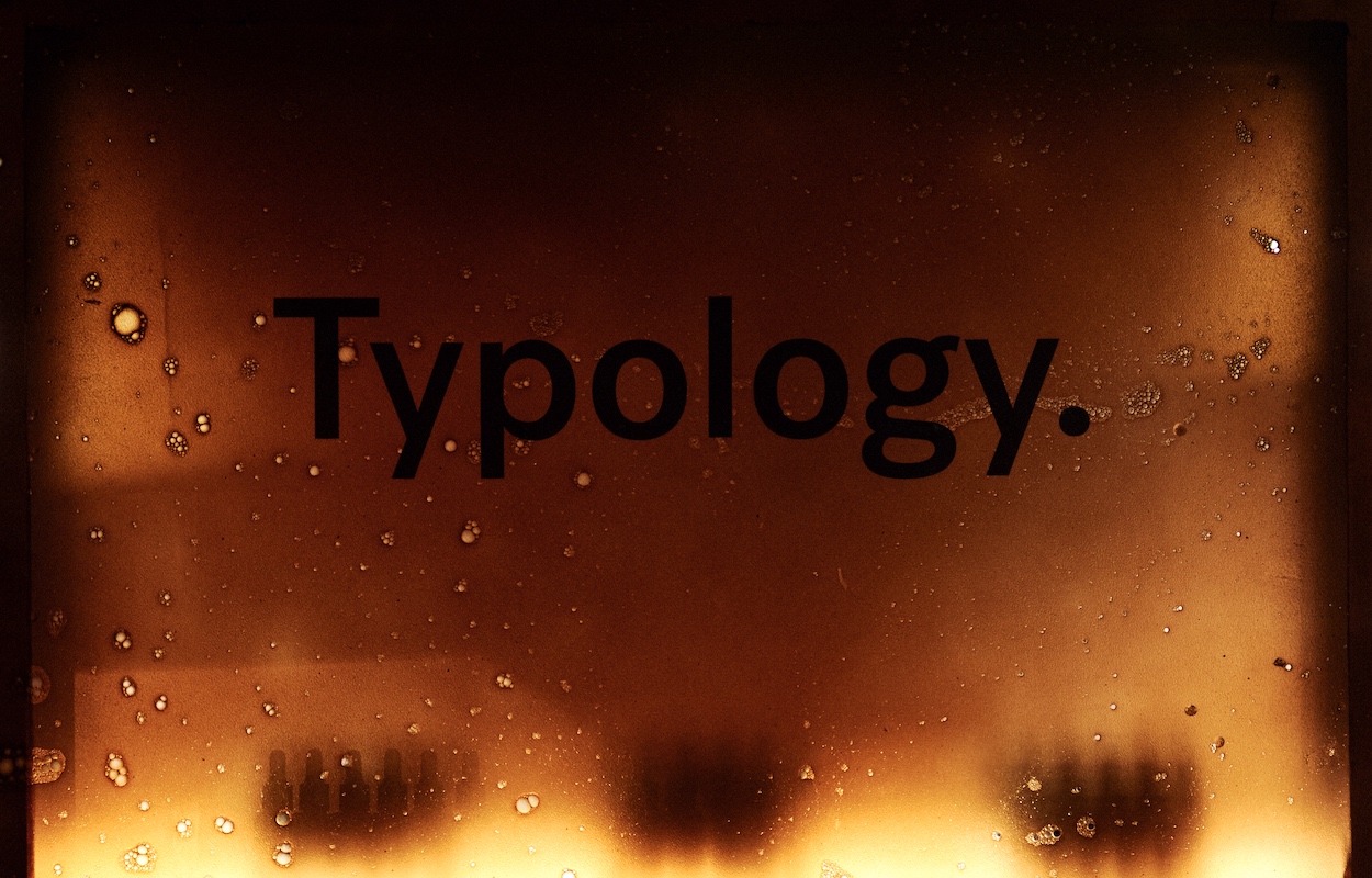 Photography courtesy of Typology
Words by Jessica-Christin Hametner
French skincare label Typology has garnered a cult following ever since its debut in 2006 when Ning Li established the brand with a mission to shake up the beauty industry. Clean, minimalist and 100% digital (until now), it develops vegan formulations using natural active ingredients.
The brand has now enlisted Norway’s esteemed architecture firm Snøhetta to bring its ethos alive offline for the first time at the iconic Printemps Haussmann. Located on the ground floor of Printemps de la Beauté, the architects transformed the 33 sq m enclave into a contemporary city refuge for natural beauty.
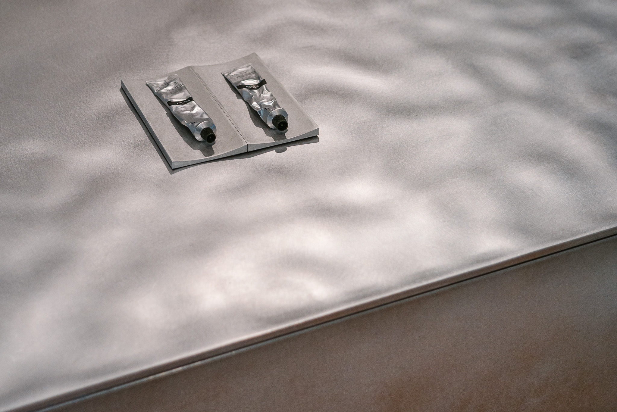
In keeping with the brand’s values to pare back products and distil each formula down to the most essential ingredients, a philosophy the brand has translated to its packaging through the use of raw aluminium, Snøhetta has drawn inspiration from Typology’s packaging design for the interior design of their first space.
 Photography courtesy of Typology
Incorporating undulations in the metal form at the heart of the space, which is reminiscent of the way the product wrinkles after use, the mix of colour and material is striking. Rows of shelves hold the product, while a popping orange hue adds vibrancy and contrast to the monolithic counters.
Before the opening of the permanent space, Snøhetta and Copenhagen-based Natural Material Studio teamed up to design a Typology pop-up store at the main entrance of Printemps Haussmann. Created to give visitors a taste of Typology’s first physical expression, the installation was built around the concept of a Japanese theatre play, which aims to emphasise spectacle and visual aesthetics.
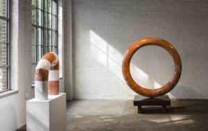
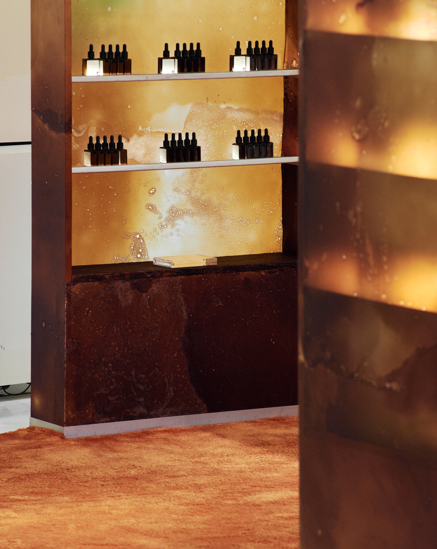
The pair soon found themselves projecting Typology’s green ethos onto Natural Material Studio’s bio-textiles by creating bespoke display objects for Typology’s products. Made using a unique handcrafted bio-textile process and production technique called Procel, it uses ingredients and pigments that are found in nature.
 Photography courtesy of Typology
Handcrafted and developed in Copenhagen by Natural Material Studio, the living material is composed of natural polymers based on proteins, natural softener, reishi mushroom and chalk. While texture, colour and shape are reactive to the material’s environment and change with temperature, humidity and time, Procel is natural, biodegradable and compostable long-term.
‘With our cross-disciplinary and systemic way of working, we aim to bring the human-nature collaboration to the forefront to set the agenda for how we believe art, technology and science should synergise,’ shares Bonnie Hvillum, founder of Natural Material Studio.
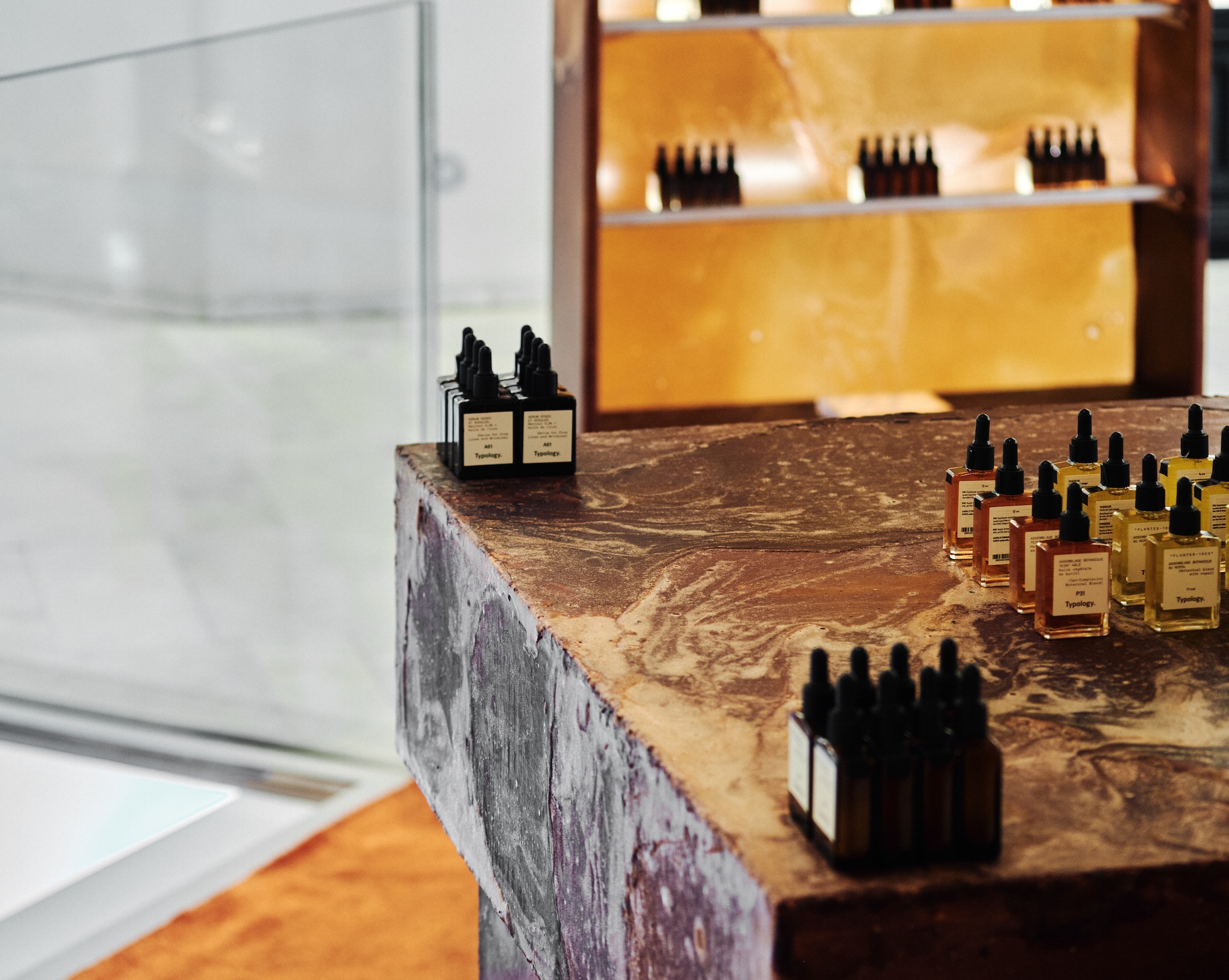
A sustainable choice that highlights the interplay between texture and materiality, the material creates visual intrigue throughout and engages our senses on a deeper level. Inviting touch and curiosity, both Snøhetta and Natural Material Studio understand the importance of creating a sensory-rich interior that appeals to all the senses.
 Photography courtesy of Typology
‘We found the perfect harmony between material and concept by working with Natural Material Studio,’ adds Oliver Page, managing Director, Snøhetta Paris. ‘The corner and the pop-up emphasise materiality, not fussy detailing, in line with Typology’s natural approach.’
As material exploration continues to drive Snøhetta’s architectural designs, the studio’s collaboration with Natural Material Studio and Typology beautifully captures the essence of all three brands. Showcasing the possibilities of Procel in a new light, the project highlights the importance of material selection, much like Typology’s meticulously produced formulations advocate a back-to-basics approach that is rooted in nature.
In harmony with its surroundings both in ethos and design, Snøhetta’s intriguing use of materiality invites visitors to explore the Typology brand universe. Imbuing the interior with an essence of the French cosmetic brand’s pared-back philosophy, this space shows how to go back to the basics and get it right.
Get a curated collection of design and architecture news in your inbox by signing up to our ICON Weekly newsletter

