|
There is nothing superficial about SelgasCano’s use of colour – the Spanish duo’s pop-art playfulness has been integral to projects from east London to northern Kenya. Their plans for this year’s Serpentine pavilion, on the other hand, remain a grey area … It’s January and Spanish architects Lucía Cano and José Selgas are in London to discuss their scheme for the 2015 Serpentine pavilion, the 15th in the gallery’s series. After a false start, and with the building scheduled for completion in a few months, SelgasCano’s design is still very much in the air. “It’s been very intense,” says Selgas, explaining that their initial idea, for a conceptual building fabricated from only one material, proved difficult. “We don’t have carte blanche,” he discovered. “Essentially, we’re building a theatre, in a royal park, where you sell alcohol. So the regulations are huge; it’s not like you can build whatever you want. We realised that we weren’t making a piece of art – it’s architecture that obeys a programme – so we had to start again, almost from scratch.” “In one month we’ll be there,” he laughs. “It’s a very quick, stressful process.” However, despite my solicitous enquiries, Selgas offers few clues as to the direction in which they are heading. “It’s a very strange space,” he says, enigmatically. “We realised that this building will sit in a piece of garden of little interest. It’s flat, empty and stupid to some point. So we wanted to create a building that has its own garden and feels like it belongs to and embraces the park again.” While the design is still under wraps, SelgasCano are under obvious pressure to showcase their distinctive style. What is certain is that it will be a vibrant structure; a glowing lightbox painted with generous splashes of their signature orange. Jean Nouvel’s 2010 pavilion was completely red, but to date all others have been muted affairs. Contemporary architects – despite the long history of polychromy in early modernism, exemplified by the Bauhaus’s love of de Stijl and Le Corbusier’s highly codified colour palette – are fearful of the use of colour. (Corb used to like quoting Fernand Léger: “Colour is one of the elements of life, not less so than water or fire.”) However, for SelgasCano, the use of colour is not superficial but integral. “Normally architects use white, black or grey,” explains Selgas. “They try to forget about the colour, probably because it’s too complicated – it’s another layer to the building. But there’s always a decision to be made, and we never avoid it.” SelgasCano are known for their confident, citrus hues, as seen in Factoría Joven, a colourful skatepark and climbing wall in Merida. With its yellow-painted paths, astroturf banks and bulging, snaking orange canopy, it might have been inspired by the set of The Wizard of Oz. |
Words Christopher Turner
Photography Iwan Baan |
|
|
||
|
|
||
|
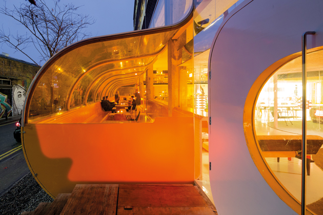
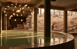
Their sizeable auditorium and congress centre in Cartagena, southern Spain, resembles a colourful freighter-load of stacked shipping containers beached on shore. A huge orange ramp inside the building leads down into a world of colourful artifice. It is an exhilarating building, almost carnivalesque in its pop-art playfulness, with a facade made of cheap, coloured plastic piping, threaded with neon lighting over an outdoor bar area, and huge orange beach balls that serve as chandeliers. SelgasCano are often compared to Luis Barragán, the Mexican architect famous for his bold use of pinks and yellows (trademark colours that were sometimes retrospectively added to his buildings). However, the way they use accents of colour to mark out ramps, staircases and recesses is perhaps closer to the work of Oscar Niemeyer. Their soon-to-be-completed Plasencia Auditorium and Congress Centre in Cáseres, on the Spanish border with Portugal, is a faceted ETFE lightbox that sits cantilevered over the landscape. The structure resembles “a UFO on the outskirts of the city”, in Selgas’s description, to which it is connected by a bright orange gangplank. The building has the drama of Niemeyer’s similarly spaceship-like Niterói Contemporary Art Museum in Rio, with its famous, spiralling red ramp. While they have not yet built in England – a requirement of the Serpentine commission – SelgasCano recently completed a fit-out for Second Home, a shared workspace in London’s East End, just off Brick Lane. They have added to the building a bright orange protrusion that eats into the street; it’s almost as if the unassuming, 1960s brick building were pregnant. This tube, known as “the bubble”, is reminiscent of the roof of their own partly submerged office in a wooded clearing in Madrid (think of Richard Rogers’s experimental Zip-Up house partially buried underground). The space houses a restaurant inspired by the River Café, which famously served as the canteen for Rogers’s office for many years. Indeed, Rogers has recently visited Second Home, which he declared “magnificent – a real organisational and spatial breakthrough”.
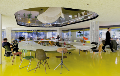
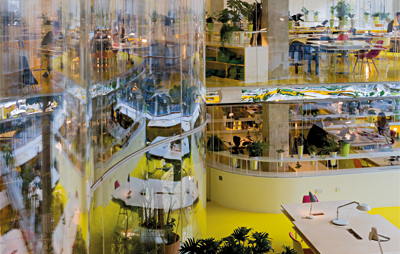
A one-and-a-half tonne meeting table can be raised into the void above Inside, the two-floor space – which accommodates 300 members in enclosed glass pods of teams of four to 30 – is a riot of yellow and orange, with planters and hanging gardens that lend a 1960s, Kubrick-esque air. Second Home is intended, says founder Rohan Silva, as “a creative hub and symbol of entrepreneurial London”. SelgasCano have cut through the building, allowing the maximum penetration of daylight, and there are no hard edges or straight lines. The ceilings are only 2.5m high, but it feels cosy rather than claustrophobic. No piece of furniture is the same, but all are carefully sourced design classics, and there are 100 different plants. At the flick of a switch, the one-and-a-half tonne meeting table on the ground floor can be mechanically lifted into the void above to make space for large events, such as films, gigs, parties and lectures. The creators of Second Home want SelgasCano to tackle the top two floors of the building next, then help in the development the car park next door, and finally in spreading the concept to other world cities. Despite this influx of work, the architects have deliberately chosen to keep their studio small (at the moment they are 12 people). “You go to Second Home and you realise why,” Selgas says. “We have personally chosen all the chairs and all the lamps in the building. You need a lot of time to take care about such things. We think that’s the only way to keep something interesting both for us and for the people working there.”
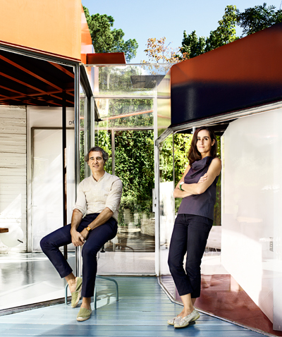
José Selgas and Lucía Cano I first met SelgasCano in 2012 when I visited their auditorium and conference centre in Cartagena, their biggest project to date. Afterwards, in the atmosphere of financial crisis, work in Spain dried up. Their congress centre in Cáseres stalled for two years as the city, realising that there were going to be no more congresses in Spain, struggled to find a new purpose for the building. In 2013, the architect-couple decided to move their family to Boston, to take up a teaching position at MIT, and ran their office from the other side of the Atlantic. They won a competition to build a big municipal building in Stockholm, and also took on commissions for two domestic homes in Los Angeles, a city that seems particularly suited to their colourful optimism. Both houses, on tricky, hillside sites, are yellow and orange, and in drawings have a Hockney-like exuberance. SelgasCano are keen to assert that their bold use of colour isn’t self-referential, absorbed in the history of architecture, but inspired by ersatz. “You go around, and you see colours everywhere,” Segas says. “Every pub in London is full of colour. At the moment we are working in Kibera, a slum in Nairobi, with the photographer Iwan Baan and others, and you realise that there colour is very important. They have a tremendous freedom in the use of colours. Architects are mistrustful of colour and don’t have that same liberty. But I think perhaps a younger generation is coming who are much freer in its use.”
The interior contains a series of soundproof glass pods for between four and 30 workers With their students at MIT, they visited Africa and worked on a commission for a communal centre in Turkana, a rugged area in the north of Kenya. SelgasCano, used to working with a tight budget and off-the-shelf materials, created a building with a colourful corrugated roof that provides shade from the 50ºC sun. The Louisiana Museum in Denmark have asked them to rebuild it there as part of an exhibition they’re devoting to Sub-Saharan Africa later this year. “Trying to bring that idea to the icy coast of Denmark is absurd,” says Selgas. “Instead of replicating something that serves for nothing, we proposed doing another totally different project in the museum, which will then be disassembled and transported at the end of the exhibition to Nairobi.” “Second Home are very interested in putting money in, perhaps for a school,” Selgas adds, keen to emphasise that architects might make a positive difference to such places. Kibera, he explains, is a slum of four million people, the largest in the world, but only has four schools – “there’s an amazing need”. SelgasCano, in collaboration with their MIT students, are currently developing designs for micro-schools, tiny structures that can accommodate up to 300 kids and be dotted around Kibera. “Its amazing what teachers can do with such a small space,” Selgas enthuses. “They’ll provide a place where the kids can learn something; which takes them from the streets, from the garbage.” It’s a shame that their Serpentine pavilion, after its few months in Kensington’s royal park, won’t have such an illustrious afterlife. This article first appeared in Icon 142: Colour. Buy back issues or subscribe to the magazine for more like this |
||


