|
|
||
|
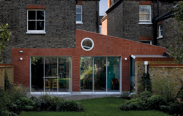
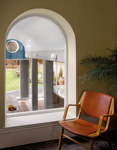
In a London conservation area, David Kohn has managed to sneak a wily back-garden extension past planning officers in the form of a fox Tucked around the back of a genteel semi-detached house in Tufnell Park, north London, David Kohn Architects has built an extension for the shoe designer Rupert Sanderson and his family, which takes the brick language of the London vernacular and plays with it in a number of surprising ways. The house sits in a conservation area and the proposed site had already been the subject of failed planning applications, so whatever was designed had to slip through a tight net. The story given to the planners was that the house was now to have two facades. Unlike most of the local 19th-century housing, which is built in the beige London stock brick, the Sanderson house has a layer of red brick on the front facade, and the extension repeats this by facing its new concrete frame in a similar layer of brick facings. There’s a second story that goes along with the house, one that originates with the client’s children – they had expressed a hope that the extension would somehow resemble a “fox in the garden”, a vision to which the red-brick skin, thin columns and circular window on the rear facade allude. “We tend to be the sort of architects who are not too fussed if the client has lots of ideas,” says David Kohn, discussing the input from Sanderson, a leading designer in his own field, not to mention his kids. “When you’re working at that scale you really need a client that is absolutely going to back you in doing something special.” |
Words Douglas Murphy
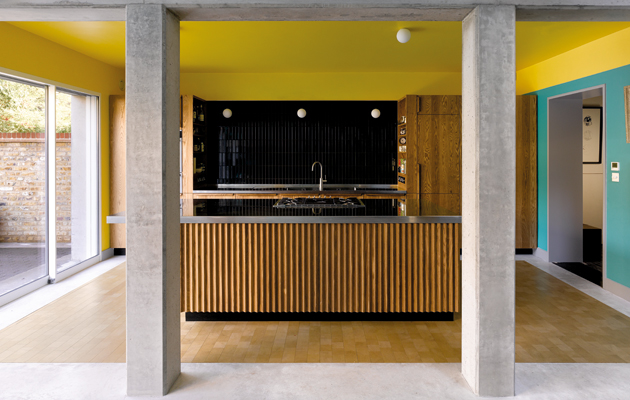
Above: Concrete columns subdivide the living space
Images: David Kohn Architects / Will Pryce |
|
|
||
|
The “fox-like” circular window and red-brick skin |
||
|
The exterior may be fun, but the interior is where the project comes alive. The extension runs across the entire width of the site at the downstairs “lower ground floor” so typical of the terrace typology. It is an open space across its width that incorporates a kitchen and dining and lounge areas, but is also divided by concrete columns and lintels that carry the weight of the upper floors.
The view from the extension through to the terrace house
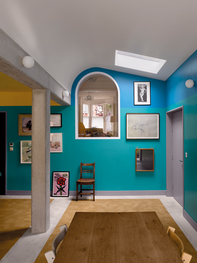
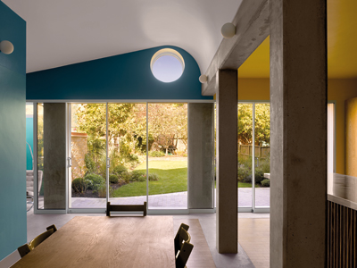
An internal window looks down into the new living area The intention, says Kohn, was to create “somewhere between the kind of openness that people tend to expect in contemporary architecture and the more ‘room-based’ architecture from a pre-modern period, with some of the distinctions between spaces that suggest a variety of uses”. The columns partially subdivide the space into these semi-rooms, while the ceiling folds round in a vault. Timber mats are set within a polished concrete floor, and there is bold use of colour throughout, ranging from sky blue to turquoise and yellow. The clients had apparently been reading up on Adolf Loos and his theories of “Raumplan”, and there’s a hint of that in the interlocking spaces and also in the internal window that looks down from the main house into the new extension. But there are also cheeky nods to the colourful late work of Stirling and Wilford, not least the Clore Galleries at Tate Britain. “I suppose that this building is a little kind of test case, it’s got a bit of everything,” says Kohn, before adding: “I mean it’s a tiny back extension, but I guess this is what architects do!”
The ceiling folds round in an irregular vault |
||

