|
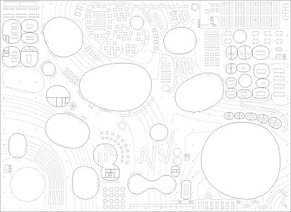
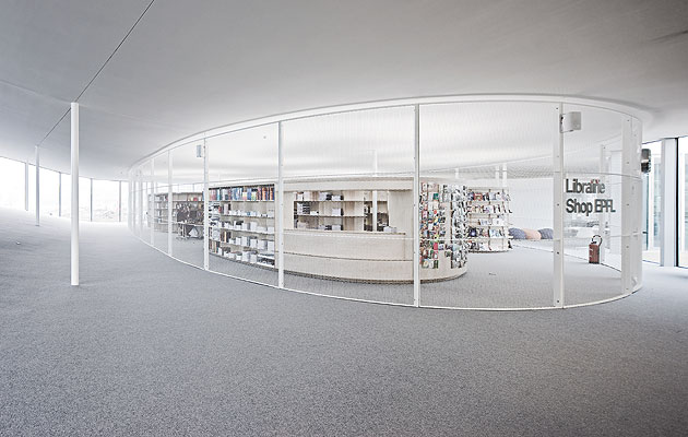
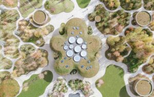
Walking through the Rolex Learning Centre is like being inside a pinball machine. The building summons you on circuitous routes, propelling you around islands and dropping you into holes. The pinball analogy, however, only goes so far, because this is also like an indoor ski slope. The floor rises and descends in a series of hills. As you hike up these inclines you can look out to the Swiss Alps, as if you’re playing some virtual simulated hiking game – sponsored by Rolex. As well as giving its name to the building, the luxury Swiss watchmaker has studded it with those wall clocks you see in airports. That’s one reward for paying half of the £70 million construction cost – the other is a direct line to some of the best technical graduates in Europe. The Rolex Learning Centre is the new heart of the École Polytechnique Fédérale de Lausanne. This vast single-storey slab, designed by the now ubiquitous Japanese practice SANAA, is the focal point of the prestigious Swiss university’s campus, a social hub for its 7,000 students that contains the library, a wall-less auditorium and learning labs as well as a restaurant and cafe. Mostly though it’s acres of open space. When I first saw the model of this building in SANAA’s office in Tokyo three years ago, I had one of those sobering moments when you realise you’re in the presence of a new idea. Here was a building that divided space with horizons rather than walls. The hills in the building’s topography are visual and sonic boundaries, and they are much less final than walls, less factual. At the time, partner Kazuyo Sejima explained it in a way that sounded almost prosaic. In Europe, she said, space is made with walls, but the Japanese just put down a tatami mat. Once you start to define space with the floor, it’s a short leap to the horizontal continuum that is the Rolex Learning Centre. “This is the only building where my hippocampus doesn’t work,” says Patrick Aebischer, president of EPFL. Aebischer is a neurobiologist, and so understandably he reads the building in terms of its effect on the brain. Since the hippocampus is the part that controls spatial navigation, Aebischer is disoriented here – and that, he says, is a good thing. Can a building change the way you learn? Aebischer thinks so. He believes that the way we acquire knowledge today is changing, that it depends much more on interaction between disciplines and the formation of groups. If the Rolex Centre promotes what he calls “bumping into”, then it will be conducive to the exchange of ideas. He wants engineers and mathematicians and neuroscientists cross-fertilising. “The most important thing is that the building forces you to think differently,” says Aebischer. “I hope a lot of innovation will happen here.” The building occupies the campus like a traditional college green, except this one has a roof over it. On the approach, the edges of this vast single-storey rectangle are not particularly inviting, but you can enter on any side, wherever the building lifts its hem and allows you to pass under it. And once you cross the threshold, you realise what an extraordinary proposition this design is. It touches the ground rather like a rumpled cloth. The floor undulates, sometimes level with your feet and other times rising over your head so that you’re looking up at smooth concrete. And, big as the building is, the inside is never far from the outside. The centre is as porous as a slice of Emmental, punctured with 14 oval courtyards that bring in daylight. On the plan they look like plant cells replicating. SANAA has come close to this before. Its 21st-Century Museum of Art in Kanazawa has a similar sense of transparency and freedom of movement, but where that was a very urban arrangement of buildings within a building, this is a thoroughly rural topography. “The concept is to make one big room,” says Sejima’s partner, Ryue Nishizawa. Sejima and Nishizawa don’t do rhetoric. When pressed to talk, their utterances have a childlike simplicity. Instead, their architecture speaks through its disarming lightness of touch, its elegant material quality and its promotion of free-flowing movement. They don’t do big ideas. And that’s why this building represents an ambitious leap, because it is nothing if not one big idea. That is, that an educational space should be like a park. It should be open, without walls or boundaries, a continuous landscape of chance encounters and the effortless exchange of ideas. The Rolex Centre aims to dissolve any distinctions between formal and casual spaces, between classrooms and corridors, between work and rest.
Now, you would be right to meet that idea with some cynicism. We have heard it before, after all. The flexitime work life promised to liberate us from the nine to five. Creative agencies installed pool and ping-pong tables in their offices and handed out BlackBerries so that staff could check emails any time, with the result that they now spend far more than their allotted eight hours at work. Is this any different? That depends on how appealing you find the idea of edifying conversation (the centre is open from 7am to midnight). It is certainly more innocent. It is an idyllic, pastoral vision of the student’s life that summons up relaxed tutorials on a hillside, or the wandering from group to group. The rhetoric, such as it is, comes from the internet, from the connective capabilities of social media. This is a centre for the Facebook generation, not so much Myspace as Ourspace. There is even something Socratic about this model. Picture the philosopher holding court in the agora – not the classroom but the marketplace, a social public space – admonishing his pupils to learn through questioning, through discussion, not by memorising the lesson. The building also embodies the internet’s erosion of privacy. For many of us, memories of studying will involve hours spent at tiny partitioned carrels, blinkered from distraction – a cubbyhole does wonders for your concentration. The question is how students will define solitude in this building, how they will carve out their private niches. In this undulating floor-scape you can imagine pulling out a book anywhere and just sitting against a wall or lying back against a hill. The building allows people to discover the right space for whatever it is they feel like doing rather than prescribing where and what that space should be. I found the place appealing. I can imagine that it must be exciting to embark on your studies somewhere as unconventional and potentially liberating as this. But it is frustrating seeing it before it is fully occupied, more so than most buildings I’ve ever visited. Here, everything depends on how the students inhabit this landscape. Does the strategy of using hills to divide space really work? What about noise? Surely one of the disadvantages of not having walls around your library is that sound will travel. Who knows? There is something else that adds a note of disquiet. As much as I love the conceit of the building, or perhaps ideology is a better word, the execution somewhat disturbs the reverie. The problem with ethereal architecture such as SANAA’s is that it requires impeccable detailing. So whenever a curve is not smooth, when a circular atrium is trimmed with straight edges, you notice it. But more serious is that the architects’ seamless rolling landscape has been mediated by a profusion of steps, ramps and handrails. As some of the hills have a steeper than six-degree incline, disabled access was required. Although the architects didn’t feel that every space had to be accessible, EPFL disagreed, and while that is admirably democratic it has affected the space more than one would have imagined. SANAA handled it cleverly, creating winding alpine paths. But add these to the paths for the blind and the stairlifts, and in places the building looks more like an old people’s home than a utopian think-space for youth. Do these awkward details ruin the experience? A little, it has to be said. This is a beautiful idea that did not quite manifest itself in a beautiful building. Yet, wandering around, I am conscious of being lucky to experience this building at all. How often does something with this bold a concept get built, in almost as pure a state as it was conceived? Hardly ever. The learning centre might easily have been consigned to folklore, like Rem Koolhaas’ Jussieu Library – one of those designs that we weren’t quite ready for – which this building evokes in places. There’s something to be said for the corporate dollar. If schools can achieve this kind of building by partnering with brands then, perhaps the more insidious aspects of such unions are worth it. |
Image Sergio Pirrone
Words Justin McGuirk |
|
|
||
|
The bookshop, an “island” behind grille walls |
||

