The RAF may be experiencing some turbulence, but Nex Architecture’s revamp of its north London museum is calm, unflappable and expertly controlled, writes Debika Ray. Pictures by Alan Williams
This year, the Royal Air Force celebrates its centenary, and the UK’s Ministry of Defence has announced it seeks to shrink its estate by a third by 2040. Money is also tight at the RAF museum, which opened in 1968 to mark the force’s 50th anniversary. It’s a problem that many museums face, but this particular institution no doubt feels an additional pressure: to continue projecting a strong and stable image for the RAF, even as the force itself is pared back and Britain’s position on the world stage is diminished more broadly by its departure from the EU.
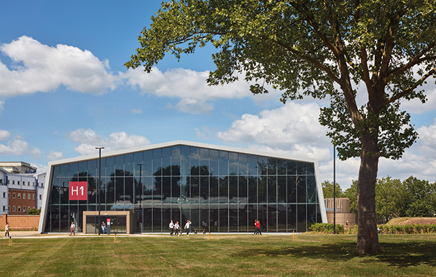 Hanger 1 is now the sole point of entry and only security checkpoint
The development of the museum’s campus that is currently underway is therefore both a practical initiative and an exercise in PR. It is centred on getting visitors to come, stay and spend, and on presenting the history and role of the RAF in an accessible manner, at a time when public memory of wartime is fading, and when you can no longer take for granted that much of Britain’s diverse population has personal links to the armed forces. London-based practice Nex Architecture and French landscape design studio Agence Ter recently completed the most recent stage in this plan: the £23m refurbishment of two buildings and a reconfiguration of the site’s landscape.
For many designers, a museum project is a chance to let loose and make the kind of architectural statement that would seem out of place in more utilitarian buildings. Nex has done the opposite: its design is more underlay than overlay, blending into the background and allowing the functions and displays of the museum to take centre stage in a deceptively simple manner.
 The 8ha former aerodrome is dominated by utilitarian structures
The museum sprawls across eight hectares in the north London suburb of Colindale. It’s a historically significant patch of land – the site of the former Hendon aerodrome, which hosted some of the country’s earliest experiments in flying, including the launch of the first air mail, the factory of aviation pioneer Claude Grahame-White and a school founded by Louis Bleriot, the first person to fly an aeroplane across the English Channel.
The design team won the job through an international competition in 2014, starting on the project before the museum had decided exactly which buildings it wanted to tackle, which meant the architects were charged with analysing the site’s problems and suggesting solutions. The most obvious of these problems was that it was dominated by car parking. Another was that the route through the spaces – a series of hangars and other utilitarian structures – was confusing.
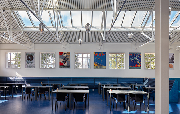
 Natural light floods into the dining areas through skylights
Project architect Rowan Morrice explains that visitors would drop off as the journey progressed – 96 per cent would visit the first exhibition space, 95 per cent would make it into the next, only 31 per cent would continue after that and a mere 17 per cent would reach the final one. ‘It was difficult to know whether you were allowed to go into all the buildings, or that there was anything in them,’ Morrice says, pointing out the added inconvenience of multiple security checkpoints.
The design was therefore shaped by the need to make the campus easier to navigate. The architects began by pushing all the parking spaces to one corner and concealing them behind a raised bank of earth: not a particularly attractive measure, but one that’s common in many airfields, creating a visual barrier and a safe distance between traffic and visitors. The space left at the heart of the campus has been turned into a large public green, which is one of the few such spaces in the neighbourhood, and therefore an added attraction.
‘We wanted to get back the aesthetic of an airfield,’ Morrice says, referring to the way that the green recalls an era when planes would take off from grass rather than tarmac. Around this space is a path that circles the entire site – the architects call it a ‘taxi way’ in another nod to aviation. It also serves a practical function: it gives a sense of the site’s scale and its accessibility. ‘The aspiration is that everybody will visit every building, or at least they will know that they can if they want to,’ Morrice says.
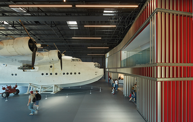 A red fin-clad structure includes two viewing galleries over Hangar 1
Navigation is aided by a subtle but effective wayfinding strategy – the buildings have been simply renamed Hangar 1, 2, 3 and so on, with clear signposting; shortcuts across the green are demarcated by shorter grass and a line of runway lights. ‘The museum attracts a huge range of people – from children to older veterans, to people who may not speak English – and it wants to further expand its audience. It’s about making it clear, legible and easy to understand, without too much signage or having to speak to staff.’
Hanger 1 – a large-span, single-roof structure from the 1970s – is now the sole point of entry and only security checkpoint on the campus. Here, Nex’s restrained approach to the design is most apparent: outside, the aluminium-clad building retains its functional appearance, except for the addition of a 40m-long entrance with a cantilevered roof canopy. Inside, an old-fashioned clunky display has been replaced by a compact building-within-a-building, which leaves the area around it open and flexible.
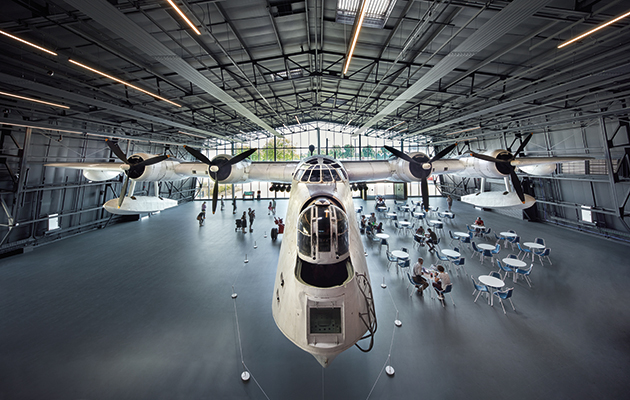
It is a red rectangular prism-shaped structure, clad in glistening fins that hint at the turbine engine of a plane. This surface is broken up by the two viewing galleries – created only because there was space left after all the functional elements had been slotted in – and by a series of propellers displayed on its surface. The whole building is pinched in the middle to create a sense of undulating movement and natural circulation around it – and to make the spaces around it feel like rooms, rather than corridors. It’s an unobtrusive way of breaking up and varying this vast expanse, while still retaining the sense of the building’s original purpose and its height.
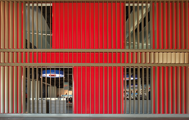 The fin-like cladding used inside Hangar 1 is reminiscent of a turbine engine
In these spaces are two new exhibitions, designed to remain in place for about 10 years: one about the RAF’s 100-year history, and the other about its future. The museum wanted to move beyond showing off the force’s technical capabilities to emphasising the human stories within it. As such, the planes are no longer the central focus. They have been lifted up near the ceiling, leaving room below for smaller objects and interactive displays – such as cabinets showing off different types of uniform worn by air force personnel and digital displays asking you to consider ethical questions related to war.
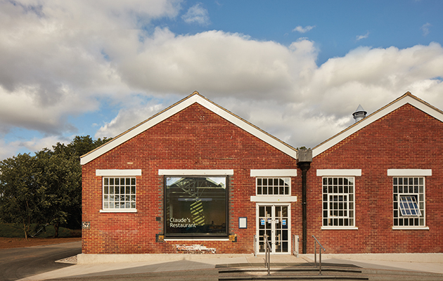
The final task in Nex’s remit was to create a 170-seater restaurant in a semi-derelict 1930s supplies building – another crucial element in the museum’s drive to secure its future, but also a rare opportunity for the designers to move away from the rest of the museum’s purposeful aesthetic and to allow colour, light and texture to sit in the foreground. The team demolished most of the internal walls and the roof, retaining the structure, the steel roof trusses and the external walls, which still bear wartime traces of camouflage paint.
The refurbished building contains two dining areas – a main one and an overspill room to rent out for events. Natural light tumbles in through skylights and a large picture window, bouncing off the white-painted exposed brick walls and the bright blue floors, furniture and ash panelling. ‘Overlaid onto the whole thing is the idea of a horizon, so you have a feeling of flight,’ Morrice says of the even line formed across the interior by the top of the blue wooden panelling. Below this ‘horizon’ are tables, chair, bags, buggies and the mess of everyday activity. Above it are light, windows, and a view of the sky beyond.

