A newly built housing complex in Barcelona offers residents a sensitively designed gradient from public to private space

Words by Rima Alsammarae
In an industrial suburb of southwestern Barcelona known as Cornellà de Llorbregat – where auto accessories, aluminium and cotton goods are produced – a recently completed social housing complex experiments with a gradient of spatial accessibility, weaving its way between private, semi-private, semi-public and public areas.
Designed by Barcelona-based studio Peris+Toral Arquitectes and occupying a site that once housed a beloved cinema, the five-storey project features 85 residential units arranged around a central courtyard. Despite including six different apartment models, the units are relatively homogeneous, thanks to a running theme that connects them.
Inspired by the Japanese tradition of measuring a room by how many tatami mats will fit inside it, the architects designed the units with similarly-sized rooms to offer flexibility of use to the tenants.

‘The bedrooms are the same size – eight tatami, or large enough to hold eight people lying down,’ says José Toral, co-founder of the practice. ‘In more direct terms, this means the rooms are 360cm by 360cm, and because they’re all the same size, you don’t decide as the architect which room is meant for whom. This helps to eliminate a hierarchy of spaces.’
With the kitchen in the centre of each unit, and the rooms opening up to one another without the use of corridors, the apartments are fluid, with unobstructed visibility from one end to the other. Views of the courtyard on one side of the apartments merge with views of the surrounding city on the other. And according to Toral, this internal openness also helps diminish gender-based roles.
‘Visibility of spaces throughout the entire apartment enables the family to collectively see what needs to be taken care of,’ he says. ‘And hopefully this encourages a more balanced approach to handling chores.’

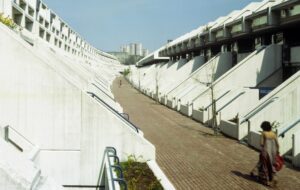
While the interiors of the apartments are based on simplicity and openness, stepping onto the terrazzo-tiled terraces bordered by large metal sheets introduces users to a series of spaces that gradually flow from semi-private to semi-public to public.
While the apartments are of course private spaces, the internal terraces are the first realisation of semi-private spaces, as they are open to the courtyard yet contain doors that allow for disconnection from immediate neighbours.
The terraces on the external side of the building also have their share of privacy measures, such as roll-down timber curtains that shield residents from outside onlookers. While moving along the internal terraces towards one of the four stairways that sit at the corners of the rectangular courtyard, users interact with a range of spaces that present various levels of accessibility.

Just past the terraces are stairwells made of pinus radiata (Monterey pine), sourced from the Basque Country (a material that can be found inside the apartments, too). While lifts are available, the stairwells offer a spontaneous meeting point for residents as they move across the different levels of the building.
On the ground floor, large glass doors grant access to the courtyard, which features a small grass mound and a contemporary lighting fixture. Framing the courtyard are large walls stuffed with locally sourced rocks and boulders to buffer sounds that might arise from activity in the space.
The courtyard is both functional and symbolic – while it is a practical source of air ventilation, it also encourages socialising and nurtures a community feeling among the neighbours. It serves as a semi-public walking path that carries residents from the city environment just beyond the outer gate to the semi-private terraces that lead to the apartments.

‘The courtyard is a shared space,’ says Toral. ‘It helps everyone feel like they belong to a community. Even though they belong to different zones of the building, they all meet here.’
Once you come to the boundaries of the building itself, a large and dominating portico filters the relationship between the communal courtyard and the surrounding public space. To the left of the building, the architects designed a small playground that is available to the wider community – another opportunity for interaction.
Throughout the project, the architects were conscious of not only using materials that were cost-efficient, but also of using them in an intelligent way so as to maximise their impact. According to Toral, this sensitivity came down to understanding the geometry of the space.

‘For us, sustainability isn’t about avoiding a particular material,’ he says. ‘It’s about how you use that material. For example, this project has half the amount of wood we designed it to have – because it’s social housing, so it has less of a budget. But you can support your ideas by using materials intelligently, and the way we used the wood here was very efficient.’
The reinforced concrete complex stands out among the neighbouring structures, which consist of mostly ageing red-brick buildings that are home to families of lower- to middle-income ranges.
‘We wanted the project to stand out,’ says Toral, ‘while also providing an example of what you can do with a smaller budget. When the residents first moved in, they found the unit layouts a bit strange. It was unusual for them not to have a hierarchy of spaces, and the semi-private and semi-public spaces are sort of unconventional. But now, I believe they feel like it’s a small community.’
Photography by José Hevia
This article was originally featured in ICON 208: Summer 2022. Read a digital version of the issue for free here
Get a curated collection of design and architecture news in your inbox by signing up to our ICON Weekly newsletter

