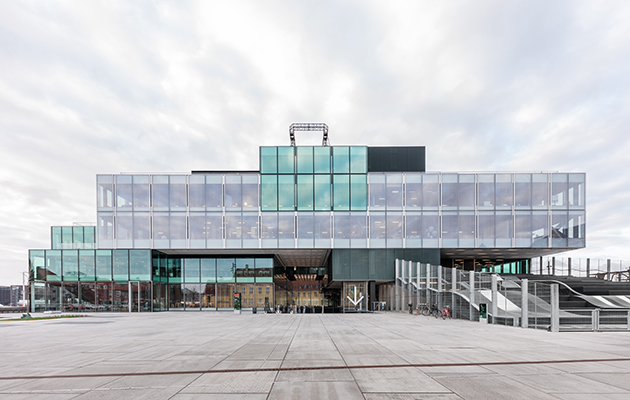
 BLOX by OMA on the Copenhagen harbour. Photo: Delfino Sisto Legnani/Marco Cappelletti
OMA’s hulking ‘city in a box’ on the Copenhagen harbourfront has been given a frosty reception by design-savvy locals, but is it just an idea that’s ahead of its time, asks Andrew Mellor
‘It is the next generation who will understand and enjoy this house best.’ So proffered Peter Fangel Poulsen – head of projects at private developer Realdania – on the weekend that his philanthropic corporation’s new baby, Blox, was inaugurated. It was a canny retort to the barrage of criticism that has been levied at Copenhagen’s latest major building by just about every adult who has seen it (and plenty who haven’t).
Ever design-savvy, Copenhageners are notoriously outspoken in the face of new architectural statements, especially those lining the city’s resurgent harbour. But Blox, designed by OMA in the Netherlands, has come in for a level of stick that makes the national bun-fight surrounding Henning Larsen’s Opera House, opened in 2005, seem positively tame. Blox joins the Opera House, Playhouse and Royal Library as the fourth grace on the city’s harbour and the first to be designed outside Denmark. It has already been accused of base ugliness: a cold, corporate monolith for some; a joyless, pale imitation of Bjarke Ingels Group’s Lego House for others (Ingels being a former OMA employee).
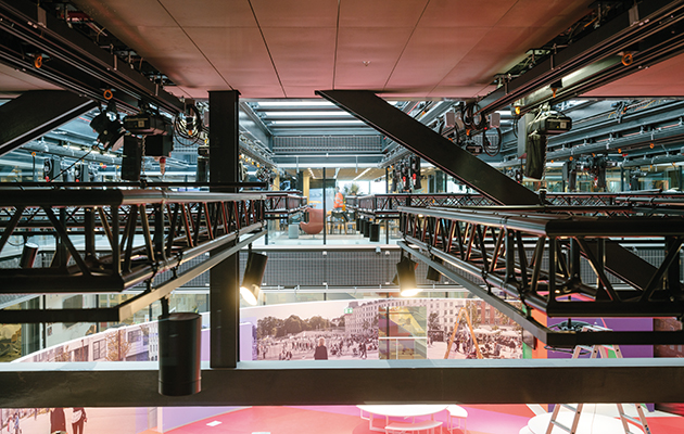 ‘The structure is ‘more like a bridge or an oil rig than a conventional building’. Photo: Richard John Seymour
Behind Blox’s rather faceless facade, there is the elephantine issue of function. Much of the hostility directed at the project is rooted in the fact that few Danes understand what it’s for and how it has been funded, cardinal architectural sins in this part of the world. Its creator Realdania – a philanthropic association supported mostly by mortgage investments – was dragged through the opinion pages of the Danish broadsheets in the week before the building’s inauguration and forced to answer claims that it was neither overly philanthropic nor particularly effective with the money it did choose to spend.
It’s easy to see why lines can appear blurred. Most people first encounter Blox from Langebro, the bridge to the south-west of the structure that forms a main artery into the city. From there, you are faced with the corner of the building tenanted to a fitness franchise (unsubtle signage included) and the 22 pricey private apartments that adorn its rooftop. From no vantage point is there anything that remotely resembles an invitation to the curious citizen or visitor to come inside.
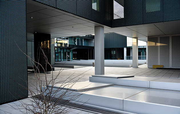 Apartments in Blox are clad in dark metal grilles, around a rooftop courtyard. Photo: Hans Werlemann
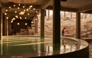
But at least one of Blox’s inhabitants wants and needs you to penetrate its obnoxious exterior. Its primary occupant is the Danish Architecture Centre (DAC), a pedagogical organisation, agency and museum (entrance: £13). It is joined by the company that runs Copenhagen Fashion Week and a swath of serviced office spaces aimed at start-ups and sole traders known as Blox Hub (desks from around £700 per month). There’s also a cafe, a self-contained restaurant, a gallery and a bijoux auditorium. True to the ideals of OMA, all these functions are physically interwoven to deliver ‘the opposite of a series of silos’.
The idea, as always with OMA, is to capture the multi-rhythmic energy of a city and re-create it in one building. From the outside, faced with a bland two-tone glass exterior through which little activity is discernable, we get no wind of that. Inside, it works wonderfully until you want to hop from one ‘function’ to another but are unable to penetrate the endless glass walls that appear to divide them. Two large internal voids make different spaces look so near while they are logistically so far. Getting lost inside Blox, one member of staff told me, is an occupational hazard. It’s still more infuriating that you can often see the space you’re trying in vain to reach.
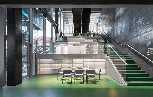 Blox Hub provides desk space for start-ups. Photo: Delfino Sisto Legnani/Marco Cappelletti
That things weren’t easy for OMA is clear. The company relishes projects that incorporate existing thoroughfares but the main road that runs straight through the heart of the building, and the harbour over which its frontage is cantilevered, proved particularly challenging. Chris Carroll of subcontractor Arup describes the structure as ‘the most complicated I have ever engineered – more like a bridge or an oil rig than a conventional building’.
Whether Blox’s strange notion of interior cohesion is a charming feature boldly embraced by OMA or an infuriating postmodernist conceit with no regard for the way humans behave, it was undeniably exacerbated by the presence of that road. The road also induced one of the building’s most unfathomable features: a central public atrium that sits directly underneath it. The point of this wide underground passage was to suggest a continuation from the street: a public underpass but a foyer and exhibition space at the same time. Problems with wind flow meant sturdy glass walls had to be erected, each with an equally sturdy revolving door. Public space? It doesn’t feel like one.
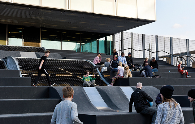 A series of giant steps create a playground that is already popular with families. Photo: Hans Werlemann
There is some recompense in Blox’s profusion of exterior space – some 7,000sq m for a footprint of only 1,000. An elegant piazza is formed to its rear with Frederiksholms Canal on one side; on the other, a series of giant-sized steps ease the structure down to ground level and create a 1,200sq m playground already popular with families. On the other side there is a modest harbour park that connects the structure to Langebro, with an additional bridge for cyclists and pedestrians soon to open that will connect the building to Islands Brygge across the water.
Rooftop terraces offer good views over the harbour and the city, some providing shelter from blustery Copenhagen winds on two sides. In the middle of the roof sits a huge central courtyard to the rental apartments. But this is redundant space even to the tenants themselves: a paddy field of angled skylights supplying natural light to DAC below but proving as unwelcoming and un-‘hygge’ as could be imagined to the tenants who overlook it (and that’s before they have accumulated the inevitable winter sludge).
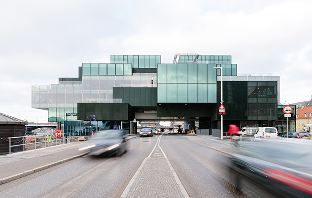 A main road cuts through the heart of the building. Photo: Richard John Seymour
Many have questioned who will occupy these expensive yet poky apartments, which offer little of note beyond attractive views. The noises coming from OMA staff suggest they were, like the gargantuan underground car park, inconveniences: plea-bargains to Copenhagen’s City Hall to get the project approved following a swath of new sustainability legislation passed just before the plans were submitted (the design was also significantly downgraded following the financial crash in 2008, nevertheless resulting in a not insubstantial budget of £236 million).
Either way, OMA has not compromised on its central ideals. To a point, the interweaving of functions inside Blox works magnificently: the workspaces of Blox Hub are filled with a sense of energy and openness incubated by the central voids, through whose glass walls you see everything from exercising bodybuilders to museum visitors and diligent office workers. DAC’s central exhibition space is a little overpowering when filled with a huge installation (as now) but I suspect, when empty, it will help the building breathe a little more. DAC’s very presence here – in a controversial building that has broken rules and confronted Danes with the idea that function can play second fiddle to form – might be seen as a triumph of engagement.
And it might be, as Poulsen suggested, that the new generation embraces and understands Blox rather more than the current one. But from a practical point of view, the building’s treatment of the public it so wants to engage is troubling at best. Aesthetically speaking, an inconsistency of finish and profusion of supporting diagonal trusses that run against the horizontal design can frustrate. Contextually, the building scores well, complementing its neighbours, the Royal Library to the east and Ny Christiansborg to the west, in outline and scale. The only problem is the look of the thing. If Blox is a bold piece of architecture on the inside, it doesn’t look that bold from the outside. Nor particularly beautiful.
Subscribe to Icon and never miss a story.


