|
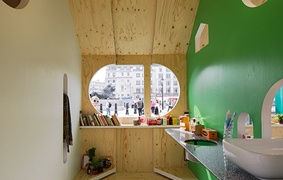
Jasper Morrison, Patternity, Raw Edges and Ilse Crawford have designed outsized Monopoly houses for Trafalgar Square Yesterday, four outsized Monopoly houses sprung up in Trafalgar Square as part of LDF. Each was adapted by a different designer – Jasper Morrison, Patternity, Raw Edges and Ilse Crawford – who were asked to produce an installation that addressed the theme of Home. Sponsored by Airbnb, whose new logo takes a similar profile, they were situated in a cluster near the central fountain, where they offered themselves up like concession stands to the assembled crowds.
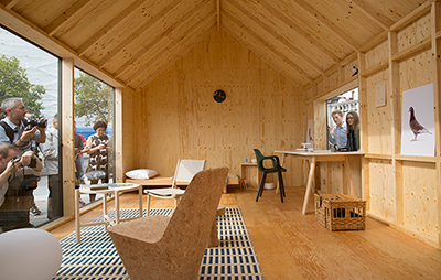
Jasper Morrison’s home for a pigeon fancier Jasper Morrison transformed his house into a dovecote, creating a sparse, minimalist space within, decorated with his furniture for an imaginary pigeon fancier. “It was an obvious choice for Trafalgar Square,” the designer told Icon, “and provided us with an excuse to make an interior for somebody or other. I think you need those kind of props to make it come alive – if you didn’t have a character who the place is for, it’d just look like another stand in Milan.” Perhaps with Marlon Brando’s character in On the Waterfront in mind, he described the process of creating his imaginary inhabitant as “like character acting”. The house features a desk that faces the National Gallery, viewed through a pillbox window of the sort you might find in a bird hide. Looking into his house through the all-glass façade on the south side of the structure, Morrison lists the props he chose to include to flesh out his character’s “deliberately odd” persona: “He has binoculars, he has a telephone, a ruler and a pencil, a pencil sharpener and a map, depicting a typical pigeon racer’s route, with a loop on top. There are some books on a low table, two side chairs, and a bed in the corner, a pair of shoes and a carrying basket on the floor, and a clock on the wall.” There are also three prints of pigeons on shelves, shot in profile against white backgrounds. The latter were used in an advertising campaign by Punkt, a Swiss brand for which Morrison designs, and were taken by Rocco Toscani, an Italian photographer and pigeon racing enthusiast. Asked whether he had Toscani in mind when he designed his house, Morrison admits, “Kind of, kind of, yes, he’s a very nice guy. I think the photos are so beautiful. Last year we hoped to get them in Trafalgar Square — big, big prints standing on easels — , but it was too expensive, security was a nightmare. But now, we’ve snuck them in!”
Raw Edges’ home to maximise space Yael Mer and Shay Alkalay of Raw Edges created a house whose interior has moving walls, so that three rooms concertina in and out according to your needs. Alkalay acknowledges the similarity to dRMM’s Sliding House, and explains that the inspiration came from the mobile aisle shelving units used in libraries and archives. “We went to the Museum of London and they have a massive archive with mobile shelving cabinets, which impressed us, and we always wanted to make something out of it. And when LDF approached us we thought, okay, this is the right moment”. A volunteer pulls the two sliding walls across the set-like space, as Alkalay explains Raw Edges solution to flexible living. “If you take a shower, you can make the shower big, and when you finish, you can push back the wall and then use the living room or the bedroom. So it’s all about using the space in a more efficient way, because in one given moment you can be only in one place. And, if you can’t be in two places at the same time, why expand space? You can just shrink the rooms you’re not using.” Using a room at a time means that one carpet and light serve all of them, and there are moments where the three rooms intersect that allow for comic category confusions. “It can be a little bit messy,” Alkalay says. “When you push the wall to close off the bathroom, the showerhead becomes a shelf in the kitchen, that’s why you have the HP Sauce bottle on top — it’s not that you need to shampoo your hair with it. You have a long shelf, which unifies all the rooms, where products get mixed up, so it’s really about celebrating the mess of life.” The installations can be seen until 22 September |
Words Christopher Turner
Image: Ed Reeve |
|
|

