|
|
||
|
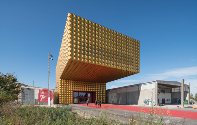
The flashy exterior of Denmark’s Ragnarock is offset by a light-touch renovation of its surroundings, writes Peter Smisek Ragnarock in Roskilde (previously known by the more understated moniker of Danish Rock Museum) will be opened to the public on 29 April by the Danish crown prince Frederik. Designed by Dutch practice MVRDV and Denmark’s own COBE, the museum is tapping into Roskilde’s reputation as the host of one of Europe’s largest music festivals, which draws around 130,000 music fans to a town of only 50,000 – in the hope of bringing in visitors all year round. The museum is part of a larger masterplan initiated in 2011, when Roskildefestivalgruppen (the foundation that organises the festival), together with the new rock museum and Roskilde Højskole, an arts and music-oriented adult education institution, banded together to regenerate an industrial estate between the city centre and the festival grounds. ‘The masterplan was initially called Rock Magnet and serves as a connecting link between the city and the festival grounds,’ MVRDV director Jacob van Rijs says.
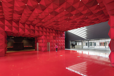
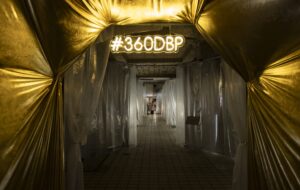
In the entrance hall, the studs turn to a deep scarlet The cantilevered, gold-studded museum is the first part of the cultural programme that has been developed for the site, while the rest – including additional student housing for the Højskole and new head offices for the festival – will be finished sometime in 2019. For now, only the rock museum rises amid the prefabricated 1960s concrete sheds that will eventually house the school’s programme in a series of loosely arranged pods. ‘The old factory is not beautiful, but by keeping the industrial architecture intact and injecting it with functions, we were able to spend more of the budget on landmark buildings that protrude from the complex,’ Van Rijs says, noting that the existing buildings possess a spatial generosity that would be difficult to replicate in new-built structures. ‘We see the halls as a stage and the new additions as musicians in a band. The rock museum is the extravagant lead singer, while the ring of student housing and the black cube of the festival offices to come are more low-key, like the drummer or the guitar player.’
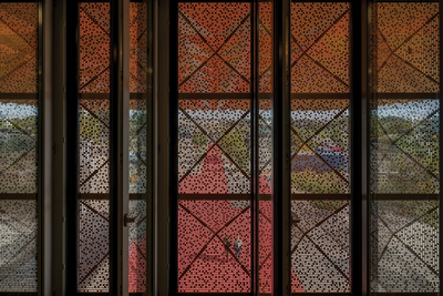
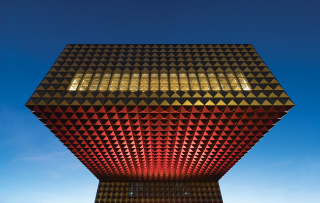
View across the development site from inside the cantilever Seductive analogies aside, the gold exterior does have multiple rockstar connotations, from the lavish colours, to the ubiquitous studded accessories and even the moulded, acoustic panels used in recording studios. In the entrance hall – which opens up to the former industrial spaces – the studs are deep scarlet, recalling the plush velvet of a soon-to-be-trashed hotel room. Below the building’s cantilever – a gesture that’s as much about providing a sense of shelter on an urban scale as it is about creating a landmark – the red carpet has already been rolled out in the form of the main pedestrian axis, which stretches from the complex paved in brightly coloured asphalt. For now, the metaphorical lead singer strikes a lonely figure in an area that’s only beginning to live up to its potential. But while the other band members are sorely lacking, MVRDV and COBE’s approach, in which adaptive reuse of the old, rough and ordinary merges with the addition of the small-scale, extravagant and specialised, seems to be not only the correct one, but points towards a bolder and more playful attitude to preservation in general. |
Words Peter Smisek
Above: The gold-studded cladding is intended to evoke the rockstar experience
Images: Ossip van Duivenbode |
|
|
||
|
A dramatic cantilever extends for almost half the building’s length |
||

