|
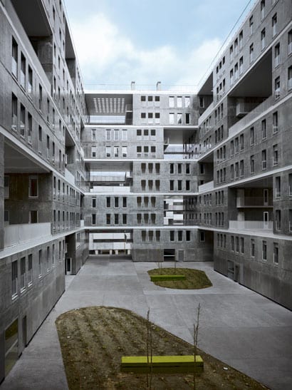
Concrete doesn’t usually shimmer. At least not in the way that it does across the walls of Celosia, MVRDV’s new social housing project in northern Madrid. In the afternoon sun, the effect of the polyurethane coating is blinding. The structure itself, five ranks of double-storey blocks that look like they should slide across the facade, could be a giant game of urban chequers. It’s 40°C and I’ve just staggered up the side of a motorway, past barren swathes of manicured verge and block after endless block of forbidding, fenced-off brick apartment buildings. This is Sanchinarro, an anonymous Ballardian realm of big roads, roundabouts and introverted blocks, fortresses around swimming pools. It is one of a multitude of identical dormitory suburbs that are growing in concentric rings around Madrid, cloned ribbons devoid of urban aspiration. “Architecture and urbanism are not really connected in Spain,” moans Jacob van Rijs, the pragmatic “VR” of MVRDV, whose new building in this soulless district is part of a city-wide programme of bringing in big-name architects – an eclectic bunch, from Foreign Office Architects to David Chipperfield, Thom Mayne to Peter Cook – to spice up public housing. For van Rijs, together with local architect and housing specialist Blanca Lleó, this is the second collaborative effort to reunite the disciplines by injecting radical urban thinking into the conventional courtyard block. “We wanted to reinvent this typology,” he explains. “So we flipped it and stretched it.” In the experimental Dutch office’s characteristically literal approach, it has done exactly that. Its first attempt, the widely published Mirador building of 2005, which towers over the roundabout a few streets away, completely turned the block on to its side, creating a vertical stack of different “neighbourhoods”, each dressed in their own lurid garb, out of which was cut a huge five-storey hole, a “plaza in the sky”. A persuasive sound-bite and instant icon, perhaps, but a recipe for disaster. Residents I spoke to detest living there, clearly reluctant to let their children play on a tarmac strip 12 storeys up in the air, a desolate void that now remains locked and unused. Cladding-panel missiles apparently keep falling from the sky, making playing in the dust around the building’s base an equally perilous pursuit. Designed at the same time as the Mirador, but sidelined by the municipality – too easily wooed by the novelty of its brazen sibling, the test-bed nature of which is now costing them in court – Celosia is an altogether different proposition. A comparatively sober stack of supersized building blocks, the structure’s formal clarity belies its varied internal planning and intelligent sensitivity to the needs of public housing. Demonstrating a leap of maturity, this stripped-back structure forgoes the flashy wow factor in favour of a considered response to how people might actually use that dreaded tool, which is so beloved of architects and urbanists alike, the “shared amenity space”.
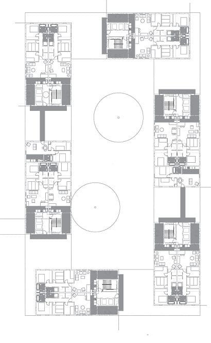
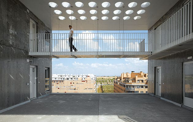
Mini plazas every other storey surround a courtyard The building’s 146 apartments are deftly arranged in a chequerboard series of 30 two-storey blocks interspersed with patios, each space shared by four or six units. The entry sequence is so designed to force you off the public stair and on to the patio to get to your front door. “We wanted to create mini neighbourhoods,” explains van Rijs. “People will pass by to get to their apartments and activate this space.” Unlike the Mirador’s agoraphobia-inducing mega-terrace, these spaces have been designed to a human scale and are actually showing signs of habitation. The first residents are only moving in this week, but already there are little gatherings of pot plants and deckchairs outside people’s flats, softening the overwhelming expanses of concrete and indicating the presence of a fledgling community. I can imagine the black-clothed grannies sitting out doing their crochet, while across the courtyard, next door’s kids torment a cat. It’s the plaza life of old Madrid, reconfigured in a vertical cellular lattice. Clearly enjoying the role of benevolent social-engineer, the architects have contrived further stimuli for neighbourly interaction. Although these mini plazas are simple squares in the main, open for the use of everyone, some parts are intentionally ambiguous in their status. In places, the patio extends into an L-shape down the side of an apartment, suggesting a continuation of its private realm. These awkward spaces are the product of variations in the blocks’ internal layout, but their potential for conflict excites the young architect who shows me around. “We’re wondering if people might start to claim these bits and fence them off,” he says. “We’re hoping that it will lead to dialogue and negotiation as people begin to take ownership of these spaces.” His glee is palpable. As we rise through the perforated levels of the building, it becomes clear that this designed-in potential for appropriation and modification is one of the scheme’s most compelling attributes. Stopping off at intermittent courtyards for views back to the city or out to the mountains, framed through the alternating grid of shared backyards, I notice there’s quite a bit of DIY action already underway. People even seem to be fixing in their own windows. My assumption of further budget cuts (the build cost was a frugal €740/sq m – and it shows) is unfounded. Once again this activity is a sign of residents being encouraged to take ownership of their new homes – and an ingenious planning ploy. Most apartments have a loggia space at their entrance, a slim room with open windows along one side, which people are rapidly filling in with the unbounded zeal that only home improvement can summon. “Many people like to close off their balconies here. It’s hard to avoid,” says van Rijs. “So we tried to make it easy for them, in a way that would not harm the exterior.” In planning terms, this is a clever way of providing bigger apartments without exceeding the stingy space limits for public housing. But architecturally it is a brave move. For the minimal, verging on downright Spartan, articulation of the carefully punctuated blocks is being slowly subject to a medley of eclectic additions. Current efforts range from cheap uPVC windows to bamboo screens, to rather more ominous metal security bars on the lower floors. Over time, the cold walls of this rather ascetic building are evolving into a collage of domestic difference. Unlike the Mirador, where neighbourhood identity was imposed through gaudy branding, here it will be a product of inhabitation and a signal of ownership. And it’s the rough-and-ready nature of the bare structure that allows, if not forces, this to happen.
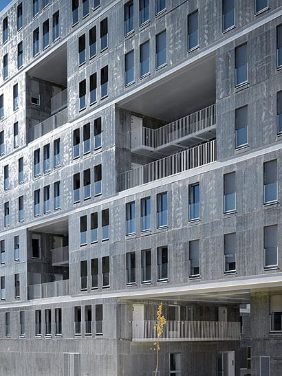
The rough concrete facade is polyurethane coated to give it an unusual shine While this utilitarian aesthetic was an inevitability of means, it also proudly displays one of the project’s key innovations. In the interests of speed and cost, the architects employed a new construction technique, borrowed from cheap mass housing in Colombia, whereby each apartment is poured in situ into an aluminium mould, all in one go. A series of five moulds make up three different modular configurations of one-, two- and three-bed apartments, the whole lot slotting together in a dextrous game of structural Tetris. There were clear benefits to this technique – a whole apartment could be poured in a day – but it is difficult to say quite how far the provisional roughness of the building’s finish was intended. The workmanship looks shoddy. There is something intriguingly perverse about varnishing such a rugged finish: cracks, dollops and stains are now sealed behind a glossy coating, like a slice of geological strata forever encased behind glass. To the objective viewer, it’s a provocative move, challenging our material assumptions by raising the perceived value of cheap construction. But to the residents, judged alongside the neighbouring private acres of terracotta cladding, it surely smacks of cost-cutting and only serves to remind them of their unfortunate predicament. Returning down to the central courtyard, I encounter a group of new residents who are adding life to the rather barren scene with their angry gesticulations. Against a backdrop of fledgling scrubby landscaping and bricked-up ground floor units – a brave attempt at activating the square, but one which I suspect will be long awaiting commercial tenants – they seem to be voicing their collective woes about the building, keen to show me its defects. “I come in through my front door, but I’m still outside,” proclaims one, pointing up to the open loggia in utter disbelief. “This is not the Spanish way.” It seems “the Spanish way” has been negated on other counts, as it emerges from several others that the open-plan fusion of kitchen and living room has also been a cause of much distress. Van Rijs is hazy about any process of consultation, explaining that the residents are chosen on a lottery once the block is complete. “If I had a choice,” a young mother tells me, “I would have gone for a more conventional building.” As I leave the group to their grumbling, I begin to question my own attraction to the scheme as an elite perversion, a rarefied pleasure for those in the know and a fetish object for concrete idolaters. But while there are clearly many teething problems with the building, and it will take time for residents to get used to modern domestic novelties, it is not the architecture but the plan which is to blame. No one I speak to has moved to Sanchinarro out of choice, and this building represents a brave attempt to offer up a fragment for a new open model of housing, a way out of the fenced-off acres of introverted sprawl.
First floor plan showing one-, two- and three-bed flats, and L-shaped mid-air walkways (01) |
Image Roland Halbe
Words Oliver Wainwright |
|
|
||
|
A walkway across one of the shared inner spaces |
||

