The aluminium-wrapped vertical structure on the Norwegian capital’s waterfront provides expansive spaces for the iconic artist’s work
Words by Will Jennings
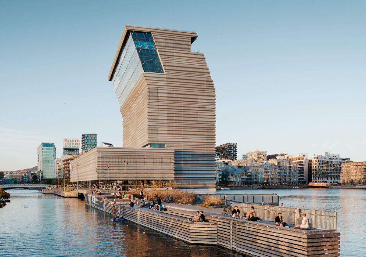
When Oslo’s opera house opened in 2008 and people discovered they could climb up and across the irregularly hewn Snøhetta-designed rooftop, a new civic engagement between architecture and the Norwegian capital was born. It was also a driver for a new urban relationship to the water centred on culture and architectural spectacle. MVRDV masterplanned Bjørvika Barcode, David Adjaye added to the Nobel Peace Centre, and the Deichman library landed. Now, the fjord’s magnetism has pulled the Munch museum 2km from its original home to a new £230m ‘vertical museum’ designed by Estudio Herreros, which opens on 22 October.
The verticality is dominant, wrestling for attention and iconic status from near-neighbours, looming larger than its 13 storeys by virtue of the wraparound dark aluminium cladding’s monolithic monumentality, seemingly in deliberate provocation to the glacial opera house which it towers over.
Sitting on a peninsula along a waterfront of pleasure and promenading, the museum invites visitors inside to two distinct zones, called the ‘static’ and the ‘dynamic’. The ‘static’ is a climate-controlled and light-blocking concrete shell within which artworks are displayed to visitors and worked on by conservators. The ‘dynamic’ zone carries the cafes, bars, shop, offices, auditorium, and spaces of public navigation.
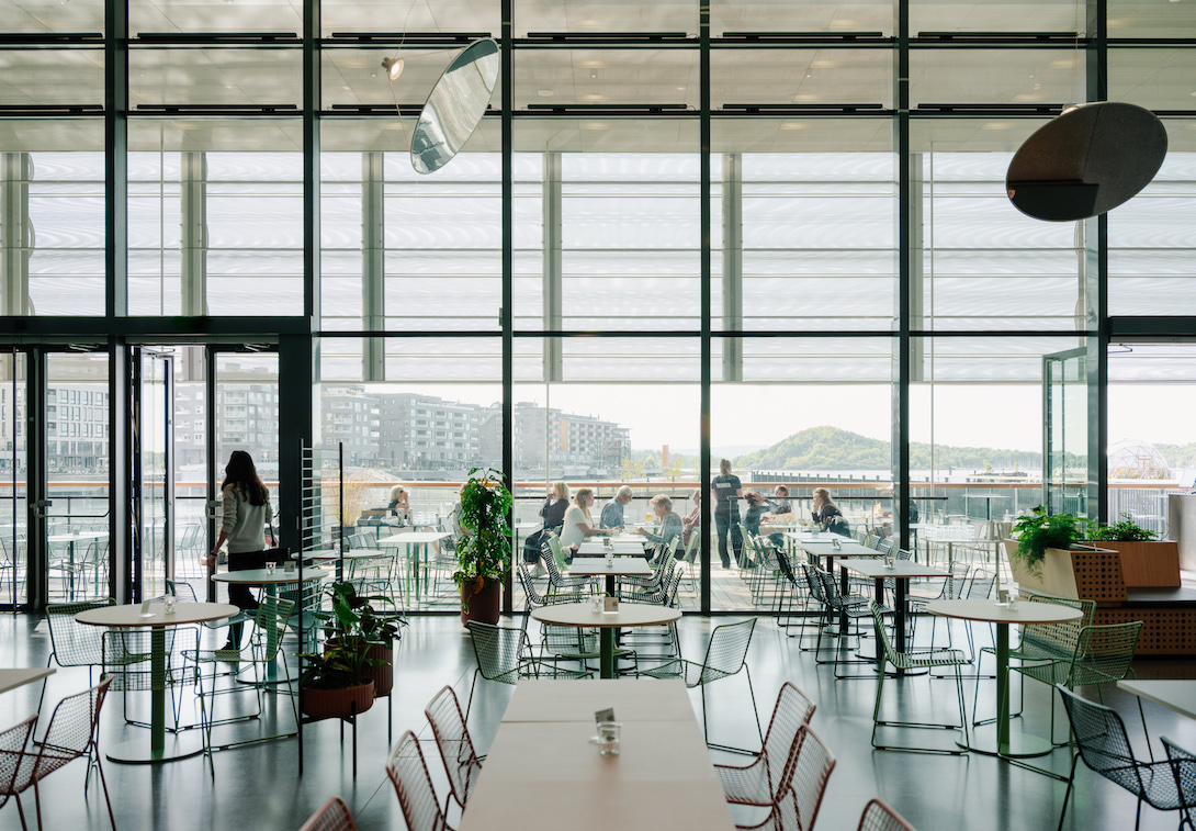
Upon entering, the space immediately opens up into a welcoming lobby for mingling, shopping, or passing through towards a cafe with beautifully framed fjord views. There is a legibility to this space, which Estudio Herreros founding partner Juan Herreros has described as ‘a comfortable feeling that everything is waiting for you’, hoping that visitors will intuitively understand how to read the building and navigate to their destination – auditorium, gallery, cafe or restaurant.
But after this initial welcome, navigating the Munch is far from comfortable. Most visitors will head to the gallery tower through a vertical slice of the building which contains zig-zag escalators and glass-wrapped lift shaft, but narrow corridors, tight turns, and slowly opening doors make the journey more akin to negotiating an airport terminal than a journey towards a cultural and vertiginous sublime.
There are moments on this journey where the palette of materials – metal, reflective glass, and huge steel sections supporting the top floors’ architectonic kink – creates cluttered and oppressive spaces of genuine angst. Meanwhile, views through the confining cladding’s perforation enclose the viewer within, rather than opening up to the outside – perhaps unintentional references to the anxiety-riddled Edvard Munch himself, who once wrote in his diary: ‘My sufferings are part of my self and my art.’
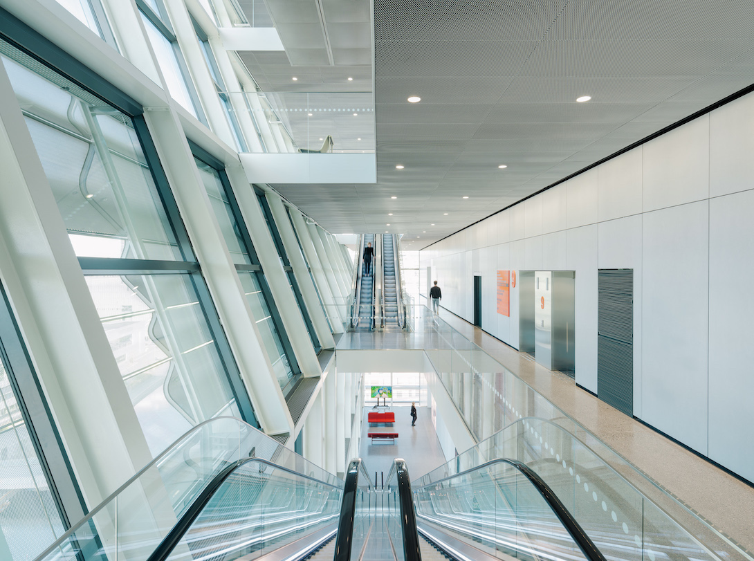
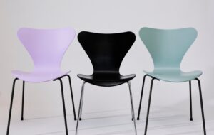
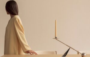
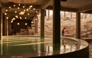
It is left to furnishings selected by interior designer Marius Brandl to soften the rigidity of the public spaces. Intelligent use of hanging and rotating Amisol lights help bring joy to the ground floor, while designers Andreas Engesvik and Jonas Stokke worked with Vestre to create furniture as a brief moment of calm on each floor of the ascent.
At the summit, Brandl hung sweeping curtains to bring some comfort, and for the roof terrace designed a playful flip-lid bar. These elevated spaces will no doubt prove popular with a trendy Oslo crowd and corporate hires, but there appears to be little space at the top for a generosity equivalent to Tate Modern’s viewing platform. This seems a contained space of consumption, views through glass seemingly only on offer for those imbibing, digesting and dancing.
At the time of my visit to the museum in late summer, the static zone of the galleries was not finished, so not possible to visit, but across the 11 galleries, wall colours and timber floor – a detail also used in the sizeable and well-detailed multi-use auditorium – appear to provide a calmer environment within which to contemplate the existentiality and materiality of Munch’s work. The artist’s ‘monumental’ paintings, including The Sun, now have a dedicated double-height gallery, and curators have more space to explore and develop new ways of understanding the collection.
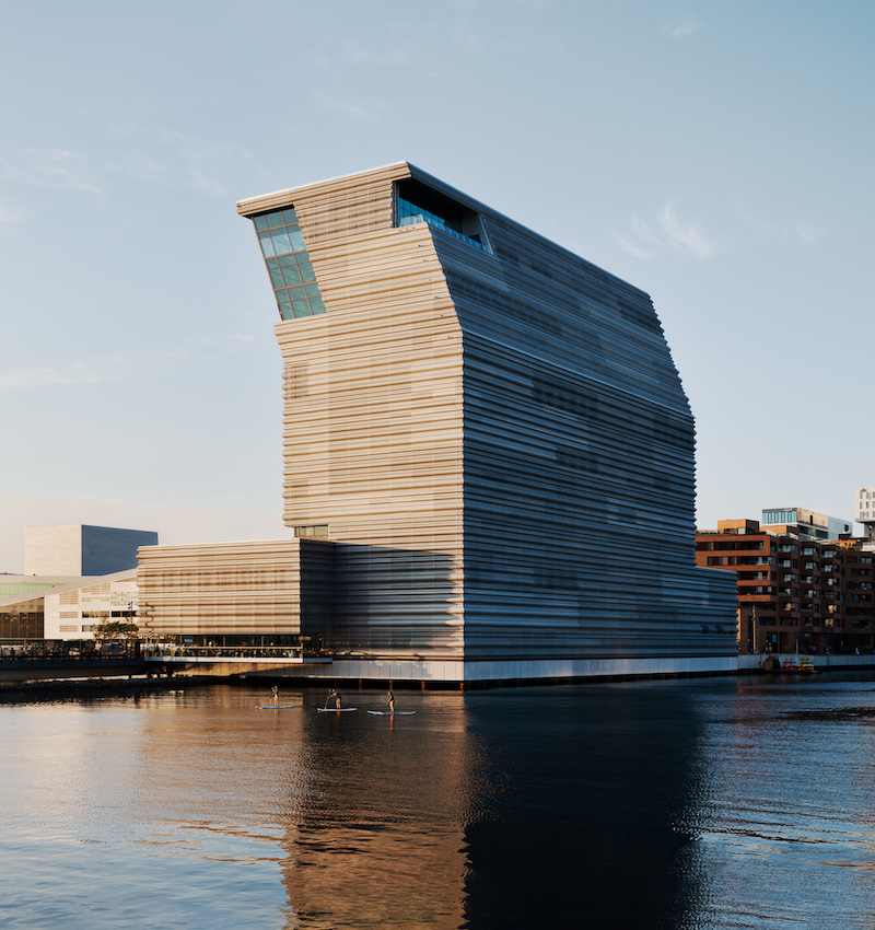
Whether over time the museum’s solid form softens into the cityscape, or stands as awkward bookend to the cultural quarter, is perhaps moot. Ultimately the success of the building will be not in the cladding or corridors, but in the ability for Munch’s work to be seen in new light and curatorial depth, and for the broad cultural events programme the sheer scale of 26,000 sq m allows. With five times the space of its previous building, the work of Munch can now hang resplendently, and when gazing into his bottomless abyss, even the harshest surroundings evaporate.
Photography by Einar Aslaksen/MUNCH
Get a curated collection of architecture and design news like this in your inbox by signing up to our ICON Weekly newsletter


