The designer tells Icon how she used bold colours and biophilia to enliven a new public space at the Broadgate development
All photos by G. Gardner
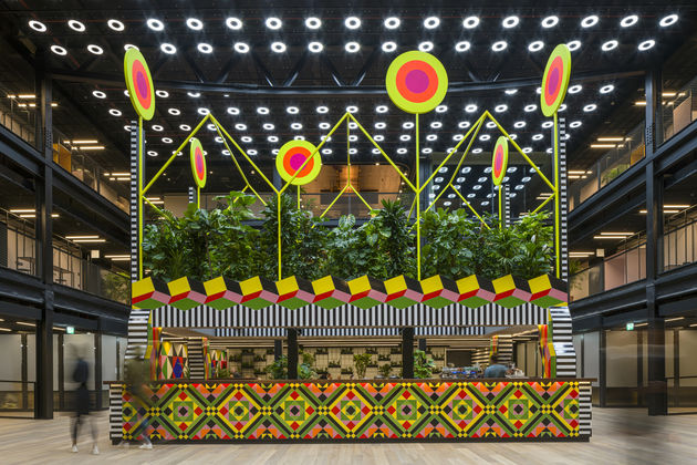
London’s ongoing Broadgate re-development has gained its first new public artwork in the form of Atoll, a project by British designer Morag Myerscough. The pavilion is located in a new thoroughfare in 1FA, a listed building currently being redesigned internally by AHMM. The new public space opens up a path between Wilson Street and Finsbury Avenue Square, and Myerscough’s creation incorporates a cafe and seating area.
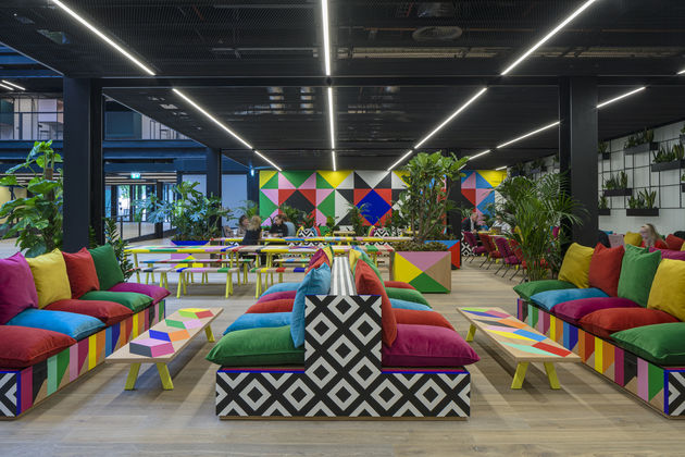
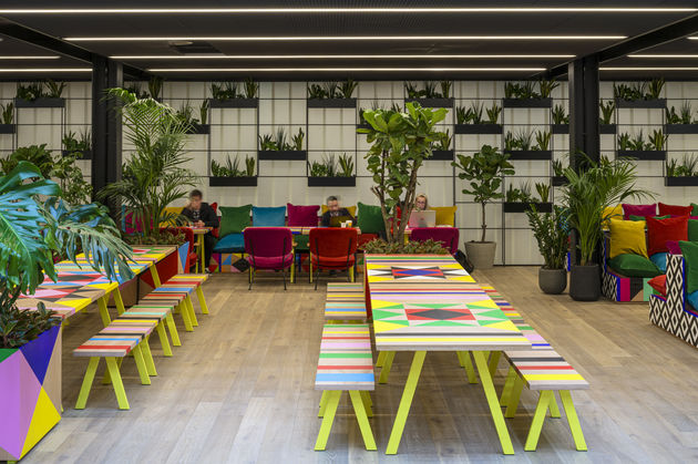
The artworks created by Myerscough include a pavilion with a cafe on the ground floor and dense greenery on the roof, as well as billboards, hand-painted colourful walls and bespoke furniture, made together with Myerscough’s collaborator Luke Morgan in their studio. As Myerscough tells Icon, the furniture proved one of the more ambitious aspects, as building and testing the number of pieces required was a new challenge for the pair.
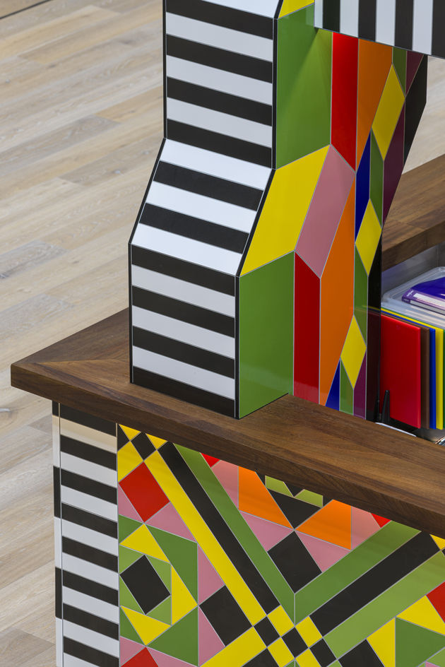
The pavilion, Myerscough’s first permanent internal installation, features her signature bold colours and energy and inspiration taken from London’s history. It also has a strong biophilic element, with the dense foliage at the top, designed to form an indoor park that references Victorian-era green spaces added to the built up city. Similarly, the mosaic tiling was inspired by Myerscough’s childhood home and the pavilion’s roof is inspired by the roofline of a typical London terrace. ‘The suns [on top of the pavilion] are also very important as they signify life, joy and energy,’ says Myerscough.
In the interview below, Myerscough explains it all, from her design process to deciding which plants to use.
ICON: What were the differences in working on a permanent installation with a particular function, compared with your work on exhibitions and artistic installations?
Morag Myerscough: When I designed this installation, the concept was the most important element and the fact it was a cafe came second. AHMM and British Land had already identified the base dimension of the cafe and that is what they gave me to work with. Then the rest was up to me.
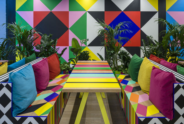
There is always a danger with ‘permanent’. Commissioners often ask ‘will this last 20 years?’, and my response is ‘I don’t know, I can’t see into the future’. Then people can get worried and often revert to making more dulled-down pieces. But when I made my first exterior permanent piece, POWER at Battersea Power Station, I decided that I needed to inject the same energy and playfulness of my temporary pieces. I worked with the materials I wanted to use rather than using an alternative that may have all the properties of permanent [installations], but lacked any of the beauty. For the Atoll, it had been a long-time ambition to build a piece in Victorian style mosaic.
ICON: You have worked with AHMM in the past, for instance on decor for the Kentish Town Health Centre and graphics for the reception area of Grove House. How did this project work?
MM: As you mentioned I have worked on many projects with AHMM, but this was different. AHMM had never commissioned me to make one of my structural installations and furniture for them, so they were putting a huge amount of trust in me and I understood that.

They totally embraced this installation as a piece of art that could not be interfered with [and] supported me throughout the whole process.
It is also important to mention Luke Morgan’s involvement in the project. We designed and Luke made all the furniture with a small team, and I painted with a small team in his workshop/my studio in Hoxton last summer. Again, it was ambitious for us as we had made quite a bit of furniture before but not this amount all in one go. We had to do loads of testing to ensure everything would last and passed all the required regulations.
ICON: What was the biggest challenge you faced in designing and making this project?
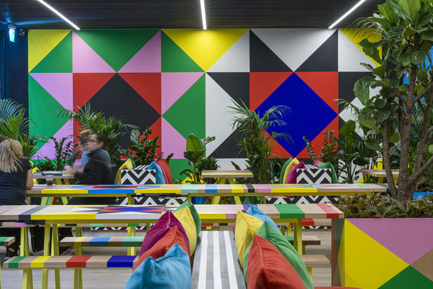
MM: The tiling was super complex. Everything was cut, perfectly drawn by me in Illustrator files, then converted to CAD files by the tile manufacturers and water jet cut. But then they were being tiled on a built piece that has many more tolerances. But with a lot of determination and skill on the part of the tilers we got it exactly how I wanted it.
ICON: There’s a big biophilic element to this work – what inspired this, and how did you go about choosing the plants and materials for this unusual semi-indoor space?
MM: Finsbury Avenue was a residential road at one point, I don’t know exactly the style/period of the housing but it made me think of the Victorian terrace house I grew up in in Holloway (hence the outline of the row of terrace houses) and how we lived very near one of the Victorian parks — Finsbury Park. These parks were designed for the city dwellers to take air at the weekend, [so] the atrium is a public space in which I wanted to bring the nature to the workers on the inside.
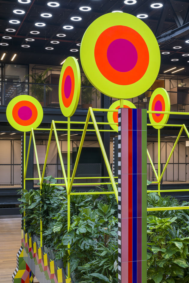
I have grown many plants over the years. My favourites are tomato plants. But I was very nervous about the planting in this space as it has no natural light. I then decided to do lots of research on plants that would live in very low light levels. I bought them and tested them in areas of my studio spaces that had similar conditions. We consulted various people about grow lights, drainage etc.
But after testing the plants and deciding the type of plant I wanted and that I knew they would live, I then approached four interior planting companies and chose Oasis Interior Landscapers based in Cheshire who were unbelievably brilliant and totally worked with me.
It was also important that the people on the surrounding balconies would get a feeling of an island of greenery in the middle of the space. The suns are very important too as they signify life, joy and energy.
ICON: How would you like your installation to be used?
MM: As a public space, a space for everyone to use. Previously the buildings at Broadgate were only to walk around unless you worked on the inside of a particular building.
Now they are open spaces for everybody to use to move seamlessly inside and outside on the ground level.

