Through renovation and expansion, Belgian practice B-architecten has eschewed statement architecture to focus on improving the museum experience
Words by Anna Winston
Once the cultural centre of Europe, Antwerp bears the scars of being invaded and occupied over and over, bombed and battered, its canals and docks concreted over and turned into car parks. Alongside the 16th-century beauty of its old centre, the city has a rough, industrial edge, thanks in no small part to its port – the second largest in Europe, with all of the pollution and prosperity that brings.
Recent years have been kinder. There is a wave of new public spaces, those car parks buried and covered with parks, squares and boardwalks. New areas of the city are being built from scratch in the north and south, with a lengthy roster of well-known architects involved. And museums are being renovated, including MoMu, the city’s fashion museum.
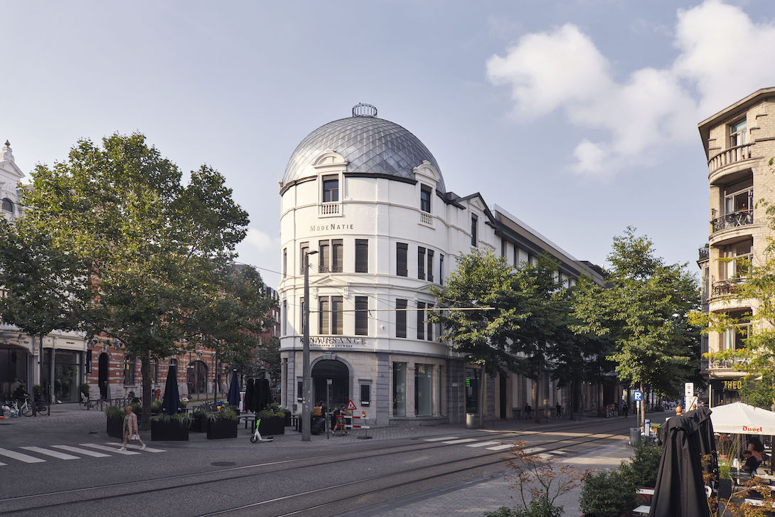
Reopening on 4 September, MoMu occupies the heart of a 19th-century city block, right in the centre of Antwerp, hovering on the edge of the oldest part of town and the fashionable shopping district. It’s a prime location for a symbol of the city’s global importance as a centre for fashion. Antwerp’s last big ‘moment’ came off the rise of the Antwerp Six in the 1980s, a group of designers including Dries van Noten and Ann Demeulemeester, who stormed London Fashion Week and recreated the entire notion of Belgian fashion. Suddenly, Antwerp was cool. The fashion academy was turning out designers like Martin Margiela, cementing a reputation as a world-leading school that it still deservedly retains.
Riding this wave, in the early 2000s, MoMu unveiled an attention-grabbing design by Ghent architect Marie-José Van Hee. Unable to affect much of the street front, Van Hee instead focused on creating a striking interior centred around a dramatic, wood-lined atrium with a massive staircase. It fit in with a wave of statement museum architecture that was sweeping through Europe. But times have changed, and a new renovation by local firm B-architecten reflects a welcome shift in museum architecture.
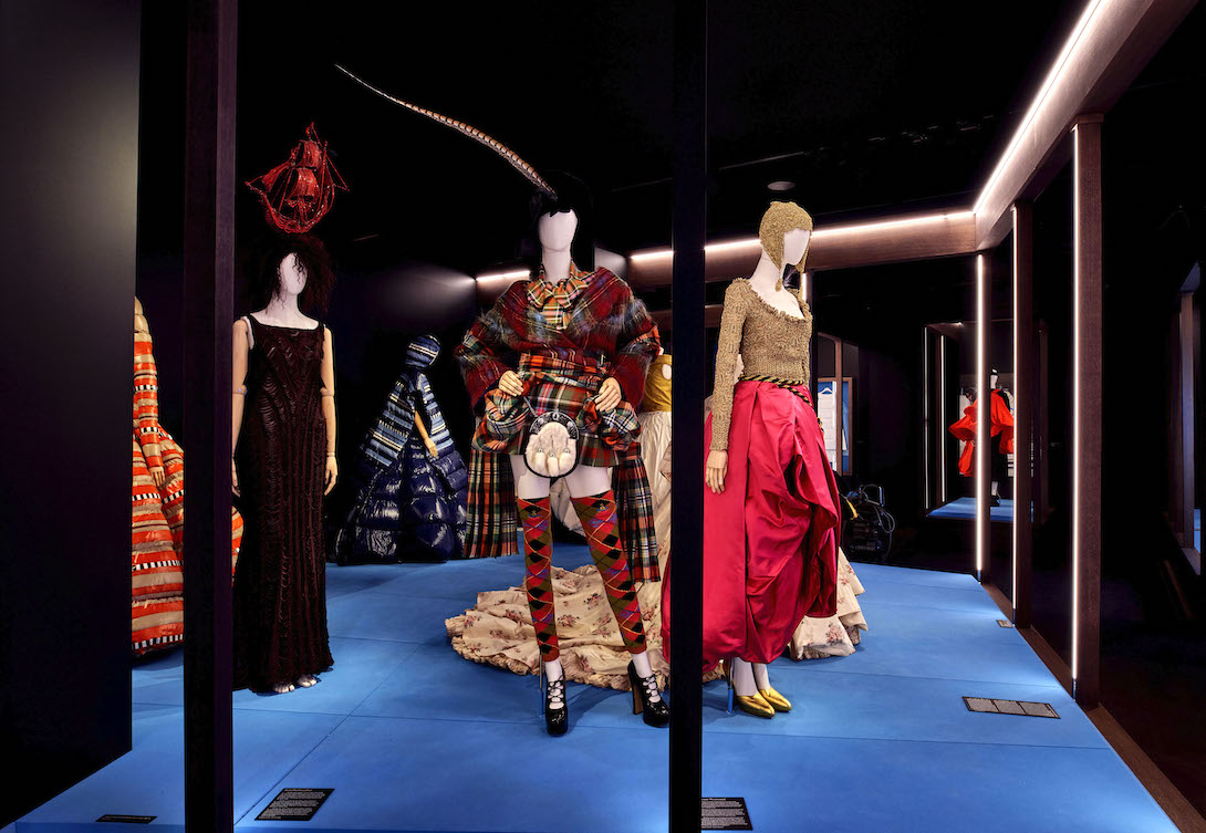
‘A lot of museums from the 90s were not easy to work in,’ says Kaat Debo, director and chief curator of MoMu. ‘We should not forget that for a big part of your audience, a museum is a temple… that kind of statement architecture doesn’t really lower the threshold. You have to find the balance with what a museum needs – for example, we need black boxes to display clothing.’
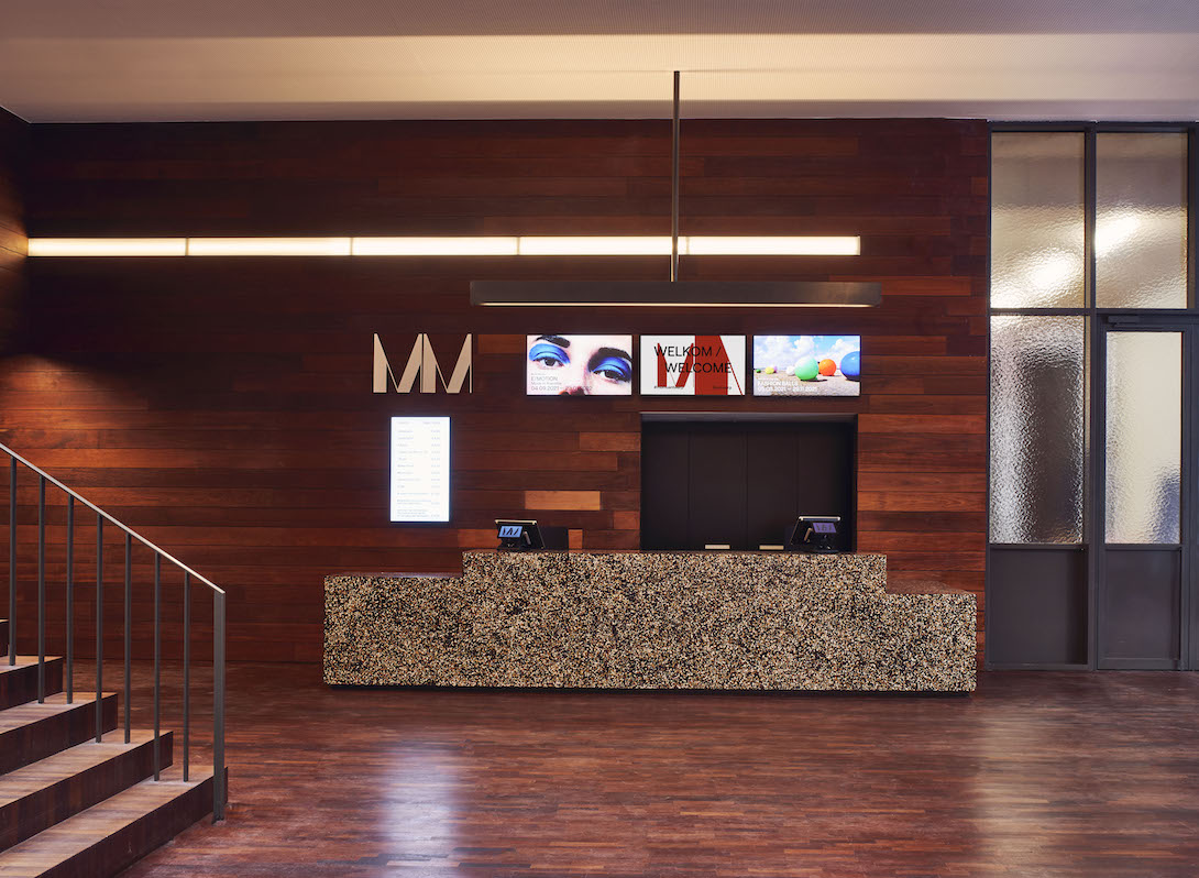
Instead of adding flashy architectural statements, B-architecten has done that rare thing and made the building more welcoming and more functional. The tropical-wood-lined atrium that was the centrepiece of Van Hee’s original design remains, but is altered around the edges to accommodate the new additions to the ground-floor layout.
‘The concept is a continuation of the concept of the 90s, but bringing the changed programme and new way of working in an upgraded, slightly more abstract environment,’ explains Dirk Engelen, co-founder of B-architecten. ‘There is a strong focus on the connections of MoMu and the city… The original design is stronger, visible and in a subtle way abstracted to a more contemporary and new building and interior.’
A revamped entrance and hall makes the museum’s presence clearer from the street, while inside 800 sq m of space has been added, with a new cafe with a second entrance, a tiny shop, a small lecture theatre and two new gallery spaces at ground level – including one that will give the museum space to show it’s permanent collection for the first time. The main exhibition area on the first floor has been updated, with a new double-height atrium completing the circular route through the space. The library and back offices of the MoMu team have also been overhauled.
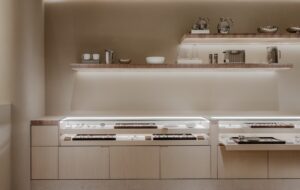
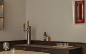
The self-service cafe replaces a fashion store that previously occupied the space – once a source of frustration for the museum – with a design by Antwerp-native Bob Verhelst, who has also designed the scenography for the new galleries and is a regular MoMu collaborator. For the first time, the museum has a social space that connects the interior to the city fluidly.
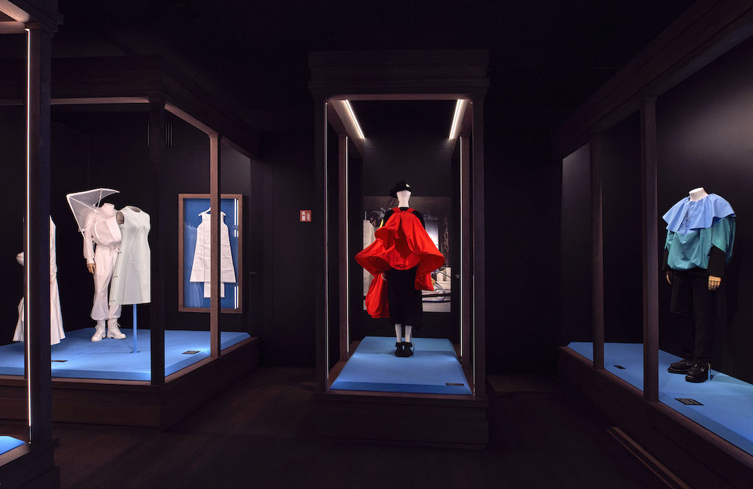
But perhaps the most innovative aspect of the project is the one that will be the least noticed out of all of this. B-architecten has designed a modular glass display system, based on a triangular arrangement, with panels that click together to create boxes with an open top, or longer glass walls.
Moving glass exhibition cases of sizes large enough to display mannequins usually takes four to five people and a specialised company, which is both costly and inflexible. The solution designed by B-architecten at the behest of Debo can be easily moved and reconfigured by the MoMu team, making exhibition-making infinitely more flexible and affordable.
In a world of dwindling resources and climate crisis, MoMu’s renovation offers a more realistic near future for museum architecture. No more ‘signature’ buildings, no more demolition where retention is possible, and instead exploring subtle, thoughtful solutions for real challenges, making old buildings work harder, do more – centring the public experience, flexibility and functionality over style. It might not make great headlines, but it certainly makes for a better museum experience.
Photography by Stany Dederen
Get a curated collection of architecture and design news like this in your inbox by signing up to our ICON Weekly newsletter

